

About
Pure CSS gradient background in the Bloom Field style, made with the 21st.dev Gradient Builder. 4-color palette (#0A0A0A, #DC2828, #811D1D, #262626). A drop-in, zero-dependency React component for hero sections, cards, and page backgrounds.
Built with React and Tailwind. Copy the prompt and paste it into Claude Code, Cursor or Lovable: your agent adds HANZO Ember Bloom to your project and fits it to your theme.
Code
How HANZO Ember Bloom is used: the demo's code. The component's own source comes with a free account.
Usage.tsx
import { GradientBackground } from "@/components/ui/hanzo-ember-bloom"

export default function GradientBackgroundDemo() {
  return (
    <div className="relative h-[440px] w-full overflow-hidden rounded-xl">
      <GradientBackground className="h-full w-full" />
    </div>
  )
}
More by Artem
View all
HANZO Camera Lens

HANZO Alarm Beacon
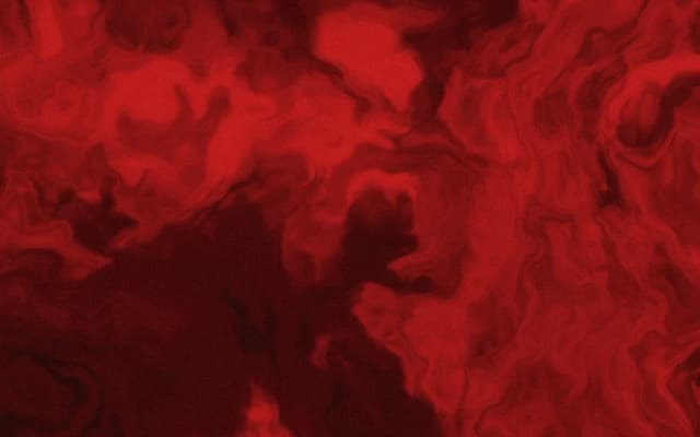
HANZO Ember Smoke

HANZO Red Silk
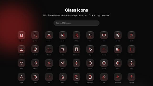
Glass Icons (142)

Glass Testimonial Marquee

Glass Stats Section

Glass Pricing Section