
About
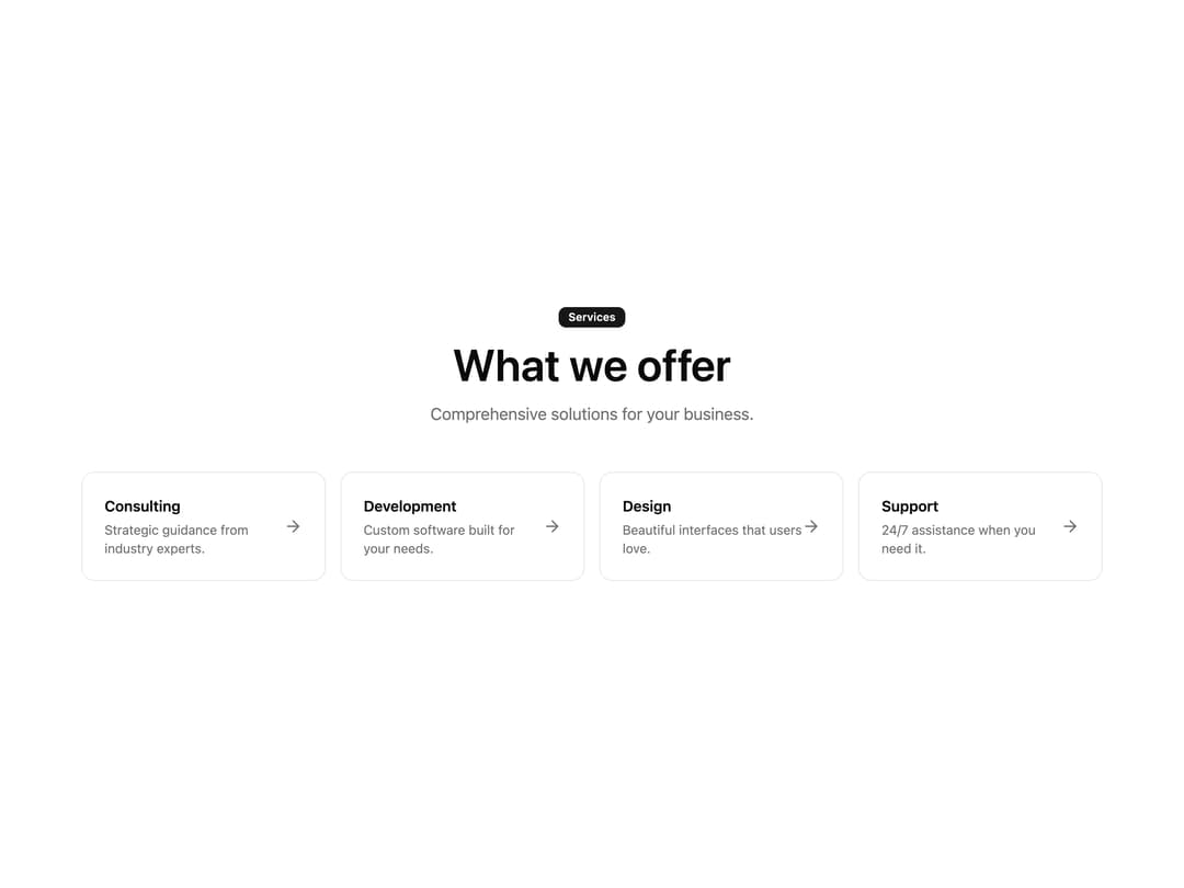
A responsive grid of service cards, each with a title, description, and arrow icon that links to a detail page — for services listings, solutions overviews, or offering showcases.
Built with React and Tailwind. Copy the prompt and paste it into Claude Code, Cursor or Lovable: your agent adds Service Offerings with Arrows to your project and fits it to your theme.
Code
How Service Offerings with Arrows is used: the demo's code. The component's own source comes with a free account.
Usage.tsx
import { Feature144 } from "@/components/ui/feature144";

export default function Feature144Demo() {
  return (
    <Feature144
      badge={{ label: "Services", variant: "default" }}
      heading="What we offer"
      description="Comprehensive solutions for your business."
      services={[
        {
          title: "Consulting",
          description: "Strategic guidance from industry experts.",
          href: "https://beste.co",
        },
        {
          title: "Development",
          description: "Custom software built for your needs.",
          href: "https://beste.co",
        },
        {
          title: "Design",
          description: "Beautiful interfaces that users love.",
          href: "https://beste.co",
        },
        {
          title: "Support",
          description: "24/7 assistance when you need it.",
          href: "https://beste.co",
        },
      ]}
    />
  );
}
Dependencies
More by uğur sözen
View all

Worth Keeping CTA
200
Comparison Slider with Highlights
191
Before/After Image Slider
120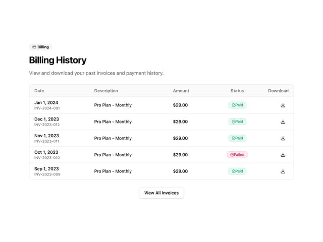
Invoice History Table
66
Recipe Card
38
PIN Keypad Unlock
34
Trigger to Action
34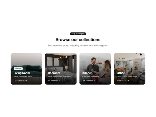
Shop by Category Grid
33
More in Cards
View all
Stats cards with links
39

Statistics Card 2
261

Course Design Cards
1.1K
The Item one
3
Card
70

Card Studio
7
Statistics Card 7
289

Card
17
