
About
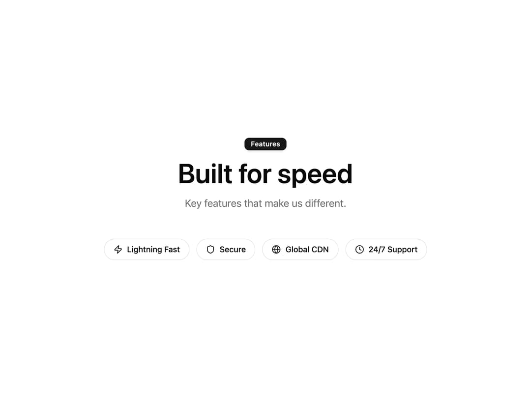
A centered row of inline feature pills with icons and labels, ideal for highlighting key benefits or feature lists.
Built with React and Tailwind. Copy the prompt and paste it into Claude Code, Cursor or Lovable: your agent adds Icon Badge Pills Row to your project and fits it to your theme.
Code
How Icon Badge Pills Row is used: the demo's code. The component's own source comes with a free account.
Usage.tsx
"use client";

import { Feature152 } from "@/components/ui/feature152";
import { Clock, Globe, Shield, Zap } from "lucide-react";

export default function Feature152Demo() {
  return (
    <Feature152
      badge={{ label: "Features", variant: "default" }}
      heading="Built for speed"
      description="Key features that make us different."
      items={[
        { icon: <Zap className="size-4" />, label: "Lightning Fast" },
        { icon: <Shield className="size-4" />, label: "Secure" },
        { icon: <Globe className="size-4" />, label: "Global CDN" },
        { icon: <Clock className="size-4" />, label: "24/7 Support" },
      ]}
    />
  );
}
Dependencies
More by uğur sözen
View all

Worth Keeping CTA
203
Comparison Slider with Highlights
191
Before/After Image Slider
121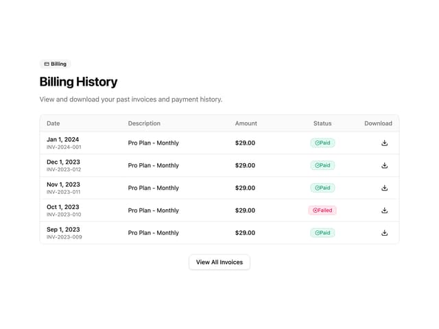
Invoice History Table
66
Recipe Card
38
PIN Keypad Unlock
34
Trigger to Action
34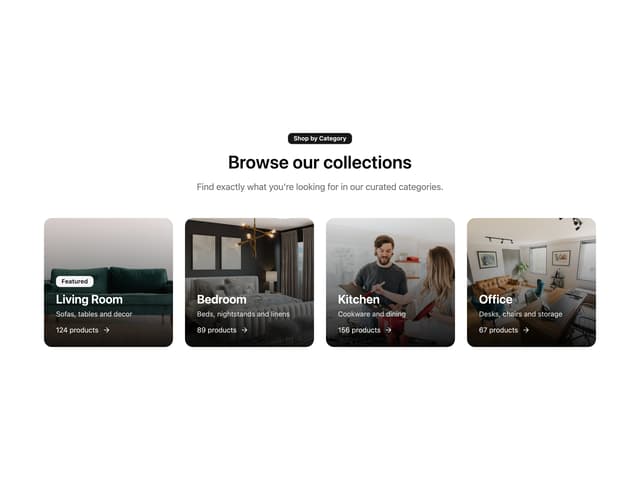
Shop by Category Grid
33
More in Features
View all

Features 8
3K
Features 2
322

Grid Feature Cards
1.9K

Feature Sections
52
Feature Modern
17
Feature with advantages
278
Feature Section with card gradient
169
Features 4
368


