

About
A six-card feature grid with icons in rounded containers that lift and highlight on hover, plus a badge, heading, and per-card titles and descriptions.
Built with React and Tailwind. Copy the prompt and paste it into Claude Code, Cursor or Lovable: your agent adds Feature Card Grid with Hover Effects to your project and fits it to your theme.
Code
How Feature Card Grid with Hover Effects is used: the demo's code. The component's own source comes with a free account.
Usage.tsx
import { Feature26, feature26Demo } from "@/components/ui/feature26";

export default function Default() {
  return <Feature26 {...feature26Demo} />;
}
Dependencies
More by uğur sözen
View all

Worth Keeping CTA
203
Comparison Slider with Highlights
191
Before/After Image Slider
121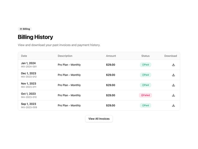
Invoice History Table
66
Recipe Card
38
PIN Keypad Unlock
34
Trigger to Action
34
Shop by Category Grid
33
More in Features
View all

Features 8
3K
Features 2
322

Grid Feature Cards
1.9K

Feature Sections
52
Feature Modern
17
Feature with advantages
278
Feature Section with card gradient
169
Features 4
368


