

About
A 3-column grid of image cards with a text overlay, hover zoom effect, and arrow indicators for showcasing team use cases, industry solutions, or department features.
Built with React and Tailwind. Copy the prompt and paste it into Claude Code, Cursor or Lovable: your agent adds Use Case Image Cards to your project and fits it to your theme.
Code
How Use Case Image Cards is used: the demo's code. The component's own source comes with a free account.
Usage.tsx
import { Feature63, feature63Demo } from "@/components/ui/feature63";

export default function Feature63Demo() {
  return <Feature63 {...feature63Demo} />;
}
Dependencies
More by uğur sözen
View all

Worth Keeping CTA
247
Comparison Slider with Highlights
208
Before/After Image Slider
131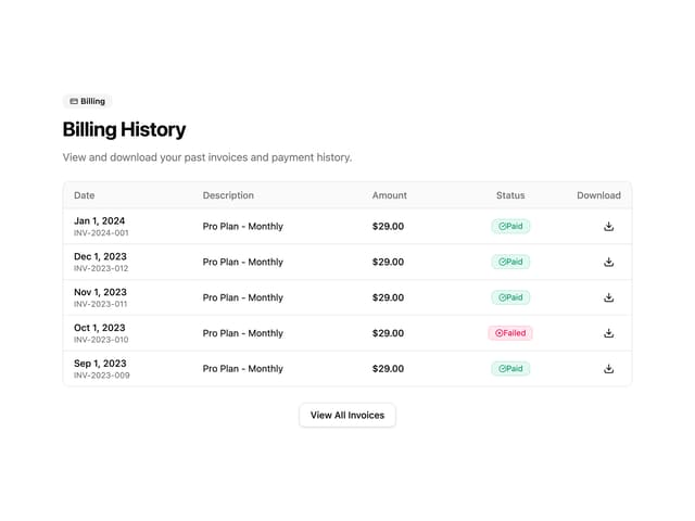
Invoice History Table
96
Recipe Card
42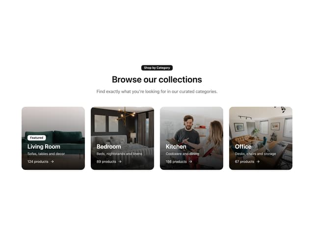
Shop by Category Grid
41
PIN Keypad Unlock
41
Trigger to Action
35
More in Features
View all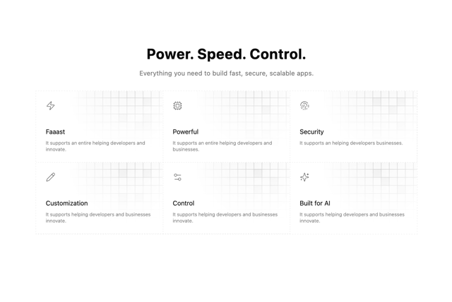

Grid Feature Cards
1.9K

Features 4
392

Feature 72
135
Features 8
3.2K
Feature 1
118

Feature Sections
191
Features Card
253
Feature with image
153

