
About
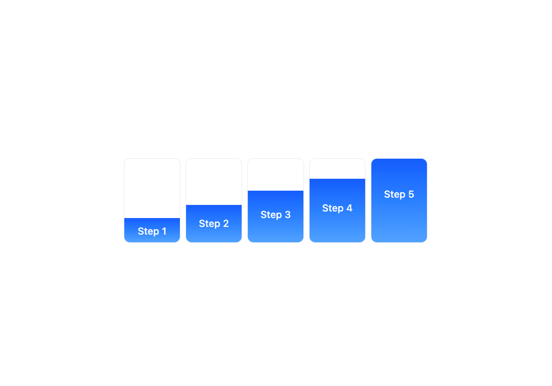
Process Pillars is a visually intuitive component that represents a typical product development lifecycle. It uses a segmented progress bar style to display five distinct phases. Each phase is represented with a partial fill to visually communicate stage-wise progression. Use Case: Ideal for portfolio sites, agency websites, SaaS dashboards, onboarding flows, or any platform that needs to communicate a linear process or workflow.
Built with React and Tailwind. Copy the prompt and paste it into Claude Code, Cursor or Lovable: your agent adds Process Pillars to your project and fits it to your theme.
Code
How Process Pillars is used: the demo's code. The component's own source comes with a free account.
Usage.tsx
import { ProcessPillars } from "@/components/ui/process-pillars";

export default function DemoOne() {
  return <ProcessPillars />;
}