
About
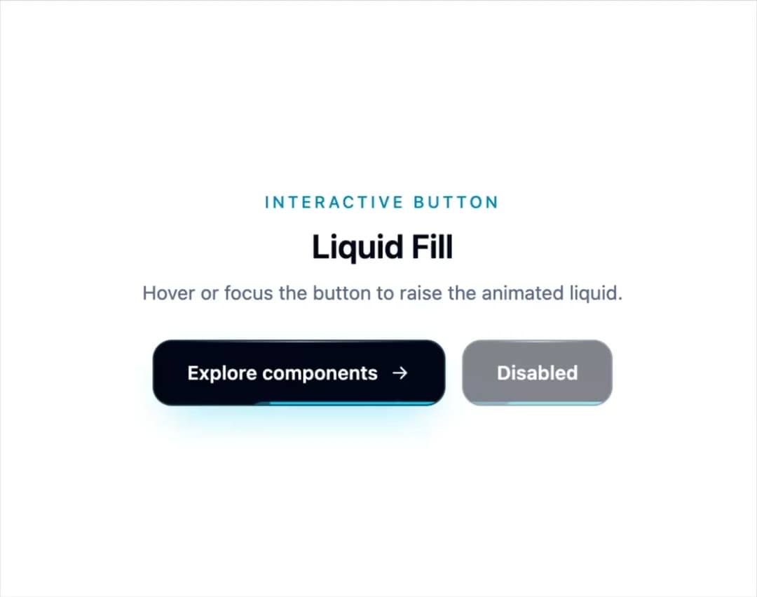
An animated liquid-fill button with rolling waves, rising bubbles, focus states, and reduced-motion support.
Built with React and Tailwind. Copy the prompt and paste it into Claude Code, Cursor or Lovable: your agent adds Liquid Button to your project and fits it to your theme.
Code
How Liquid Button is used: the demo's code. The component's own source comes with a free account.
Usage.tsx
import { LiquidButton } from "@/components/ui/liquid-button"

function ArrowIcon() {
  return (
    <svg aria-hidden="true" className="size-4" fill="none" viewBox="0 0 24 24">
      <path
        d="M5 12h14m-6-6 6 6-6 6"
        stroke="currentColor"
        strokeLinecap="round"
        strokeLinejoin="round"
        strokeWidth="2"
      />
    </svg>
  )
}

export default function LiquidButtonDemo() {
  return (
    <div className="flex min-h-[420px] w-full items-center justify-center bg-white p-8 dark:bg-slate-950">
      <div className="flex max-w-md flex-col items-center gap-6 text-center">
        <div>
          <p className="text-xs font-medium tracking-[0.18em] text-cyan-600 uppercase dark:text-cyan-400">
            Interactive button
          </p>
          <h2 className="mt-2 text-2xl font-semibold text-slate-950 dark:text-white">
            Liquid Fill
          </h2>
          <p className="mt-2 text-sm text-slate-500 dark:text-slate-400">
            Hover or focus the button to raise the animated liquid.
          </p>
        </div>

        <div className="flex flex-wrap items-center justify-center gap-3">
          <LiquidButton>
            Explore components
            <ArrowIcon />
          </LiquidButton>
          <LiquidButton disabled>Disabled</LiquidButton>
        </div>
      </div>
    </div>
  )
}
More by goodListener
View all
R3F Macro Keypad
59
Waves shader
8
More in Buttons
View all

Button
4

Button
47

App Store Button
452

Eclipse Button
39
Texture Button
92
Split Button
14
Native Button
12
Button Save
46


