
About
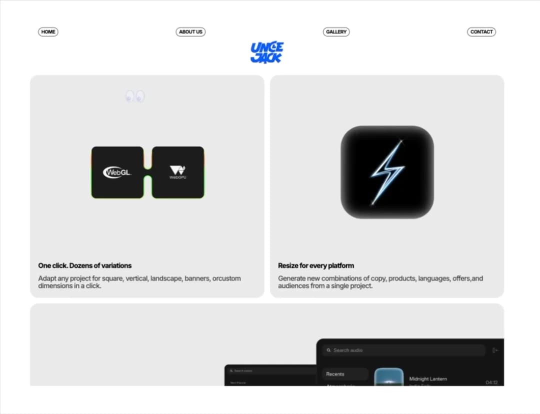
An interactive custom cursor featuring playful googly eyes that track pointer movement with smooth physics. Built by goodmotion.vercel.app/
Built with React and Tailwind. Copy the prompt and paste it into Claude Code, Cursor or Lovable: your agent adds Googly Eye Cursor to your project and fits it to your theme.
Code
How Googly Eye Cursor is used: the demo's code. The component's own source comes with a free account.
Usage.tsx
"use client";

import React from "react";
import Component from "@/components/ui/googly-eye-cursor";

const ASSETS = {
  logo: "https://cdn.21st.dev/assets/mirror/07/0703238c886a4600f7303a5e3a6e2c25d5fdf4e676ebf8c53e8536a762e0b78c.png",
  card1: "https://cdn.21st.dev/assets/mirror/f7/f719fe742b340a31aa80ca0aaeb98c076c22d5e5e55a551b10eb69815aa76ab1.png",
  card2: "https://cdn.21st.dev/assets/mirror/44/44b8196b2882b59d098bcda7ee9100f2508be0396495d9d013ff91a2be46ccdb.png",
  card3: "https://cdn.21st.dev/assets/mirror/4f/4f47af99c3a42767bb238dfd34c75dbc29414077f0a5e6e80924e8f899d50efb.png",
};

const navItems = ["HOME", "ABOUT US", "GALLERY", "CONTACT"];

export default function Demo() {
  return (
    <div className="relative w-full min-h-screen bg-white text-black font-['Inter',sans-serif] tracking-[-0.05em] leading-[1] select-none">
      <link rel="preconnect" href="https://fonts.googleapis.com" />
      <link rel="preconnect" href="https://fonts.gstatic.com" crossOrigin="" />
      <link
        href="https://fonts.googleapis.com/css2?family=Inter:wght@500;700&display=swap"
        rel="stylesheet"
      />

      <Component accentColor="#0067FE" hideDefaultCursor={true} />

      {/* Container chính: 3 card cách rìa màn hình đúng 16px ở mobile, 24px ở md+ */}
      <div className="w-full max-w-[1536px] mx-auto px-[16px] md:px-[24px] pt-0 pb-6 flex flex-col items-center">

        {/* Navigation Bar: space-between, border đen */}
        <nav className="w-full flex items-center justify-between px-[8px] md:px-[24px] py-[8px] mt-0">
          {navItems.map((item) => (
            <a
              key={item}
              href={`#${item.toLowerCase().replace(/\s+/g, "-")}`}
              className="text-[14px] font-[700] tracking-[-0.05em] leading-[1] px-[8px] py-[5px] rounded-full border border-black hover:bg-black hover:text-white transition-colors"
            >
              {item}
            </a>
          ))}
        </nav>

        {/* Logo: cách nav 0px, height 80px, cách card dưới 24px */}
        <div className="mt-0 mb-[24px] flex items-center justify-center">
          <img
            src={ASSETS.logo}
            alt="Logo"
            className="h-[80px] w-auto object-contain pointer-events-none"
          />
        </div>

        {/* Bento Grid: 1 col dưới 1200px, 2 col từ 1200px trở lên */}
        <main className="w-full grid grid-cols-1 min-[1200px]:grid-cols-2 gap-[16px]">

          {/* Card 1 */}
          <article className="bg-[#EDEDED] rounded-3xl p-[16px] md:p-[24px] flex flex-col justify-between">
            <div className="h-[315px] md:h-[520px] w-full flex items-center justify-center mb-[48px] min-[1200px]:mb-0">
              <img
                src={ASSETS.card1}
                alt="Feature preview"
                className="w-[60%] max-h-[60%] object-contain pointer-events-none"
                draggable={false}
              />
            </div>
            <div className="flex flex-col gap-[16px]">
              <h3 className="text-[18px] md:text-[20px] font-[700] text-black tracking-[-0.05em] leading-[1]">
                One click. Dozens of variations
              </h3>
              <p className="text-[16px] md:text-[20px] font-[500] text-black/70 tracking-[-0.05em] leading-[1.1]">
                Adapt any project for square, vertical, landscape, banners, orcustom dimensions in a click.
              </p>
            </div>
          </article>

          {/* Card 2 */}
          <article className="bg-[#EDEDED] rounded-3xl p-[16px] md:p-[24px] flex flex-col justify-between">
            <div className="h-[315px] md:h-[520px] w-full flex items-center justify-center mb-[48px] min-[1200px]:mb-0">
              <img
                src={ASSETS.card2}
                alt="Platform preview"
                className="w-[60%] max-h-[60%] object-contain pointer-events-none"
                draggable={false}
              />
            </div>
            <div className="flex flex-col gap-[16px]">
              <h3 className="text-[18px] md:text-[20px] font-[700] text-black tracking-[-0.05em] leading-[1]">
                Resize for every platform
              </h3>
              <p className="text-[16px] md:text-[20px] font-[500] text-black/70 tracking-[-0.05em] leading-[1.1]">
                Generate new combinations of copy, products, languages, offers,and audiences from a single project.
              </p>
            </div>
          </article>

          {/* Card 3: Không có padding bottom & right ở card cha */}
          <article className="min-[1200px]:col-span-2 bg-[#EDEDED] rounded-3xl pt-[16px] pl-[16px] md:pt-[24px] md:pl-[24px] pr-0 pb-0 flex flex-col min-[1200px]:flex-row items-stretch justify-between overflow-hidden">
            {/* Div Title + Body: Thêm cố định pb-[24px] cho div text */}
            <div className="w-full min-[1200px]:w-[40%] flex flex-col justify-end pb-[24px] pr-[16px] md:pr-[24px] min-[1200px]:pr-0 gap-[16px] order-2 min-[1200px]:order-1">
              <h3 className="text-[18px] md:text-[20px] font-[700] text-black tracking-[-0.05em] leading-[1]">
                Build videos from reusableblocks
              </h3>
              <p className="text-[16px] md:text-[20px] font-[500] text-black/70 tracking-[-0.05em] leading-[1.1]">
                Combine fully editable blocks for motion, captions,effects, layouts, and brand assets. Customize everydetail, reuse what works, and export polished videosright from your browser.
              </p>
            </div>

            {/* Khối ảnh Card 3: Mobile mb-[48px] cách div text, lên desktop mb-0 sát đáy */}
            <div className="w-full min-[1200px]:w-[60%] flex items-end justify-end order-1 min-[1200px]:order-2 mb-[48px] min-[1200px]:mb-0">
              <img
                src={ASSETS.card3}
                alt="Reusable blocks mockup"
                className="w-full h-[315px] md:h-auto min-[1200px]:w-full object-contain md:object-cover min-[1200px]:object-contain object-right-bottom pointer-events-none"
                draggable={false}
              />
            </div>
          </article>

        </main>
      </div>
    </div>
  );
}

export { Demo as Component };