
About
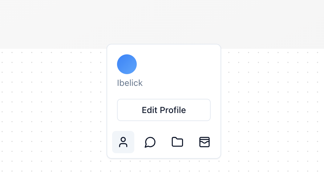
A toolbar that changes its height as needed. It grows to show more content and shrinks to save space, keeping your screen neat.
Built with React and Tailwind. Copy the prompt and paste it into Claude Code, Cursor or Lovable: your agent adds Toolbar Dynamic to your project and fits it to your theme.
Code
How Toolbar Dynamic is used: the demo's code. The component's own source comes with a free account.
Usage.tsx
import { Folder, MessageCircle, User, WalletCards } from "lucide-react";
import { Button } from "@/components/ui/button";
import { Toolbar, type ToolbarItem } from "@/components/ui/toolbar-dynamic";

const TOOLBAR_ITEMS: ToolbarItem[] = [
  {
    id: 1,
    label: "User",
    icon: <User className="h-5 w-5" />,
    content: (
      <div className="flex flex-col space-y-4">
        <div className="flex flex-col space-y-1 text-muted-foreground">
          <div className="h-8 w-8 rounded-full bg-gradient-to-br from-blue-500 to-blue-400" />
          <span>Ibelick</span>
        </div>
        <Button variant="outline" size="sm">
          Edit Profile
        </Button>
      </div>
    ),
  },
  {
    id: 2,
    label: "Messages",
    icon: <MessageCircle className="h-5 w-5" />,
    content: (
      <div className="flex flex-col space-y-4">
        <div className="text-muted-foreground">You have 3 new messages.</div>
        <Button variant="outline" size="sm">
          View more
        </Button>
      </div>
    ),
  },
  {
    id: 3,
    label: "Documents",
    icon: <Folder className="h-5 w-5" />,
    content: (
      <div className="flex flex-col space-y-4">
        <div className="flex flex-col text-muted-foreground">
          <div className="space-y-1">
            <div>Project_Proposal.pdf</div>
            <div>Meeting_Notes.docx</div>
            <div>Financial_Report.xls</div>
          </div>
        </div>
        <Button variant="outline" size="sm">
          Manage documents
        </Button>
      </div>
    ),
  },
  {
    id: 4,
    label: "Wallet",
    icon: <WalletCards className="h-5 w-5" />,
    content: (
      <div className="flex flex-col space-y-4">
        <div className="flex flex-col text-muted-foreground">
          <span>Current Balance</span>
          <span>$1,250.32</span>
        </div>
        <Button variant="outline" size="sm">
          View Transactions
        </Button>
      </div>
    ),
  },
]

export function ToolbarDemo() {
  return (
    <div className="h-[400px] w-full relative bg-gradient-to-br from-neutral-50 to-neutral-100">
      <Toolbar items={TOOLBAR_ITEMS} />
    </div>
  )
}
Dependencies
More in Buttons
View all
Texture Button
98

Button
34

HeroUI Button Group


Eclipse Button
40

Button
49
Base Button
4
Button


App Store Button
464

