
About
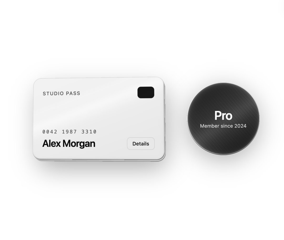
Wrap any card to give it real depth: pointer tilt with a resting pose, an extruded body, a bevelled rim, a travelling shadow and a glossy or brushed-metal WebGL layer. Follows your theme in light and dark, with hover, focus and press states.
Built with React and Tailwind. Copy the prompt and paste it into Claude Code, Cursor or Lovable: your agent adds Card Tilt Depth to your project and fits it to your theme.
Code
How Card Tilt Depth is used: the demo's code. The component's own source comes with a free account.
Usage.tsx
// Copyright (c) 2026 haim repael azoulay. Released under the MIT License.
import CardTiltDepth, { type CardTiltDepthProps } from "@/components/ui/card-tilt-depth"

const settings = {
  // body
  thickness: 6, // px, 0 = flat
  bevel: 3, // px bevel on the face rim
  // light & material
  lightAngle: -35, // degrees clockwise from the top
  lightAmount: 0.8, // 0-2
  material: "glossy",
  materialStrength: 0.5, // 0-1
  // tilt
  tilt: 10, // max degrees
  tiltSensitivity: 1, // 0.2-2
  restTiltX: 3.5,
  restTiltY: -4.5,
  perspective: 900,
  hoverScale: 1.02,
  smoothing: 0.18,
  // shadow
  shadowDistance: 24,
  shadowBlur: 36,
  shadowOpacity: 0.4,
  // interactions
  interactions: true,
  hoverGlare: true, // glare runs once when the pointer or keyboard focus enters
  glareSpeed: 900, // 200-2000 ms
  glareWidth: 0.16,
  glareIntensity: 0.9,
  glarePasses: "double",
  hoverLift: true, // bring the card closer on hover and focus
  liftDistance: 24, // 5-100 px
}

export default function CardTiltDepthDemo(props: Partial<typeof settings>) {
  const s = { ...settings, ...props } as CardTiltDepthProps
  return (
    <div className="flex min-h-[480px] w-full flex-wrap items-center justify-center gap-14 bg-background p-6 sm:p-12">
      {/* The face is bg-card / text-card-foreground by default, so it follows the theme. */}
      <CardTiltDepth className="aspect-[8/5] w-full max-w-[320px]" radius={20} {...s}>
        <div className="flex h-full w-full flex-col justify-between p-6">
          <div className="flex items-center justify-between">
            <span className="text-xs font-medium uppercase tracking-widest opacity-70">Studio pass</span>
            <span aria-hidden className="h-7 w-10 rounded-md bg-primary" />
          </div>
          <div className="flex items-end justify-between gap-4">
            <div>
              <div className="font-mono text-xs tracking-[0.2em] opacity-70">0042 1987 3310</div>
              <div className="mt-1 text-2xl font-semibold tracking-tight">Alex Morgan</div>
            </div>
            {/* Children stay interactive: focus this button with Tab and the card lifts. */}
            <button
              type="button"
              className="rounded-md border border-border bg-background px-3 py-1.5 text-xs font-medium text-foreground transition-colors hover:bg-accent hover:text-accent-foreground focus-visible:outline-none focus-visible:ring-2 focus-visible:ring-ring"
            >
              Details
            </button>
          </div>
        </div>
      </CardTiltDepth>

      {/* Any face works: a round badge on the primary color with the metallic material. */}
      <CardTiltDepth
        className="h-44 w-44"
        radius={999}
        {...s}
        faceClassName="bg-primary text-primary-foreground"
        material="metallic"
        thickness={4}
        tilt={14}
        restTiltX={0}
        restTiltY={0}
      >
        <div className="flex h-full w-full flex-col items-center justify-center">
          <span className="text-3xl font-semibold tracking-tight">Pro</span>
          <span className="text-xs opacity-80">Member since 2024</span>
        </div>
      </CardTiltDepth>
    </div>
  )
}
More by Haim Repaél Azoulay
View all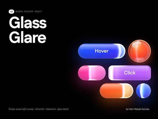

Glass Glare
79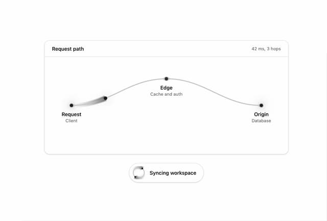
Light Runner Path
1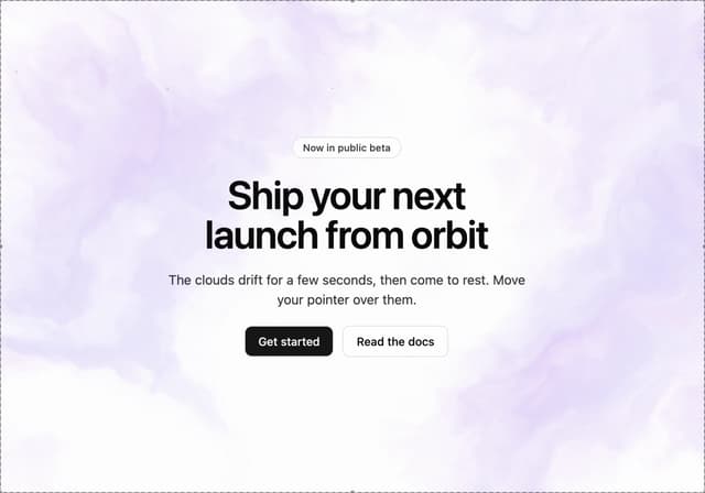
Nebula Space Background
More in Shaders
View all
Glass Fold
485

Illos Knowledge Sources
52

Shader Animation
3.9K

Phosphor 30
311

Paper design shader Background
699

NeonRGBTextEffect
153
LightSpeed
242
Black Hole
42

