About
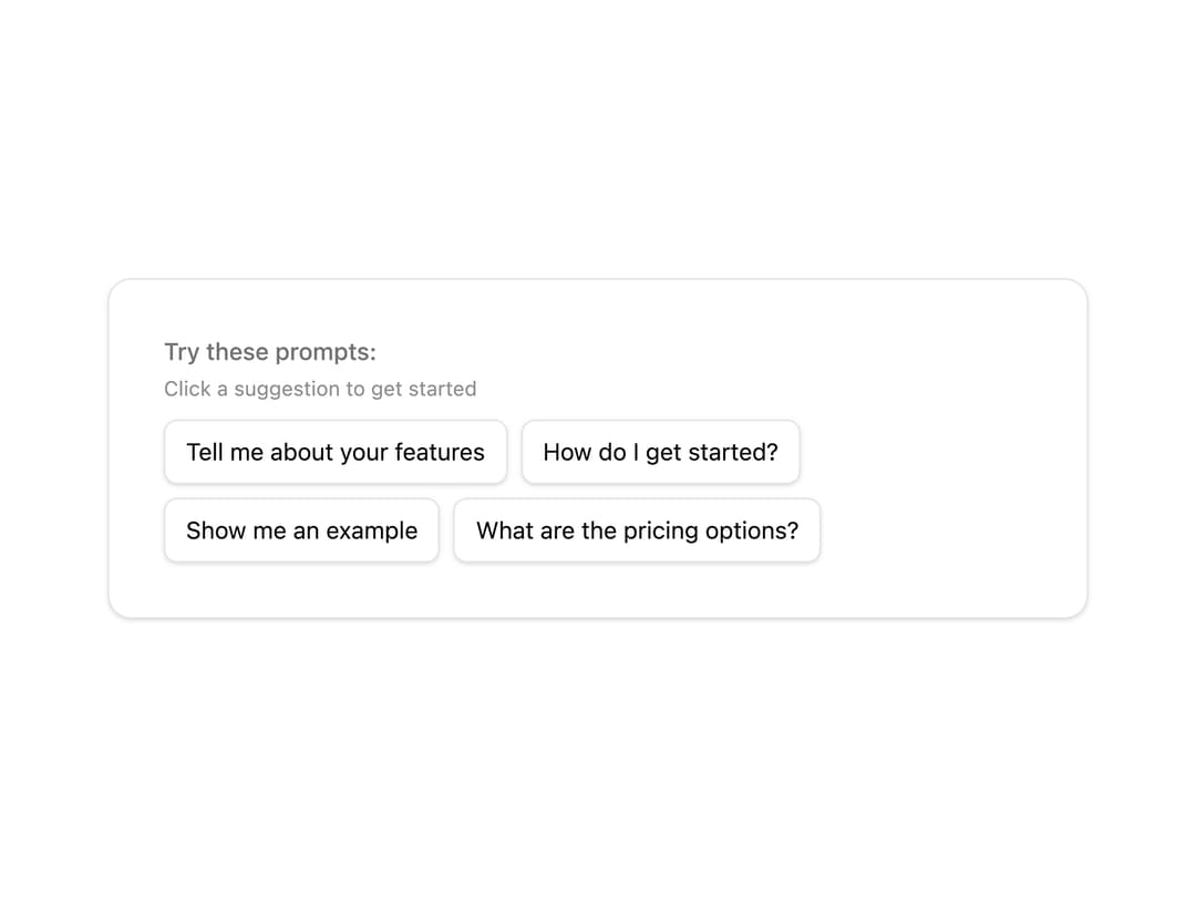
A composable set of components for displaying chat prompt suggestions as clickable buttons, ideal for onboarding or empty chat states.
Built with React and Tailwind. Copy the prompt and paste it into Claude Code, Cursor or Lovable: your agent adds Chat Suggestions to your project and fits it to your theme.
Code
How Chat Suggestions is used: the demo's code. The component's own source comes with a free account.
Usage.tsx
"use client";

import { ChatSuggestion, ChatSuggestions, ChatSuggestionsContent, ChatSuggestionsDescription, ChatSuggestionsHeader, ChatSuggestionsTitle } from "@/components/ui/chat-suggestions";
import { useState } from "react";

export default function ChatSuggestionsDemo() {
	const [selectedSuggestion, setSelectedSuggestion] = useState<string>("");

	const suggestions = [
		"Tell me about your features",
		"How do I get started?",
		"Show me an example",
		"What are the pricing options?",
	];

	return (
		<div className="flex flex-col gap-4 p-4">
			<ChatSuggestions>
				<ChatSuggestionsHeader>
					<ChatSuggestionsTitle>
						Try these prompts:
					</ChatSuggestionsTitle>
					<ChatSuggestionsDescription>
						Click a suggestion to get started
					</ChatSuggestionsDescription>
				</ChatSuggestionsHeader>
				<ChatSuggestionsContent>
					{suggestions.map((suggestion) => (
						<ChatSuggestion
							key={suggestion}
							onClick={() => setSelectedSuggestion(suggestion)}
						>
							{suggestion}
						</ChatSuggestion>
					))}
				</ChatSuggestionsContent>
			</ChatSuggestions>

			{selectedSuggestion && (
				<div className="p-3 bg-muted rounded-md text-sm">
					<span className="font-medium">Selected:</span>{" "}
					{selectedSuggestion}
				</div>
			)}
		</div>
	);
}
More by Alwurts
View all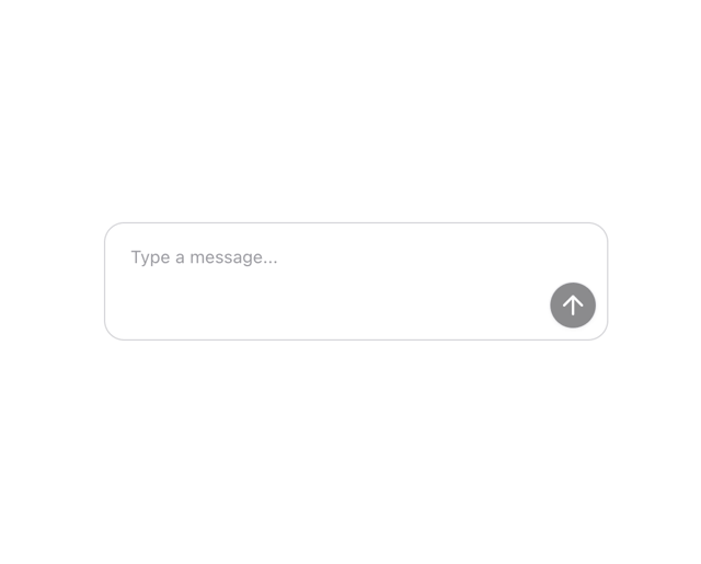
Chat Input
302
Tool Invocation
46
Model Selector
40
Status Edge
7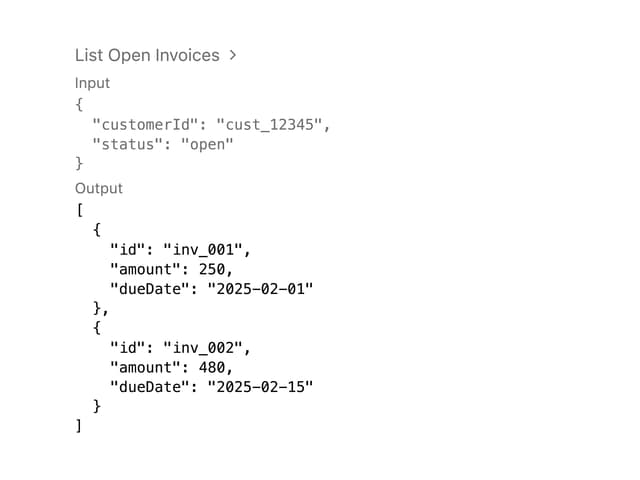
Tool Call
4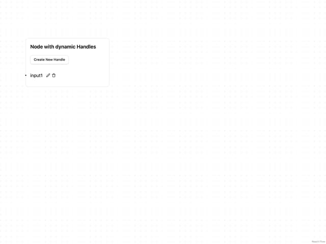
Editable Handle
1
JSX Renderer
More in AI chats
View all

AI Actions
319
Agent Chat
17
Message Thread
34

System Message
53
Color Picker
80

AI Task List
159
Code Block
8
Thinking Orbs
242


