
About
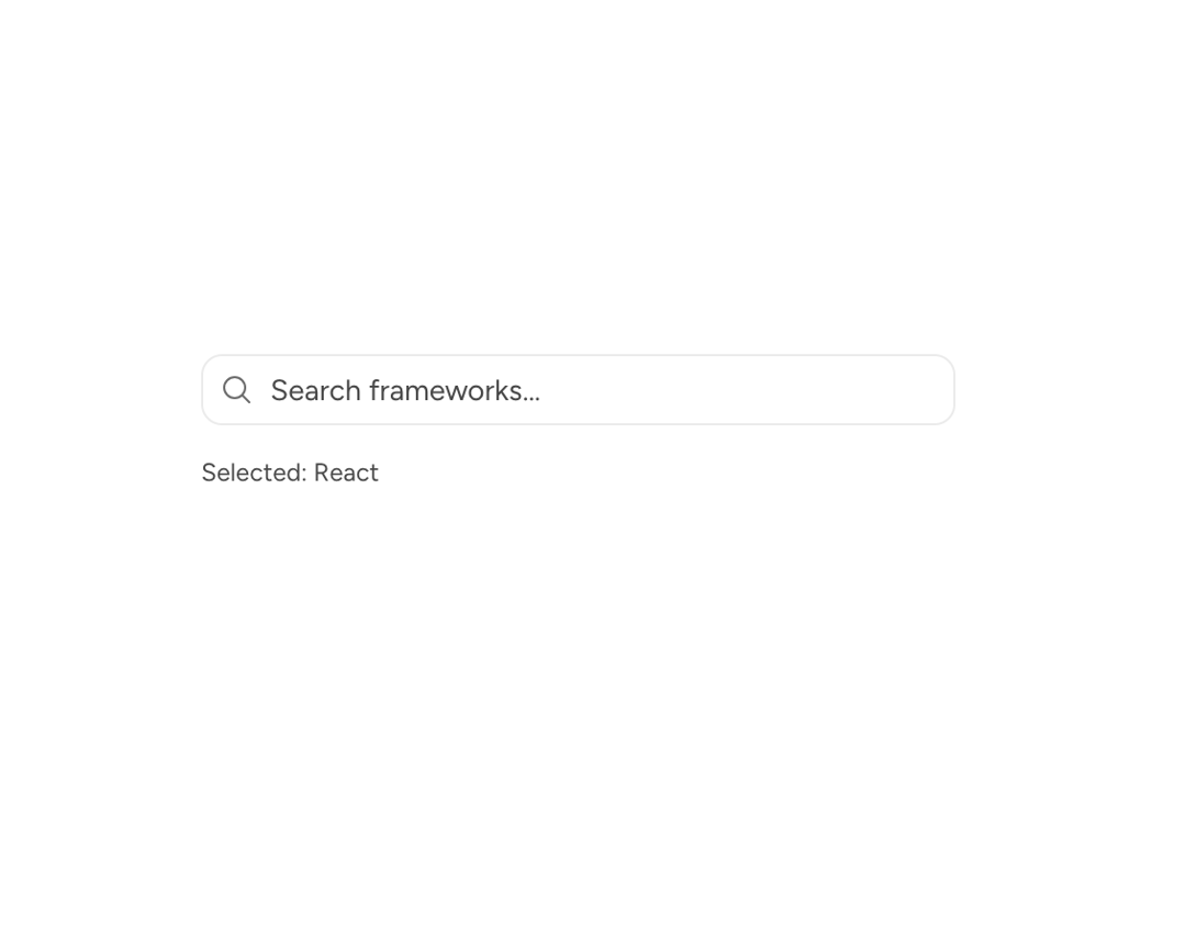
A composable Astryx combobox engine with search, keyboard navigation, custom results, and anchored dropdown positioning.
Built with React and Tailwind. Copy the prompt and paste it into Claude Code, Cursor or Lovable: your agent adds Astryx Base Typeahead to your project and fits it to your theme.
Code
How Astryx Base Typeahead is used: the demo's code. The component's own source comes with a free account.
Usage.tsx
"use client"

import { useRef, useState } from "react"
import BaseTypeahead, {
  createStaticSource,
  type SearchableItem,
} from "@/components/ui/astryx-base-typeahead"
import { Icon } from "@astryxdesign/core/Icon"
import { HStack, VStack } from "@astryxdesign/core/Layout"
import { Text } from "@astryxdesign/core/Text"
import {
  borderVars,
  colorVars,
  focusVars,
  radiusVars,
  spacingVars,
} from "@astryxdesign/core/theme/tokens.stylex"
import { MagnifyingGlassIcon } from "@heroicons/react/24/outline"

const frameworks: SearchableItem[] = [
  { id: "react", label: "React" },
  { id: "vue", label: "Vue" },
  { id: "angular", label: "Angular" },
  { id: "svelte", label: "Svelte" },
  { id: "solid", label: "SolidJS" },
  { id: "remix", label: "Remix" },
  { id: "next", label: "Next.js" },
  { id: "nuxt", label: "Nuxt" },
]

const source = createStaticSource(frameworks)

export default function BaseTypeaheadDemo() {
  const [value, setValue] = useState<SearchableItem | null>(null)
  const [isFocusVisible, setIsFocusVisible] = useState(false)
  const wrapperRef = useRef<HTMLDivElement>(null)

  return (
    <VStack
      data-astryx-theme="neutral"
      data-theme="light"
      gap={3}
      style={{ colorScheme: "light", width: "100%", maxWidth: 360 }}
    >
      <HStack
        ref={wrapperRef}
        gap={2}
        vAlign="center"
        onFocusCapture={(event) => setIsFocusVisible(event.target.matches(":focus-visible"))}
        onBlurCapture={() => setIsFocusVisible(false)}
        style={{
          backgroundColor: colorVars["--color-background-surface"],
          borderColor: colorVars["--color-border"],
          borderRadius: radiusVars["--radius-element"],
          borderStyle: "solid",
          borderWidth: borderVars["--border-width"],
          paddingBlock: spacingVars["--spacing-1-5"],
          paddingInline: spacingVars["--spacing-2"],
          outlineColor: isFocusVisible ? focusVars["--focus-outline-color"] : "transparent",
          outlineOffset: focusVars["--focus-outline-offset"],
          outlineStyle: "solid",
          outlineWidth: isFocusVisible ? focusVars["--focus-outline-width"] : 0,
        }}
      >
        <Icon icon={MagnifyingGlassIcon} size="sm" color="secondary" />
        <BaseTypeahead
          aria-label="Search frameworks"
          searchSource={source}
          value={value}
          onChange={setValue}
          anchorRef={wrapperRef}
          placeholder="Search frameworks…"
          hasEntriesOnFocus
          debounceMs={0}
        />
      </HStack>
      <Text type="supporting" color="secondary">
        {value != null ? `Selected: ${value.label}` : "No selection"}
      </Text>
    </VStack>
  )
}
Dependencies
More by Astryx
View all

Astryx Banner
56
Astryx Avatar
28
Astryx Aspect Ratio
27
Astryx Badge
25
Astryx Button Group
23
Astryx Toggle Button
16
Astryx Avatar Group
8
Astryx Button
4
More in Forms
View all

Contact Card
1.1K

Premium Auth
552

Book A Demo 1
84

Form
17
Authentication Card
50

Login 1
60

Form
16

Card Studio
46
