
About
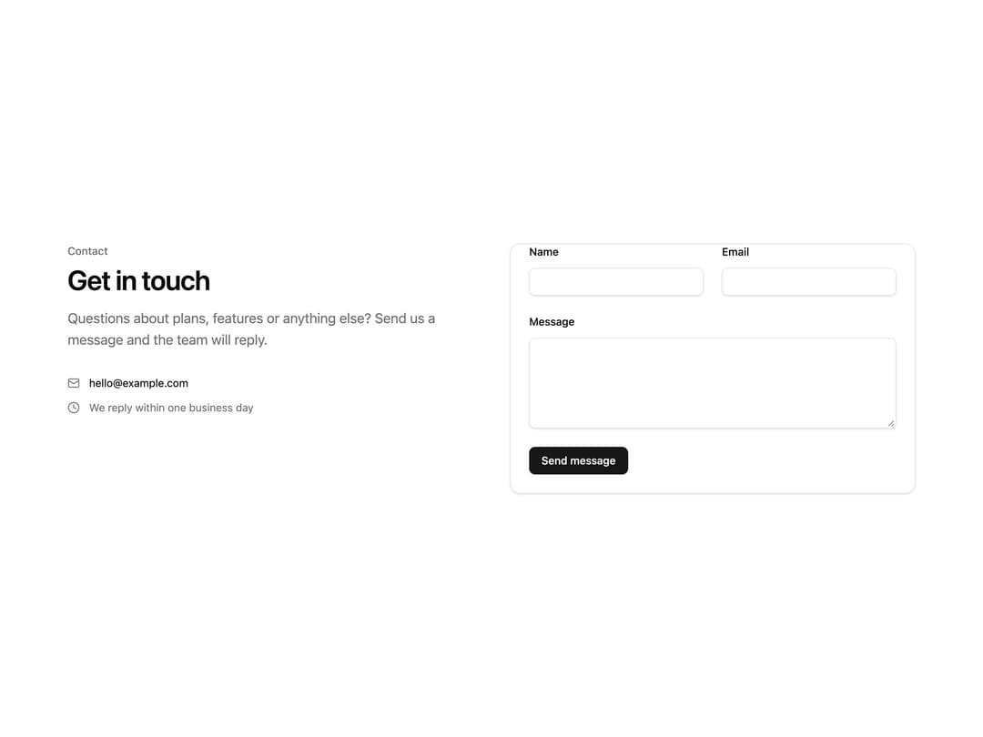
A two-column contact section with a header and contact details on one side and a validated name/email/message form in a card on the other, with built-in pending, success and error states.
Built with React and Tailwind. Copy the prompt and paste it into Claude Code, Cursor or Lovable: your agent adds Contact Form to your project and fits it to your theme.
Code
How Contact Form is used: the demo's code. The component's own source comes with a free account.
Usage.tsx
import ContactForm from "@/components/ui/contact-form";

export default function ContactFormDemo() {
  return (
    <ContactForm
      onSubmit={async () => {
        await new Promise((resolve) => setTimeout(resolve, 1200));
      }}
    />
  );
}
Dependencies
More by kevingirelli
View all
Aurora
54
Warp Gradient
48
QR Code
47
FAQ Section
46
Wave Text
37
Corner Frame
36
Animated Border
32
Spotlight
23
More in Forms
View all

Premium Auth
499

Login 2
7
Authentication Card
46

Login 1
52

Contact Card
1K
Login Form
6

Form
16

Form
136
