
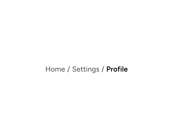
About
An individual Astryx breadcrumb item supporting links, current-page text, icons, and click handlers.
Built with React and Tailwind. Copy the prompt and paste it into Claude Code, Cursor or Lovable: your agent adds Astryx Breadcrumb Item to your project and fits it to your theme.
Code
How Astryx Breadcrumb Item is used: the demo's code. The component's own source comes with a free account.
Usage.tsx
'use client';

import {Breadcrumbs, BreadcrumbItem} from '@/components/ui/astryx-breadcrumb-item';

function BreadcrumbItemBasic() {
  return (
    <Breadcrumbs>
      <BreadcrumbItem href="/">Home</BreadcrumbItem>
      <BreadcrumbItem href="/settings">Settings</BreadcrumbItem>
      <BreadcrumbItem isCurrent>Profile</BreadcrumbItem>
    </Breadcrumbs>
  );
}

export default function BreadcrumbItemBasicDemo() {
  return (
    <div
      data-astryx-theme="neutral"
      data-theme="light"
      style={{colorScheme: 'light', display: 'contents'}}>
      <BreadcrumbItemBasic />
    </div>
  );
}
Dependencies
More by Astryx
View all

Astryx Banner
56
Astryx Avatar
28
Astryx Aspect Ratio
28
Astryx Badge
25
Astryx Button Group
23
Astryx Toggle Button
16
Astryx Avatar Group
8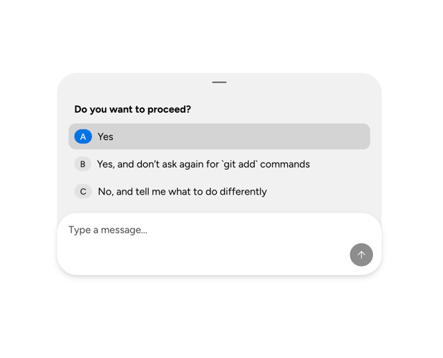
Astryx Chat Composer Drawer
6
More in Navigation
View all

Sidebar
362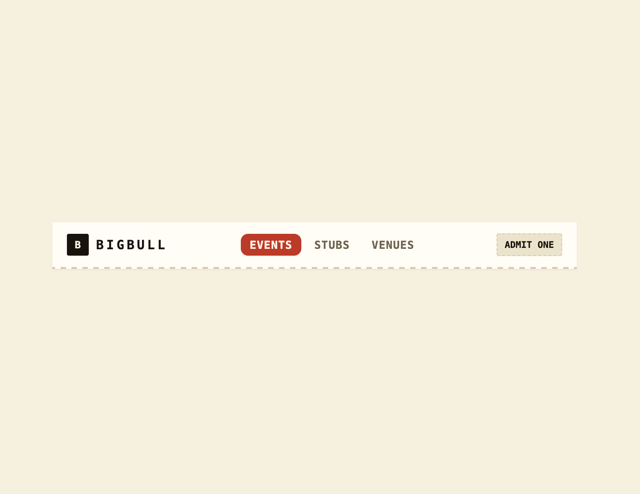
Navbar
8

Pagination
38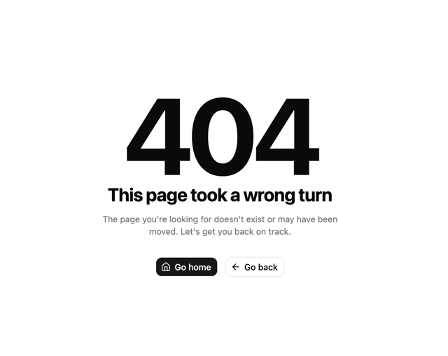

Oversized 404 Numeral
72
Footer
456

Sortable Sidebar Navigation
75
Tabs like bookmark
75
Navbar with Theme Toggle
59


