
About
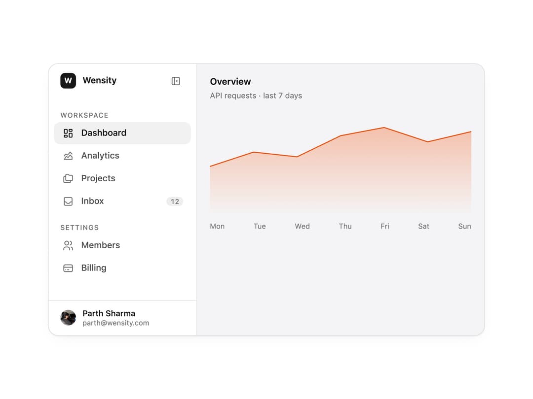
A collapsible app sidebar that shrinks to an icon rail, with sections, badges, a user footer and an animated active item. The base for dashboards and SaaS app shells.
Built with React and Tailwind. Copy the prompt and paste it into Claude Code, Cursor or Lovable: your agent adds Sidebar to your project and fits it to your theme.
Code
How Sidebar is used: the demo's code. The component's own source comes with a free account.
Usage.tsx
"use client";

import * as React from "react";
import { Sidebar, SidebarFooter, SidebarHeader, SidebarItem, SidebarNav, SidebarSection, SidebarToggle, useSidebar } from "@/components/ui/sidebar";
import { IconChartAreaLine, IconCreditCard, IconFolders, IconInbox, IconLayoutDashboard, IconUsers } from "@tabler/icons-react";

import { clsx, type ClassValue } from "clsx";
import { twMerge } from "tailwind-merge";

function cn(...inputs: ClassValue[]) {
  return twMerge(clsx(inputs));
}

const primitivePreviewCardSurfaceFrameClass = cn(
  "relative isolate overflow-hidden rounded-2xl",
  "border",
);

const primitivePreviewCardSurfaceLightClass = cn(
  "border-black/[0.08] bg-[#f4f4f5]",
  "[box-shadow:0_1px_2px_rgba(0,0,0,.06),0_8px_24px_-12px_rgba(0,0,0,.08)]",
);

const primitivePreviewCardSurfaceClass = cn(
  primitivePreviewCardSurfaceFrameClass,
  primitivePreviewCardSurfaceLightClass,
  // Full static `dark:bg-[#0a0a0b]` kept for Tailwind content scan - same as
  // PRIMITIVE_PREVIEW_CANVAS_DARK_BG / PRIMITIVE_PREVIEW_CANVAS_DARK.
  "dark:border-white/[0.06] dark:bg-[#0a0a0b] dark:[box-shadow:0_1px_2px_rgba(0,0,0,.4),0_8px_24px_-12px_rgba(0,0,0,.6)]",
);

/* ─── Shared demo bits ──────────────────────────────────────── */

const frameClass = cn(
  primitivePreviewCardSurfaceClass,
  "flex w-full overflow-hidden text-left",
);

function CountBadge({ children }: { children: React.ReactNode }) {
  return (
    <span className="rounded-md bg-[color-mix(in_srgb,var(--foreground)_7%,transparent)] px-1.5 py-0.5 text-[10.5px] font-medium leading-none text-[var(--muted-foreground)] tabular-nums">
      {children}
    </span>
  );
}

function WorkspaceMark() {
  const { collapsed } = useSidebar();
  return (
    <div className="flex min-w-0 items-center gap-2.5">
      <div className="flex size-6 shrink-0 items-center justify-center rounded-[7px] bg-[color:var(--color-brand,var(--primary))] text-[12px] font-bold text-[color:var(--color-brand-foreground,var(--primary-foreground))]">
        W
      </div>
      {!collapsed && (
        <span className="truncate text-[13.5px] font-semibold leading-none">
          Wensity
        </span>
      )}
    </div>
  );
}

function UserFooter() {
  const { collapsed } = useSidebar();
  return (
    <>
      <img
        src="https://cdn.21st.dev/assets/mirror/88/88eff84004a86794f7aa26759831cc1655b43e729e9a074e9093415d2266d1f7.webp"
        alt=""
        className="size-6 shrink-0 rounded-full object-cover"
      />
      {!collapsed && (
        <div className="min-w-0 flex-1">
          <div className="truncate text-[12.5px] font-medium leading-tight">
            Parth Sharma
          </div>
          <div className="truncate text-[11px] leading-tight text-[var(--muted-foreground)]">
            parth@wensity.com
          </div>
        </div>
      )}
    </>
  );
}

/* ─── Chart data (dashboard pane content) ───────────────────── */

const usageData = [
  { day: "Mon", requests: 2400 },
  { day: "Tue", requests: 3100 },
  { day: "Wed", requests: 2870 },
  { day: "Thu", requests: 3900 },
  { day: "Fri", requests: 4300 },
  { day: "Sat", requests: 3600 },
  { day: "Sun", requests: 4100 },
];


function UsageSparkline() {
  const max = Math.max(...usageData.map((d) => d.requests));
  const points = usageData.map((d, i) => [
    (i / (usageData.length - 1)) * 100,
    40 - (d.requests / max) * 34,
  ]);
  const line = points.map(([x, y]) => `${x},${y}`).join(" ");
  return (
    <div className="flex flex-col gap-2">
      <svg viewBox="0 0 100 40" preserveAspectRatio="none" className="h-[160px] w-full">
        <defs>
          <linearGradient id="usage-fill" x1="0" x2="0" y1="0" y2="1">
            <stop offset="0%" stopColor="var(--primitive-chart-1, var(--chart-1))" stopOpacity="0.3" />
            <stop offset="100%" stopColor="var(--primitive-chart-1, var(--chart-1))" stopOpacity="0" />
          </linearGradient>
        </defs>
        <polygon points={`0,40 ${line} 100,40`} fill="url(#usage-fill)" />
        <polyline
          points={line}
          fill="none"
          stroke="var(--primitive-chart-1, var(--chart-1))"
          strokeWidth="1.5"
          vectorEffect="non-scaling-stroke"
        />
      </svg>
      <div className="flex justify-between text-[11px] text-[var(--muted-foreground)]">
        {usageData.map((d) => (
          <span key={d.day}>{d.day}</span>
        ))}
      </div>
    </div>
  );
}

function DashboardPane() {
  return (
    <div className="flex min-w-0 flex-1 flex-col gap-4 p-5">
      <div>
        <div className="text-[14px] font-semibold leading-none">Overview</div>
        <div className="mt-1.5 text-[12px] text-[var(--muted-foreground)]">
          API requests · last 7 days
        </div>
      </div>
      <UsageSparkline />
    </div>
  );
}

/* ─── Main preview - collapsible sidebar + dashboard ────────── */

export function SidebarPreview() {
  const [active, setActive] = React.useState("dashboard");

  const items = [
    { id: "dashboard", label: "Dashboard", icon: <IconLayoutDashboard className="size-[18px]" stroke={1.75} /> },
    { id: "analytics", label: "Analytics", icon: <IconChartAreaLine className="size-[18px]" stroke={1.75} /> },
    { id: "projects", label: "Projects", icon: <IconFolders className="size-[18px]" stroke={1.75} /> },
    { id: "inbox", label: "Inbox", icon: <IconInbox className="size-[18px]" stroke={1.75} />, badge: "12" },
  ];

  return (
    <div className={cn(frameClass, "h-[420px] max-w-2xl")}>
      <Sidebar variant="collapsible" width={228} aria-label="Main navigation">
        <SidebarHeader>
          <WorkspaceMark />
          <SidebarToggle className="ml-auto" />
        </SidebarHeader>
        <SidebarNav>
          <SidebarSection label="Workspace">
            {items.map((item) => (
              <SidebarItem
                key={item.id}
                icon={item.icon}
                active={active === item.id}
                badge={item.badge ? <CountBadge>{item.badge}</CountBadge> : undefined}
                onClick={() => setActive(item.id)}
              >
                {item.label}
              </SidebarItem>
            ))}
          </SidebarSection>
          <SidebarSection label="Settings">
            <SidebarItem
              icon={<IconUsers className="size-[18px]" stroke={1.75} />}
              active={active === "members"}
              onClick={() => setActive("members")}
            >
              Members
            </SidebarItem>
            <SidebarItem
              icon={<IconCreditCard className="size-[18px]" stroke={1.75} />}
              active={active === "billing"}
              onClick={() => setActive("billing")}
            >
              Billing
            </SidebarItem>
          </SidebarSection>
        </SidebarNav>
        <SidebarFooter>
          <UserFooter />
        </SidebarFooter>
      </Sidebar>
      <DashboardPane />
    </div>
  );
}

/* ─── Collapsible ───────────────────────────────────────────── */

/* ─── Icon Rail ─────────────────────────────────────────────── */

/* ─── Nested ────────────────────────────────────────────────── */

/* ─── Floating ──────────────────────────────────────────────── */

/* ─── Resizable ─────────────────────────────────────────────── */

export default function Demo() {
  return <SidebarPreview />;
}
Dependencies
More by Wensity Labs
View all

Calendar
216
Button
99
Color Picker
78
Image Comparison Slider
71
AI Prompt Input
59
Text Morphing
46
Carousel
42
GitHub Activity Grid
40
More in Navigation
View all
Navbar with Theme Toggle
47
Stacked Circular Footer
436

Breadrcrumb
8

Footer
557
Oversized 404 Numeral
63

Breadcrumb
12

Tabs
17
Progress Bar Stepper
48

