
About
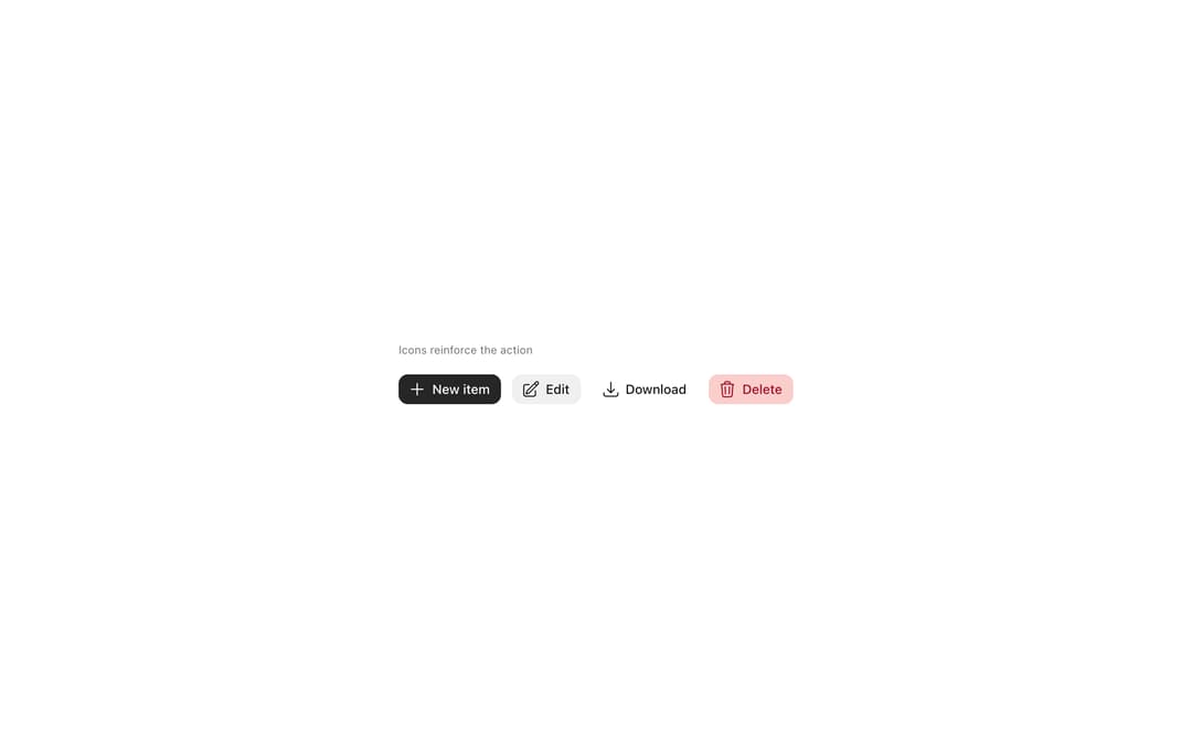
Button triggers actions with a clear visual hierarchy, from Meta's Astryx design system. Variants: primary, secondary, ghost, destructive; sizes sm/md/lg; disabled and loading states; leading icon and trailing endContent slots for badges or counts.
Built with React and Tailwind. Copy the prompt and paste it into Claude Code, Cursor or Lovable: your agent adds Astryx Button to your project and fits it to your theme.
Code
How Astryx Button is used: the demo's code. The component's own source comes with a free account.
Usage.tsx
'use client';

import Button from '@/components/ui/astryx-button';
import {Theme} from '@astryxdesign/core/theme';
import {neutralTheme} from '@astryxdesign/theme-neutral/built';
import {Icon} from '@astryxdesign/core/Icon';
import {Stack} from '@astryxdesign/core/Layout';
import {Text} from '@astryxdesign/core/Text';
import {
  ArrowDownTrayIcon,
  PencilSquareIcon,
  PlusIcon,
  TrashIcon,
} from '@heroicons/react/24/outline';

export default function ButtonWithIcon() {
  return (
    <Theme theme={neutralTheme}>
      <div
        style={{
          minHeight: '100dvh',
          display: 'grid',
          placeItems: 'center',
          padding: 24,
        }}>
        <Stack direction="vertical" gap={4}>
          <Text type="supporting" color="secondary">
            Icons reinforce the action
          </Text>
          <Stack direction="horizontal" gap={3} vAlign="center">
            <Button
              label="New item"
              variant="primary"
              icon={<Icon icon={PlusIcon} />}
            />
            <Button
              label="Edit"
              variant="secondary"
              icon={<Icon icon={PencilSquareIcon} />}
            />
            <Button
              label="Download"
              variant="ghost"
              icon={<Icon icon={ArrowDownTrayIcon} />}
            />
            <Button
              label="Delete"
              variant="destructive"
              icon={<Icon icon={TrashIcon} />}
            />
          </Stack>
        </Stack>
      </div>
    </Theme>
  );
}
Dependencies
More by Meta
View all

Astryx Banner
54
Astryx Avatar
26
Astryx Aspect Ratio
26
Astryx Button Group
22
Astryx Badge
22
Astryx Toggle Button
15
Astryx Avatar Group
7
Astryx Blockquote
3
More in Buttons
View all

Button
4
Button
47

App Store Button
452

Eclipse Button
39
Texture Button
92
Split Button
14
Native Button
12
Button Save
46


