
About
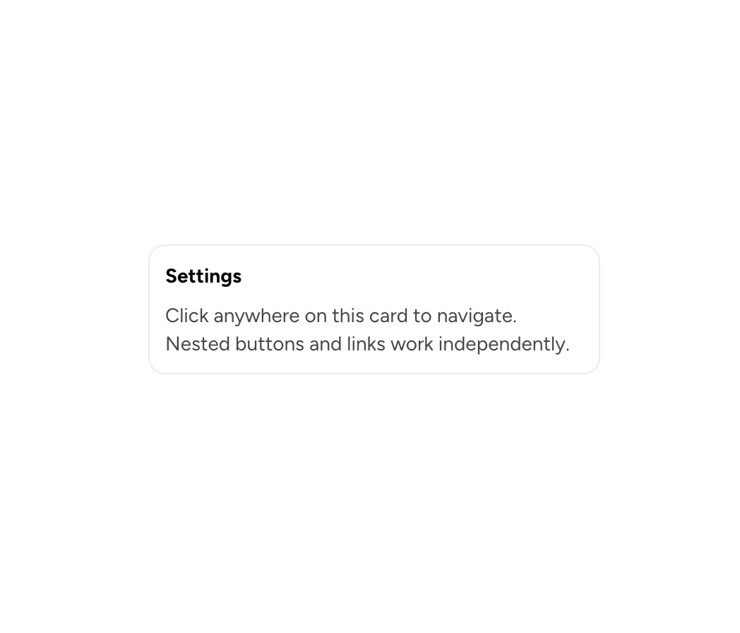
An interactive card for navigation or action targets. Nested interactive elements work independently.
Built with React and Tailwind. Copy the prompt and paste it into Claude Code, Cursor or Lovable: your agent adds Astryx Clickable Card to your project and fits it to your theme.
Code
How Astryx Clickable Card is used: the demo's code. The component's own source comes with a free account.
Usage.tsx
// Copyright (c) Meta Platforms, Inc. and affiliates.

'use client';

import {ClickableCard} from '@/components/ui/astryx-clickable-card';
import {Stack} from '@astryxdesign/core/Layout';
import {Text, Heading} from '@astryxdesign/core/Text';

function ClickableCardShowcase() {
  return (
    <ClickableCard label="Settings" href="#" width={320}>
      <Stack direction="vertical" gap={2}>
        <Heading level={4}>Settings</Heading>
        <Text type="body" color="secondary">
          Click anywhere on this card to navigate. Nested buttons and links work
          independently.
        </Text>
      </Stack>
    </ClickableCard>
  );
}

export default function ClickableCardShowcaseDemo() {
  return (
    <div
      data-astryx-theme="neutral"
      data-theme="light"
      style={{colorScheme: 'light', display: 'contents'}}>
      <ClickableCardShowcase />
    </div>
  );
}
Dependencies
More by Astryx
View all

Astryx Banner
56
Astryx Avatar
28
Astryx Aspect Ratio
27
Astryx Badge
25
Astryx Button Group
23
Astryx Toggle Button
16
Astryx Avatar Group
8
Astryx Button
4
More in Cards
View all

Course Design Cards
1.2K
Stats cards with links
131

Statistics Card 7
315

Interactive Tech Stack Bento Grid with Hover Effects
473
Card
71
Statistics Card 2
294
The Item one
3

Card Studio
8
