
About
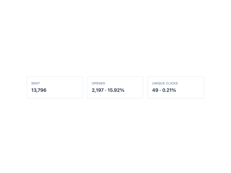
A bounded surface container with header, title, description, content and footer sections for grouping related content like stats, summaries, and previews.
Built with React and Tailwind. Copy the prompt and paste it into Claude Code, Cursor or Lovable: your agent adds Card to your project and fits it to your theme.
Code
How Card is used: the demo's code. The component's own source comes with a free account.
Usage.tsx
import Card, { CardContent } from "@/components/ui/card";

const stats = [
  { label: "Sent", value: "13,796" },
  { label: "Opened", value: "2,197 · 15.92%" },
  { label: "Unique Clicks", value: "49 · 0.21%" },
];

export default function CardDemo() {
  return (
    <div className="grid w-full max-w-2xl gap-4 sm:grid-cols-3">
      {stats.map((stat) => (
        <Card key={stat.label}>
          <CardContent className="p-4">
            <p className="text-xs font-medium uppercase tracking-wide text-ink-light">
              {stat.label}
            </p>
            <p className="mt-1 text-lg font-semibold text-ink-dark">
              {stat.value}
            </p>
          </CardContent>
        </Card>
      ))}
    </div>
  );
}
More by Mahmoud Ilyan
View all
Steps
5
Radio Card
1
Switch
1
Textarea
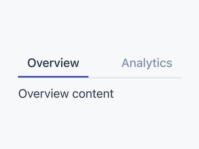
Tabs

Progress
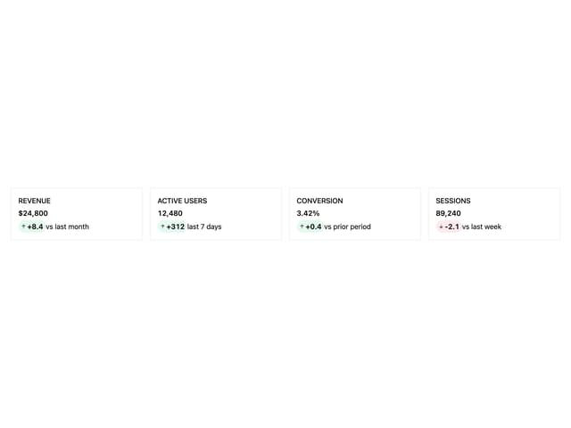
KPI Card
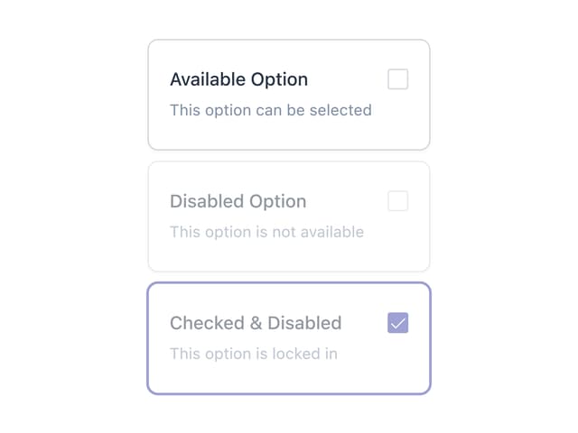
Checkbox Card
More in Cards
View all

Course Design Cards
1.3K

Statistics Card 7
327
Statistics Card 2
305

Interactive Tech Stack Bento Grid with Hover Effects
625

Card Studio
5
The Item one
4

Weather Card
65

Card
9