
About
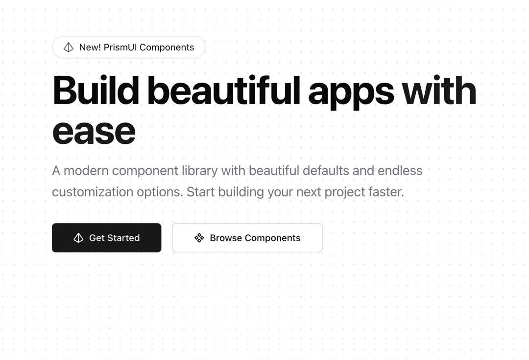
Hero Section with Appear Animation and Hero Badge
Built with React and Tailwind. Copy the prompt and paste it into Claude Code, Cursor or Lovable: your agent adds Hero to your project and fits it to your theme.
Code
How Hero is used: the demo's code. The component's own source comes with a free account.
Usage.tsx
"use client";

import { Hero } from "@/components/blocks/hero";
import { Icons } from "@/components/ui/icons";
import { ProjectStatusCard } from "@/components/ui/expandable-card";

function HeroBasic() {
  return (
    <Hero
      pill={{
        text: "New! PrismUI Components",
        href: "/docs",
        icon: <Icons.logo className="h-4 w-4" />,
        variant: "default",
        size: "md",
      }}
      content={{
        title: "Build beautiful apps",
        titleHighlight: "with ease",
        description:
          "A modern component library with beautiful defaults and endless customization options. Start building your next project faster.",
        primaryAction: {
          href: "/docs/getting-started",
          text: "Get Started",
          icon: <Icons.logo className="h-4 w-4" />,
        },
        secondaryAction: {
          href: "/components",
          text: "Browse Components",
          icon: <Icons.component className="h-4 w-4" />,
        },
      }}
    />
  );
}

function PreviewCards() {
  return (
    <div className="grid gap-4 md:grid-cols-2">
      <ProjectStatusCard
        title="Marketing Website"
        progress={75}
        dueDate="Feb 15, 2024"
        contributors={[{ name: "Alex" }, { name: "Sarah" }, { name: "Mike" }]}
        tasks={[
          { title: "Homepage Design", completed: true },
          { title: "Blog Integration", completed: true },
          { title: "SEO Optimization", completed: false },
        ]}
        githubStars={124}
        openIssues={3}
      />
      <ProjectStatusCard
        title="Mobile App"
        progress={40}
        dueDate="Apr 1, 2024"
        contributors={[{ name: "Chris" }, { name: "Emma" }, { name: "Tom" }]}
        tasks={[
          { title: "UI Design", completed: true },
          { title: "Core Features", completed: false },
          { title: "Testing", completed: false },
        ]}
        githubStars={89}
        openIssues={5}
      />
    </div>
  );
}

export default { HeroBasic };
Dependencies
More by Prism UI
View all
Display Cards
5.6K
Pricing
4.1K
Expandable Card
340
Floating Action Panel
206
Hero Badge
165
useExpandable
140
Icons
134
Logo Carousel
133
More in Heroes
View all

Responsive Hero Banner
2.2K

SaaS Template
2.7K

Hero
1.3K
Centered Hero with Image Fan
1.1K
Hero with group of images, text and two buttons
440
Editorial Collage Hero
501

Aero Hero-3
614

Hero 03
373
