
About
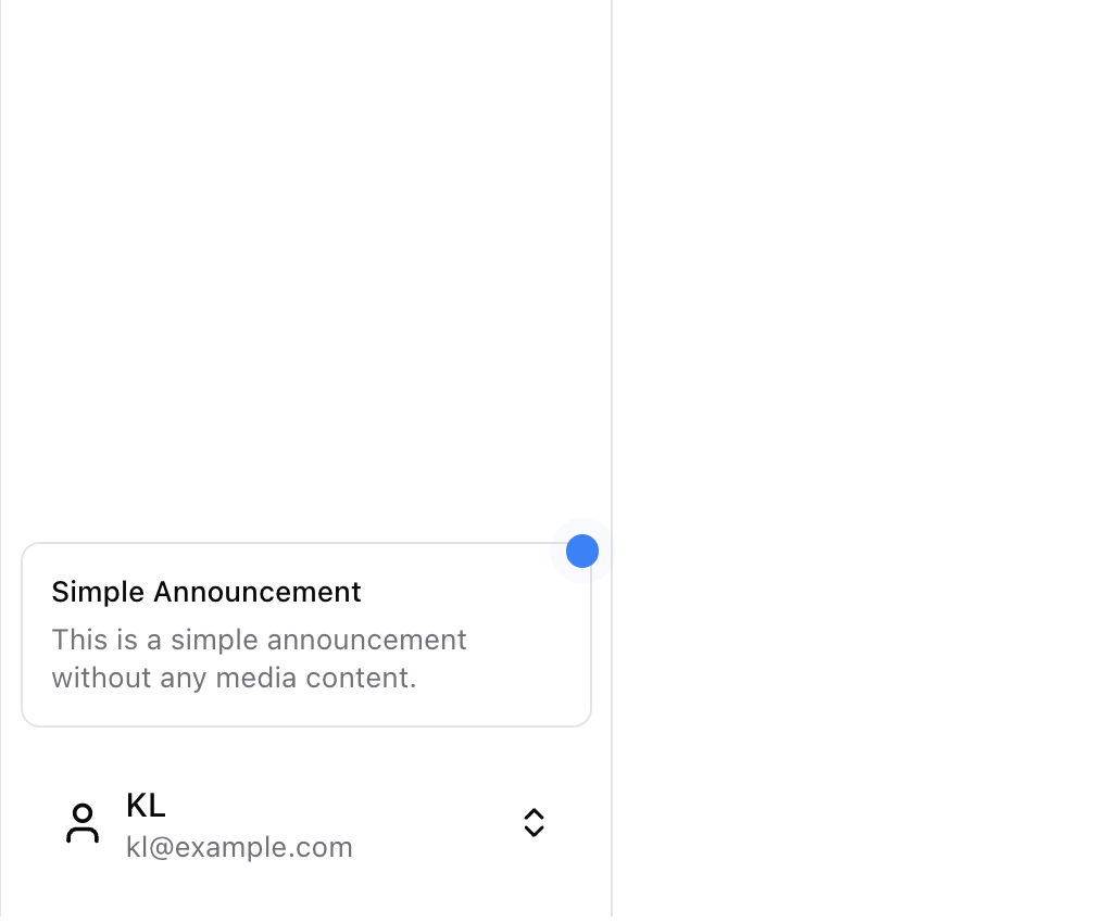
Information cards can serve as callout cards, banners, toast notifications, or announcement boxes to deliver news, updates, and alerts to your users.
Built with React and Tailwind. Copy the prompt and paste it into Claude Code, Cursor or Lovable: your agent adds Information Card to your project and fits it to your theme.
Code
How Information Card is used: the demo's code. The component's own source comes with a free account.
Usage.tsx
import {
  InfoCard,
  InfoCardContent,
  InfoCardTitle,
  InfoCardDescription,
  InfoCardFooter,
  InfoCardDismiss,
  InfoCardAction,
} from "@/components/ui/info-card"
import {
  Sidebar,
  SidebarProvider,
  SidebarContent,
  SidebarGroup,
  SidebarGroupLabel,
  SidebarGroupContent,
  SidebarMenu,
  SidebarMenuItem,
  SidebarMenuButton,
  SidebarFooter,
  SidebarTrigger,
} from "@/components/blocks/sidebar"
import {
  ExternalLink,
  User,
  ChevronsUpDown,
  Calendar,
  Home,
  Inbox,
  Search,
  Settings,
} from "lucide-react"
import Link from "next/link"

const items = [
  {
    title: "Home",
    url: "#",
    icon: Home,
  },
  {
    title: "Inbox",
    url: "#",
    icon: Inbox,
  },
  {
    title: "Calendar",
    url: "#",
    icon: Calendar,
  },
  {
    title: "Search",
    url: "#",
    icon: Search,
  },
  {
    title: "Settings",
    url: "#",
    icon: Settings,
  },
]

export function InfoCardDemo() {
  return (
    <SidebarProvider>
      <Sidebar>
        <SidebarContent>
          <SidebarGroup>
            <SidebarGroupLabel>Application</SidebarGroupLabel>
            <SidebarGroupContent>
              <SidebarMenu>
                {items.map((item) => (
                  <SidebarMenuItem key={item.title}>
                    <SidebarMenuButton asChild>
                      <a href={item.url}>
                        <item.icon />
                        <span>{item.title}</span>
                      </a>
                    </SidebarMenuButton>
                  </SidebarMenuItem>
                ))}
              </SidebarMenu>
            </SidebarGroupContent>
          </SidebarGroup>
        </SidebarContent>
        <SidebarFooter>
          <InfoCard>
            <InfoCardContent>
              <div className="relative">
                <div className="absolute -top-4 -right-4 w-[14px] h-[14px] bg-blue-500 rounded-full animate-ping" />
                <div className="absolute -top-4 -right-4 w-[14px] h-[14px] bg-blue-500 rounded-full" />
                <InfoCardTitle>Simple Announcement</InfoCardTitle>
                <InfoCardDescription>
                  This is a simple announcement without any media content.
                </InfoCardDescription>
                <InfoCardFooter>
                  <InfoCardDismiss>Dismiss</InfoCardDismiss>
                  <InfoCardAction>
                    <Link
                      href="#"
                      className="flex flex-row items-center gap-1 underline"
                    >
                      Read more <ExternalLink size={12} />
                    </Link>
                  </InfoCardAction>
                </InfoCardFooter>
              </div>
            </InfoCardContent>
          </InfoCard>
          <SidebarGroup>
            <SidebarMenuButton className="w-full justify-between gap-3 h-12">
              <div className="flex items-center gap-2">
                <User className="h-5 w-5 rounded-md" />
                <div className="flex flex-col items-start">
                  <span className="text-sm font-medium">KL</span>
                  <span className="text-xs text-muted-foreground">
                    kl@example.com
                  </span>
                </div>
              </div>
              <ChevronsUpDown className="h-5 w-5 rounded-md" />
            </SidebarMenuButton>
          </SidebarGroup>
        </SidebarFooter>
      </Sidebar>
      <div className="px-4 py-2">
        <SidebarTrigger />
      </div>
    </SidebarProvider>
  )
}
Dependencies
More by KarrixLee
View all
Unsave Popup
59
More in Cards
View all

Course Design Cards
1.3K

Card Studio
12

Statistics Card 2
305

Interactive Tech Stack Bento Grid with Hover Effects
620

Card
19
Statistics Card 7
327
Card
61
The Item one
4