
About
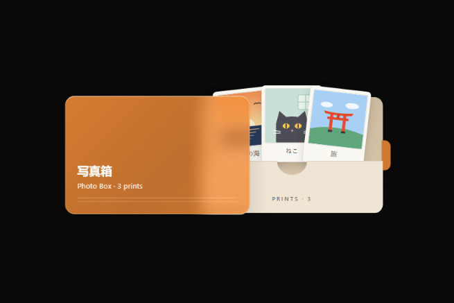
An interactive keepsake photo box with a frosted translucent sleeve, sliding Polaroid print tray, hover lift physics, and an accessible full-bleed print viewer modal.
Built with React and Tailwind. Copy the prompt and paste it into Claude Code, Cursor or Lovable: your agent adds PhotoBox to your project and fits it to your theme.
Code
How PhotoBox is used: the demo's code. The component's own source comes with a free account.
Usage.tsx
"use client";

import React from "react";
import { PhotoBox } from "@/components/ui/photo-box";

const settings = {
  title: "写真箱",
  subtitle: "Photo Box",
  defaultOpen: false,
  accentColor: "#F28C38",
  theme: "auto",
};

const VALID_THEMES = ["auto", "light", "dark"] as const;
type ThemeOption = (typeof VALID_THEMES)[number];

export default function PhotoBoxDemo(props: Partial<typeof settings>) {
  const config = {
    ...settings,
    ...props,
  };

  const theme: ThemeOption = VALID_THEMES.includes(config.theme as ThemeOption)
    ? (config.theme as ThemeOption)
    : "auto";

  const accentColor =
    typeof config.accentColor === "string" &&
    /^#([0-9a-fA-F]{3}|[0-9a-fA-F]{6})$/.test(config.accentColor.trim())
      ? config.accentColor.trim()
      : "#F28C38";

  const canvasBg =
    theme === "light"
      ? "bg-[#F4F4F3]"
      : theme === "dark"
      ? "bg-[#141413]"
      : "bg-[#F4F4F3] dark:bg-[#141413]";

  return (
    <div
      className={`flex min-h-[460px] w-full items-center justify-center p-8 transition-colors duration-300 ${canvasBg}`}
    >
      <PhotoBox
        title={typeof config.title === "string" ? config.title : "写真箱"}
        subtitle={
          typeof config.subtitle === "string" ? config.subtitle : "Photo Box"
        }
        defaultOpen={Boolean(config.defaultOpen)}
        accentColor={accentColor}
        theme={theme}
      />
    </div>
  );
}
Dependencies
More by Syed
View all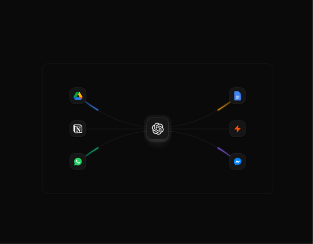

Animated Beam Integration
135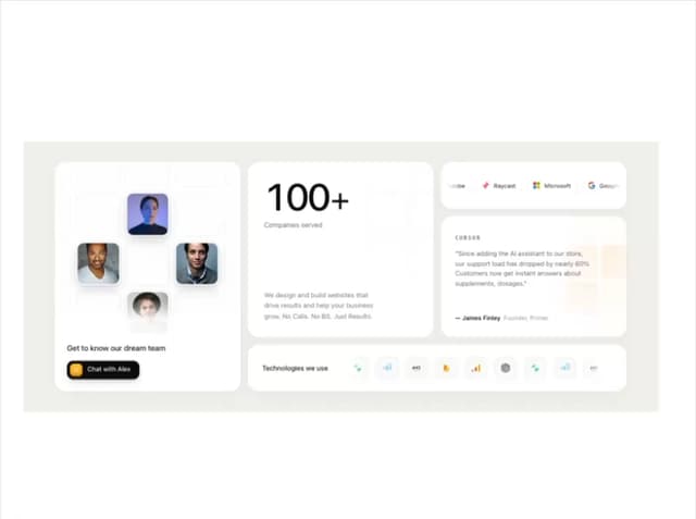
Agency Bento Grid
87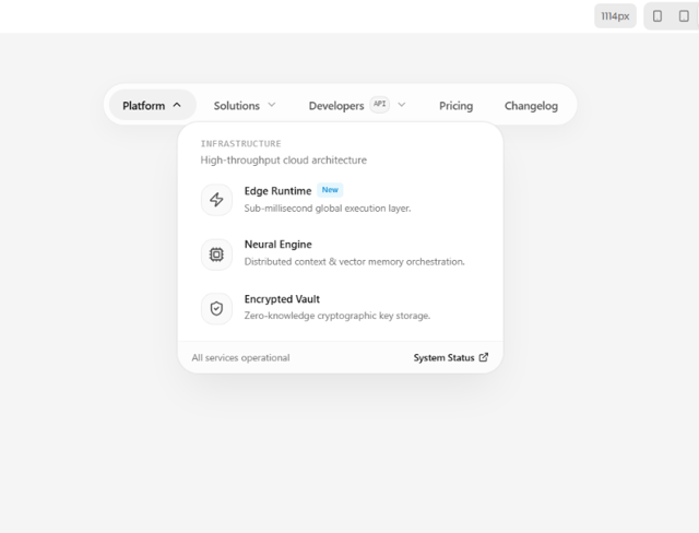
Morphing Island Navbar
75
Animated Tree View
58
Interactive Eye Tracker
56
Rolling Counter
55
Grid Testimonials Marquee
42
Tier Badge
41
More in Galleries
View all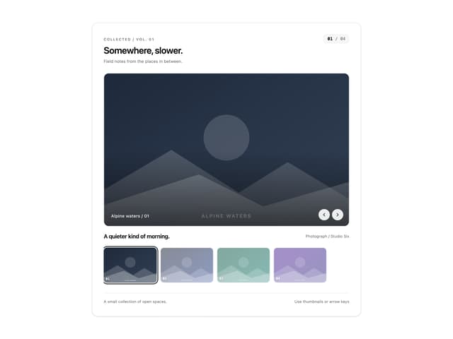
Thumbnail image viewer
99

Animated Gallery
1.5K

Image Gallery
130
Editorial Collage Hero
499

Elastic Gallery
1.1K

Astryx Aspect Ratio
4
Layout Grid
906

File Upload
20

