
About
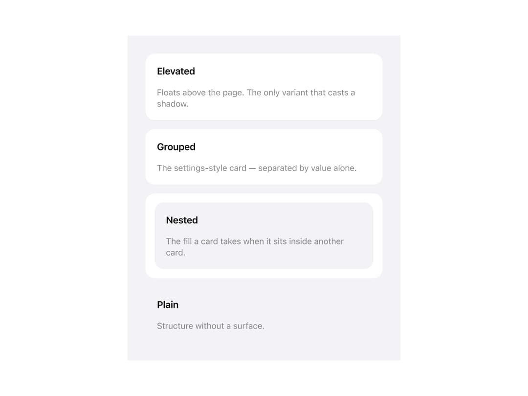
A surface container with header, title, description, body and footer slots for grouping related content, supporting elevated, grouped, nested and plain variants plus an optional interactive button mode.
Built with React and Tailwind. Copy the prompt and paste it into Claude Code, Cursor or Lovable: your agent adds Adaptive Card to your project and fits it to your theme.
Code
How Adaptive Card is used: the demo's code. The component's own source comes with a free account.
Usage.tsx
import Card, { CardTitle, CardDescription } from "@/components/ui/card";

export default function CardVariantsDemo() {
  return (
    <div className="may-root" style={{ padding: 32 }}>
      <div
        style={{
          display: "flex",
          flexDirection: "column",
          gap: "var(--may-space-4)",
          maxWidth: 420,
        }}
      >
        <Card variant="elevated">
          <CardTitle>Elevated</CardTitle>
          <CardDescription>
            Floats above the page. The only variant that casts a shadow.
          </CardDescription>
        </Card>
        <Card variant="grouped">
          <CardTitle>Grouped</CardTitle>
          <CardDescription>
            The settings-style card — separated by value alone.
          </CardDescription>
        </Card>
        <Card variant="grouped" padding="sm">
          <Card variant="nested">
            <CardTitle>Nested</CardTitle>
            <CardDescription>
              The fill a card takes when it sits inside another card.
            </CardDescription>
          </Card>
        </Card>
        <Card variant="plain">
          <CardTitle>Plain</CardTitle>
          <CardDescription>Structure without a surface.</CardDescription>
        </Card>
      </div>
    </div>
  );
}
More by adit-firdaus
View all
Box
Pagination
More in Cards
View all

Course Design Cards
1.2K

Interactive Tech Stack Bento Grid with Hover Effects
297

Card Studio
11
Stats cards with links
40

Statistics Card 2
281
Statistics Card 10
275
Card
57
The Item one
3
