
About
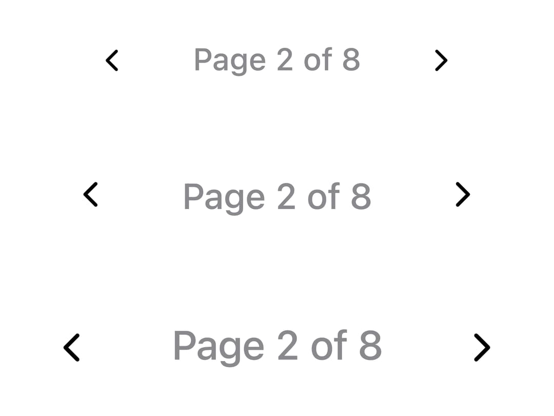
A numeric page navigator with an animated sliding highlight on the current page, that collapses into a compact "Page X of Y" readout when there isn't room for the full row of page keys.
Built with React and Tailwind. Copy the prompt and paste it into Claude Code, Cursor or Lovable: your agent adds Pagination to your project and fits it to your theme.
Code
How Pagination is used: the demo's code. The component's own source comes with a free account.
Usage.tsx
import * as React from "react";
import Pagination from "@/components/ui/pagination";

function SizeRow({ size }: { size: "sm" | "md" | "lg" }) {
  const [page, setPage] = React.useState(2);
  return (
    <Pagination size={size} page={page} pageCount={8} onPageChange={setPage} />
  );
}

export default function PaginationSizesDemo() {
  return (
    <div className="flex w-full flex-col items-center justify-center gap-4 p-10">
      <SizeRow size="sm" />
      <SizeRow size="md" />
      <SizeRow size="lg" />
    </div>
  );
}
Dependencies
More by adit-firdaus
View all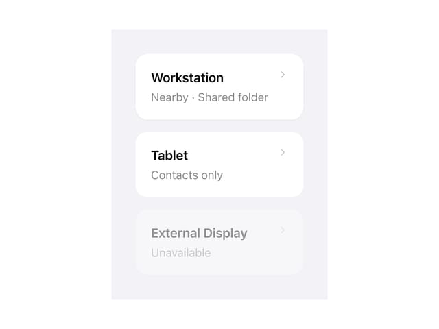
Adaptive Card

Box
More in Navigation
View all

Sidebar
311
Stacked Circular Footer
436

Breadrcrumb
8
Navbar with Theme Toggle
47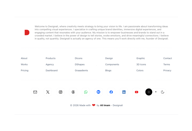

Footer
557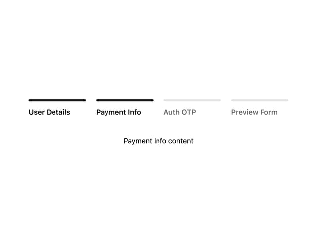

Progress Bar Stepper
48

Breadcrumb
12
Tabs
17
