
About
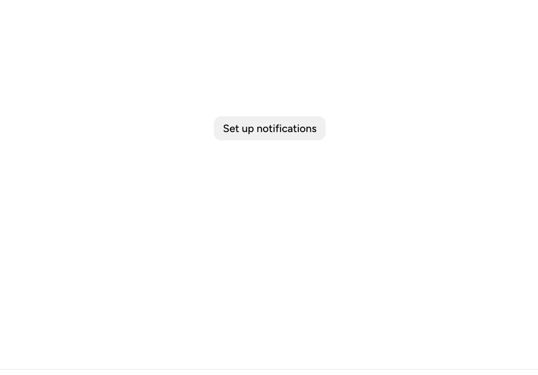
A multi-step Astryx bottom-sheet flow demonstrating in-place transitions between notification setup steps.
Built with React and Tailwind. Copy the prompt and paste it into Claude Code, Cursor or Lovable: your agent adds Astryx Bottom Sheet Switcher to your project and fits it to your theme.
Code
How Astryx Bottom Sheet Switcher is used: the demo's code. The component's own source comes with a free account.
Usage.tsx
'use client';

import {useState} from 'react';
import {BottomSheet} from '@/components/ui/astryx-bottom-sheet-switcher';
import {Button} from '@astryxdesign/core/Button';
import {CheckboxList, CheckboxListItem} from '@astryxdesign/core/CheckboxList';
import {Divider} from '@astryxdesign/core/Divider';
import {Heading} from '@astryxdesign/core/Heading';
import {Section} from '@astryxdesign/core/Section';
import {HStack, VStack} from '@astryxdesign/core/Stack';
import {Text} from '@astryxdesign/core/Text';
import {RadioList, RadioListItem} from '@astryxdesign/core/RadioList';

type NotificationSheetHeight = 'hug' | 'capped';

/**
 * Each step is a standalone sheet. Closing the open step and opening the
 * next one in the same update (one `step` state value) replaces it in place.
 */
interface StepSheetProps {
  isOpen: boolean;
  onOpenChange: (isOpen: boolean) => void;
  hasScrim: boolean;
  height: NotificationSheetHeight;
}

interface NotificationOverviewSheetProps extends StepSheetProps {
  onCancel: () => void;
  onContinue: () => void;
}

function NotificationOverviewSheet({
  isOpen,
  onOpenChange,
  hasScrim,
  height,
  onCancel,
  onContinue,
}: NotificationOverviewSheetProps) {
  return (
    <BottomSheet
      isOpen={isOpen}
      onOpenChange={onOpenChange}
      hasScrim={hasScrim}
      label="Set up notifications"
      height={height}>
      <Section padding={4}>
        <VStack gap={4}>
          <VStack gap={1}>
            <Heading level={3}>Set up notifications</Heading>
            <Text type="supporting" color="secondary">
              Step 1 of 3
            </Text>
          </VStack>
          <Divider />
          <Text type="supporting" color="secondary">
            Stay informed about activity that matters without checking back
            throughout the day.
          </Text>
          <VStack gap={3}>
            <VStack gap={1}>
              <Text type="label">Important activity</Text>
              <Text type="supporting" color="secondary">
                Know when someone mentions you or needs your attention.
              </Text>
            </VStack>
            <VStack gap={1}>
              <Text type="label">Timely reminders</Text>
              <Text type="supporting" color="secondary">
                Get a reminder before work reaches its due date.
              </Text>
            </VStack>
            <VStack gap={1}>
              <Text type="label">Useful summaries</Text>
              <Text type="supporting" color="secondary">
                Catch up on anything you may have missed.
              </Text>
            </VStack>
          </VStack>
          <HStack gap={2} hAlign="end">
            <Button label="Cancel" variant="secondary" onClick={onCancel} />
            <Button label="Continue" onClick={onContinue} />
          </HStack>
        </VStack>
      </Section>
    </BottomSheet>
  );
}

interface NotificationFrequencySheetProps extends StepSheetProps {
  onBack: () => void;
  onContinue: () => void;
}

function NotificationFrequencySheet({
  isOpen,
  onOpenChange,
  hasScrim,
  height,
  onBack,
  onContinue,
}: NotificationFrequencySheetProps) {
  const [frequency, setFrequency] = useState('daily');

  return (
    <BottomSheet
      isOpen={isOpen}
      onOpenChange={onOpenChange}
      hasScrim={hasScrim}
      label="Notification frequency"
      height={height}>
      <Section padding={4}>
        <VStack gap={4}>
          <VStack gap={1}>
            <Heading level={3}>How often?</Heading>
            <Text type="supporting" color="secondary">
              Step 2 of 3
            </Text>
          </VStack>
          <Divider />
          <RadioList
            label="Notification frequency"
            isLabelHidden
            value={frequency}
            onChange={setFrequency}>
            <RadioListItem label="Immediately" value="immediately" />
            <RadioListItem label="Daily" value="daily" />
            <RadioListItem label="Weekly" value="weekly" />
          </RadioList>
          <HStack gap={2} hAlign="end">
            <Button label="Back" variant="secondary" onClick={onBack} />
            <Button label="Continue" onClick={onContinue} />
          </HStack>
        </VStack>
      </Section>
    </BottomSheet>
  );
}

interface NotificationChannelsSheetProps extends StepSheetProps {
  onBack: () => void;
  onFinish: () => void;
}

function NotificationChannelsSheet({
  isOpen,
  onOpenChange,
  hasScrim,
  height,
  onBack,
  onFinish,
}: NotificationChannelsSheetProps) {
  const [email, setEmail] = useState(true);
  const [pushNotifications, setPushNotifications] = useState(true);
  const [textMessages, setTextMessages] = useState(false);

  return (
    <BottomSheet
      isOpen={isOpen}
      onOpenChange={onOpenChange}
      hasScrim={hasScrim}
      label="Notification channels"
      height={height}>
      <Section padding={4}>
        <VStack gap={4}>
          <VStack gap={1}>
            <Heading level={3}>Where should we notify you?</Heading>
            <Text type="supporting" color="secondary">
              Step 3 of 3
            </Text>
          </VStack>
          <Divider />
          <Text type="supporting" color="secondary">
            Choose any combination. You can change these preferences later.
          </Text>
          <CheckboxList label="Notification channels" isLabelHidden>
            <CheckboxListItem
              label="Email"
              isChecked={email}
              onCheck={setEmail}
            />
            <CheckboxListItem
              label="Push notifications"
              isChecked={pushNotifications}
              onCheck={setPushNotifications}
            />
            <CheckboxListItem
              label="Text messages"
              isChecked={textMessages}
              onCheck={setTextMessages}
            />
          </CheckboxList>
          <HStack gap={2} hAlign="end">
            <Button label="Back" variant="secondary" onClick={onBack} />
            <Button label="Finish" onClick={onFinish} />
          </HStack>
        </VStack>
      </Section>
    </BottomSheet>
  );
}

type Step = 'overview' | 'frequency' | 'channels' | null;

interface MultiStepExampleProps {
  height: NotificationSheetHeight;
  hasScrim?: boolean;
}

function MultiStepExample({height, hasScrim = true}: MultiStepExampleProps) {
  // One state value names the open step. Moving on closes one sheet and
  // opens the next in the same update, which replaces it in place.
  const [step, setStep] = useState<Step>(null);
  const stepProps = (id: Step) => ({
    isOpen: step === id,
    onOpenChange: (isOpen: boolean) => {
      // Clear the step only if it is still the open one: a step that closes
      // because the person moved on must not undo the move.
      if (!isOpen) {
        setStep(current => (current === id ? null : current));
      }
    },
    hasScrim,
    height,
  });

  return (
    <>
      <Button
        label="Set up notifications"
        onClick={() => setStep('overview')}
      />
      <NotificationOverviewSheet
        {...stepProps('overview')}
        onCancel={() => setStep(null)}
        onContinue={() => setStep('frequency')}
      />
      <NotificationFrequencySheet
        {...stepProps('frequency')}
        onBack={() => setStep('overview')}
        onContinue={() => setStep('channels')}
      />
      <NotificationChannelsSheet
        {...stepProps('channels')}
        onBack={() => setStep('frequency')}
        onFinish={() => setStep(null)}
      />
    </>
  );
}

export default function BottomSheetSwitcherShowcase() {
  return (
    <div
      data-astryx-theme="neutral"
      data-theme="light"
      style={{colorScheme: 'light', display: 'contents'}}>
      <MultiStepExample height="hug" />
    </div>
  );
}
Dependencies
More by Alok
View all

Glossy Slider Call Button
25
Dot Graph Card
22
Profile Menu Expander
4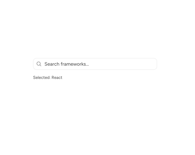
Astryx Base Typeahead
2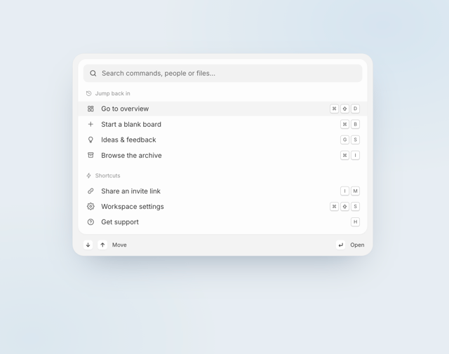
Pixel Perfect Command Palette
2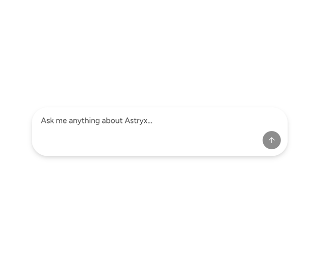
Astryx Chat Composer Input
1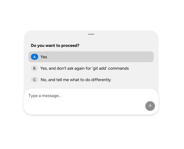
Astryx Chat Composer Drawer
1
Sticky Cascade Services & Timeline