
About
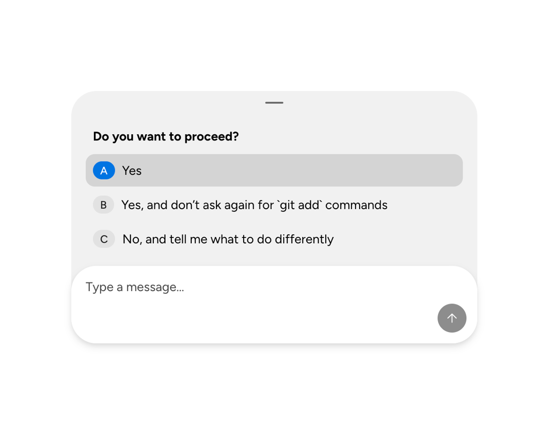
A collapsible Astryx chat-composer drawer for attachments, feedback prompts, context chips, and supplementary content.
Built with React and Tailwind. Copy the prompt and paste it into Claude Code, Cursor or Lovable: your agent adds Astryx Chat Composer Drawer to your project and fits it to your theme.
Code
How Astryx Chat Composer Drawer is used: the demo's code. The component's own source comes with a free account.
Usage.tsx
'use client';

import {useState} from 'react';
import {ChatComposer, ChatComposerDrawer} from '@/components/ui/astryx-chat-composer-drawer';
import {List, ListItem} from '@astryxdesign/core/List';
import {Text} from '@astryxdesign/core/Text';
import {Badge} from '@astryxdesign/core/Badge';
import {Stack} from '@astryxdesign/core/Layout';

const options = [
  {key: 'A', label: 'Yes'},
  {key: 'B', label: 'Yes, and don\u2019t ask again for `git add` commands'},
  {key: 'C', label: 'No, and tell me what to do differently'},
];

export default function ChatComposerDrawerFeedback() {
  const [selected, setSelected] = useState<string | null>(null);

  return (
    <div
      data-astryx-theme="neutral"
      data-theme="light"
      style={{colorScheme: 'light', display: 'contents'}}>
      <Stack direction="vertical" width={450} maxWidth="100%">
        <ChatComposer
          onSubmit={value => {
            console.log('Submit:', value, '| Answer:', selected);
          }}
          drawer={
            <ChatComposerDrawer count={1} label="User feedback requested">
              <Stack direction="vertical" gap={1} width="100%">
                <List>
                  <ListItem
                    label={<Text weight="bold">Do you want to proceed?</Text>}
                  />
                  {options.map(opt => (
                    <ListItem
                      key={opt.key}
                      label={opt.label}
                      startContent={
                        <Badge
                          variant={selected === opt.key ? 'info' : 'neutral'}
                          label={opt.key}
                        />
                      }
                      isSelected={selected === opt.key}
                      onClick={() => setSelected(opt.key)}
                    />
                  ))}
                </List>
              </Stack>
            </ChatComposerDrawer>
          }
        />
      </Stack>
    </div>
  );
}
Dependencies
More by Alok Srivastava
View all
Glossy Slider Call Button
25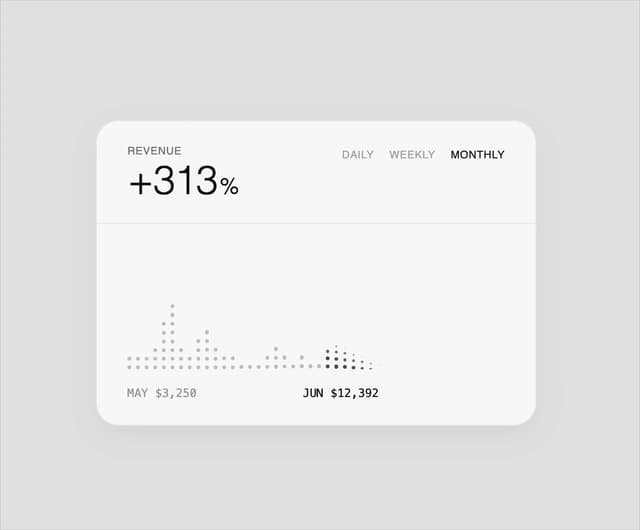
Dot Graph Card
21
Profile Menu Expander
4
Astryx Base Typeahead
2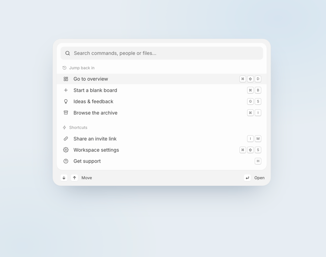
Pixel Perfect Command Palette
1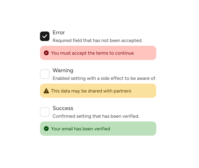
Astryx Checkbox Input
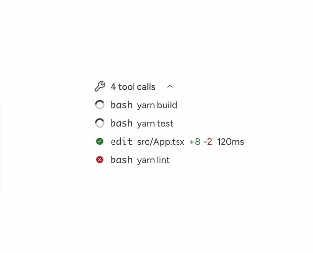
Astryx Chat Tool Calls
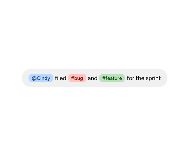
Astryx Chat Tokenized Text