
About
CheckboxInput toggles a single on/off value. Use it for settings like "Enable notifications", terms acceptance, or opt-in choices. For multiple checkboxes in a group, use CheckboxList instead.
Built with React and Tailwind. Copy the prompt and paste it into Claude Code, Cursor or Lovable: your agent adds Astryx Checkbox Input to your project and fits it to your theme.
Code
How Astryx Checkbox Input is used: the demo's code. The component's own source comes with a free account.
Usage.tsx
'use client';

import {useState} from 'react';
import {CheckboxInput} from '@/components/ui/astryx-checkbox-input';
import {Stack} from '@astryxdesign/core/Layout';

function CheckboxInputStatusVariations() {
  const [error, setError] = useState<boolean | 'indeterminate'>(false);
  const [warning, setWarning] = useState<boolean | 'indeterminate'>(true);
  const [success, setSuccess] = useState<boolean | 'indeterminate'>(true);

  return (
    <Stack direction="vertical" gap={4}>
      <CheckboxInput
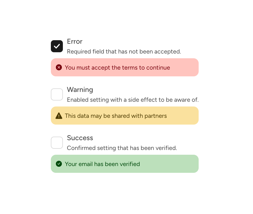
        label="Error"
        description="Required field that has not been accepted."
        value={error}
        onChange={setError}
        status={{
          type: 'error',
          message: 'You must accept the terms to continue',
        }}
      />
      <CheckboxInput
        label="Warning"
        description="Enabled setting with a side effect to be aware of."
        value={warning}
        onChange={setWarning}
        status={{
          type: 'warning',
          message: 'This data may be shared with partners',
        }}
      />
      <CheckboxInput
        label="Success"
        description="Confirmed setting that has been verified."
        value={success}
        onChange={setSuccess}
        status={{type: 'success', message: 'Your email has been verified'}}
      />
    </Stack>
  );
}

export default function CheckboxInputStatusVariationsDemo() {
  return (
    <div
      data-astryx-theme="neutral"
      data-theme="light"
      style={{colorScheme: 'light', display: 'contents'}}>
      <CheckboxInputStatusVariations />
    </div>
  );
}
Dependencies
More by Alok Srivastava
View all
Glossy Slider Call Button
25
Dot Graph Card
22
Profile Menu Expander
4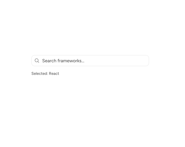
Astryx Base Typeahead
2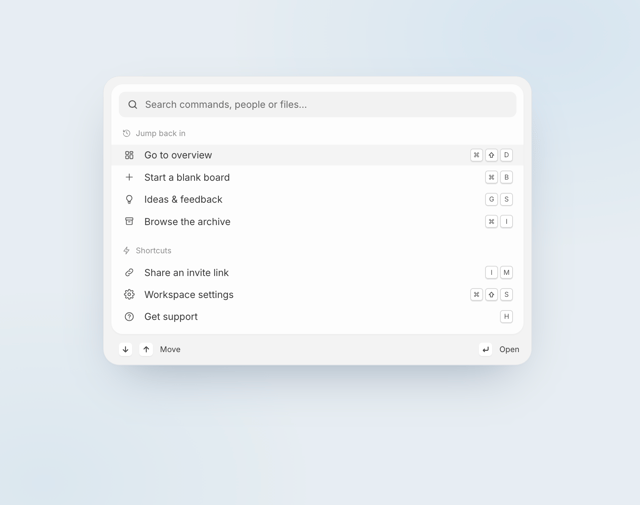
Pixel Perfect Command Palette
2
Dynamic Island Feedback Notch
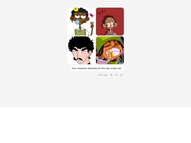
CopyPlus Dual Copy Button
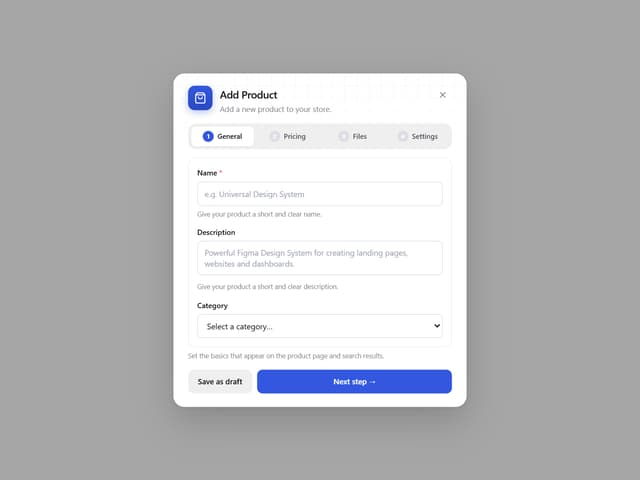
Add Product Wizard Modal
More in Forms
View all

Contact Card
1.1K

Premium Auth
552

Book A Demo 1
84

Form
17

Login 1
60

Form
16

Card Studio
46

Form
12