

About
A white-page features section with a masked headline reveal and a 3/2/2/3 bento grid of animated flowchart, profile, and network cards.
Built with React and Tailwind. Copy the prompt and paste it into Claude Code, Cursor or Lovable: your agent adds Stacker Style Bento Grid to your project and fits it to your theme.
Code
How Stacker Style Bento Grid is used: the demo's code. The component's own source comes with a free account.
Usage.tsx
"use client"

import Component from "@/components/ui/cue-stacker-style-bento-grid"

export default function Demo() {
  return <Component />
}
Dependencies
More by Alok
View all

Glossy Slider Call Button
34
Dot Graph Card
30
3D Book Carousel Reading Mode
26
Chained Spring Arc Carousel
25
Collapsing Cards Accordion
18
Interactive Card Sphere
14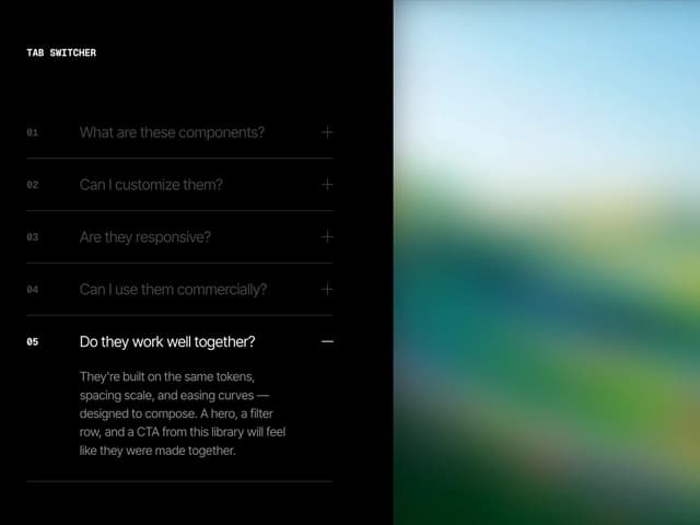
Split Panel Image-Synced FAQ/Features
10
Flex-Grow Benefits Reveal
9
More in Features
View all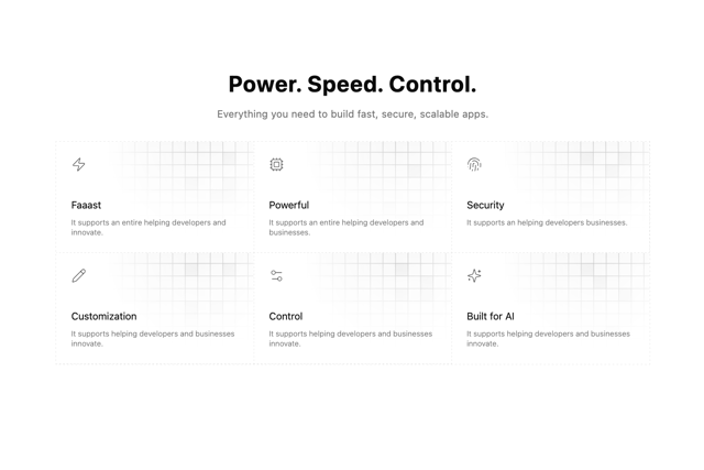

Grid Feature Cards
1.9K

Features 4
391
Features 8
3.2K

Feature 1
118
Feature 72
135

Feature Sections
191
Features Card
251
Feature with image
153

