About
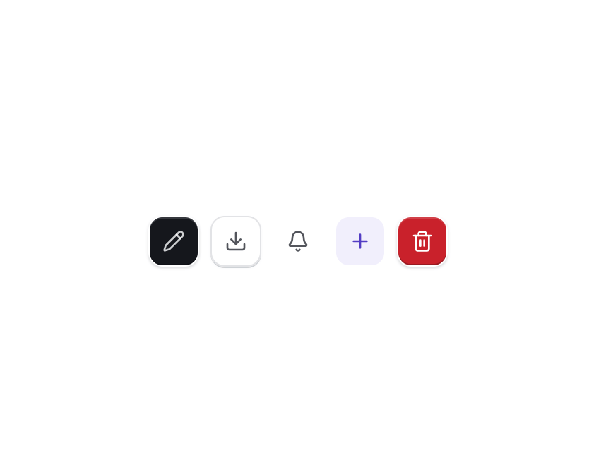
A square button sized for a single icon-only action, with small/default/large sizes, every button variant, and a required aria-label so it stays accessible.
Built with React and Tailwind. Copy the prompt and paste it into Claude Code, Cursor or Lovable: your agent adds Icon Button to your project and fits it to your theme.
Code
How Icon Button is used: the demo's code. The component's own source comes with a free account.
Usage.tsx
import { IconButton } from "@/components/ui/icon-button";
import {
  BellIcon,
  DownloadIcon,
  PencilIcon,
  PlusIcon,
  Trash2Icon,
} from "lucide-react";

export default function IconButtonDemo() {
  return (
    <div className="flex flex-wrap items-center gap-2">
      <IconButton variant="default" aria-label="Edit">
        <PencilIcon />
      </IconButton>
      <IconButton aria-label="Download">
        <DownloadIcon />
      </IconButton>
      <IconButton variant="ghost" aria-label="Notifications">
        <BellIcon />
      </IconButton>
      <IconButton variant="soft" aria-label="Add">
        <PlusIcon />
      </IconButton>
      <IconButton variant="destructive" aria-label="Delete">
        <Trash2Icon />
      </IconButton>
    </div>
  );
}
Dependencies
More by amankaushik481
View all

Chip Filter
7
Emoji Picker
4
Morphing Text
1
Comment Composer
Logo Cloud
Text
Slash Command Menu
More in Buttons
View all
Texture Button
107

Notification Button
116
Button
14

HeroUI Button Group
1

Button
2
Base Button
2

App Store Button
484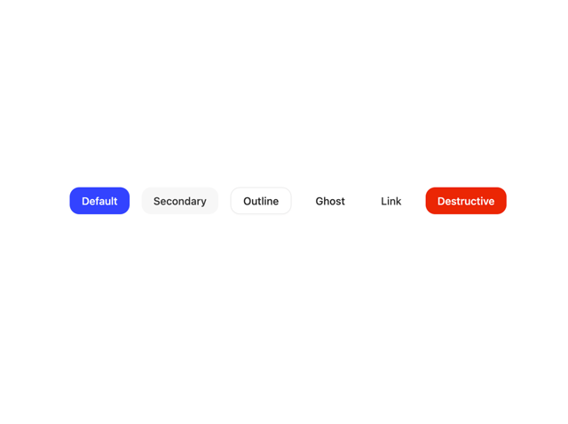

Button
36

