import ProximitySidebar from "@/components/ui/proximity-sidebar";
import type { ProximitySection } from "@/components/ui/proximity-sidebar";

type DocItem = {
  id: string;
  label: string;
  eyebrow?: string;
  title: string;
  description: string;
  kind: NonNullable<ProximitySection["kind"]>;
};

type DocGroup = {
  id: string;
  label: string;
  eyebrow: string;
  title: string;
  description: string;
  items: DocItem[];
};

const docs: DocGroup[] = [
  {
    id: "overview",
    label: "Overview",
    eyebrow: "Introduction",
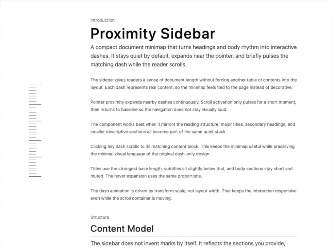
    title: "Proximity Sidebar",
    description:
      "A compact document minimap that turns headings and body rhythm into interactive dashes. It stays quiet by default, expands near the pointer, and briefly pulses the matching dash while the reader scrolls.",
    items: [
      {
        id: "overview-purpose",
        label: "Purpose",
        eyebrow: "Why it exists",
        title: "A spatial cue for long pages",
        description:
          "The sidebar gives readers a sense of document length without forcing another table of contents into the layout. Each dash represents real content, so the minimap feels tied to the page instead of decorative.",
        kind: "body",
      },
      {
        id: "overview-pattern",
        label: "Pattern",
        eyebrow: "Interaction model",
        title: "Hover locally, pulse on scroll",
        description:
          "Pointer proximity expands nearby dashes continuously. Scroll activation only pulses for a short moment, then returns to baseline so the navigation does not stay visually loud.",
        kind: "body",
      },
      {
        id: "overview-density",
        label: "Density",
        eyebrow: "Visual density",
        title: "Many small marks beat a few large buttons",
        description:
          "The component works best when it mirrors the reading structure: major titles, secondary headings, and smaller descriptive sections all become part of the same quiet stack.",
        kind: "body",
      },
      {
        id: "overview-clicks",
        label: "Clicks",
        eyebrow: "Navigation",
        title: "Every dash is a target",
        description:
          "Clicking any dash scrolls to its matching content block. This keeps the minimap useful while preserving the minimal visual language of the original dash-only design.",
        kind: "body",
      },
      {
        id: "overview-sizing",
        label: "Sizing",
        eyebrow: "Dash scale",
        title: "Importance controls dash length",
        description:
          "Titles use the strongest base length, subtitles sit slightly below that, and body sections stay short and muted. The hover expansion uses the same proportions.",
        kind: "body",
      },
      {
        id: "overview-motion",
        label: "Motion",
        eyebrow: "Animation",
        title: "Springs keep the response fluid",
        description:
          "The dash animation is driven by transform scale, not layout width. That keeps the interaction responsive even while the scroll container is moving.",
        kind: "body",
      },
    ],
  },
  {
    id: "content-model",
    label: "Content Model",
    eyebrow: "Structure",
    title: "Content Model",
    description:
      "The sidebar does not invent marks by itself. It reflects the sections you provide, which makes the visual hierarchy predictable and easy to tune.",
    items: [
      {
        id: "content-title",
        label: "Title",
        eyebrow: "Kind: title",
        title: "Use title for page-level anchors",
        description:
          "A title dash should represent a major region of the document. These are the strongest marks and should appear only where the reader expects a new chapter or major concept.",
        kind: "body",
      },
      {
        id: "content-subtitle",
        label: "Subtitle",
        eyebrow: "Kind: subtitle",
        title: "Use subtitle for important groups",
        description:
          "Subtitle dashes are slightly quieter than title dashes. They are useful for feature groups, installation steps, API categories, or meaningful document turns.",
        kind: "body",
      },
      {
        id: "content-section",
        label: "Section",
        eyebrow: "Kind: section",
        title: "Use section for scannable blocks",
        description:
          "Section dashes sit between markers and body text. They add rhythm without making the entire minimap look like every entry has the same importance.",
        kind: "body",
      },
      {
        id: "content-body",
        label: "Body",
        eyebrow: "Kind: body",
        title: "Use body for detail paragraphs",
        description:
          "Body dashes are the smallest marks. They let the sidebar reach the same density as the original implementation while still being connected to real content.",
        kind: "body",
      },
      {
        id: "content-auto",
        label: "Auto Detect",
        eyebrow: "Fallback",
        title: "Headings can be detected from markup",
        description:
          "If a section does not provide a kind or level, the component looks for the first heading inside the target element and maps h1, h2, and h3 to visual weight.",
        kind: "body",
      },
    ],
  },
  {
    id: "behavior",
    label: "Behavior",
    eyebrow: "Interaction",
    title: "Behavior",
    description:
      "The sidebar balances direct interaction with passive reading. It responds to the pointer, follows scroll position briefly, and stays out of the way when idle.",
    items: [
      {
        id: "behavior-hover",
        label: "Hover",
        eyebrow: "Pointer",
        title: "Nearby dashes expand around the cursor",
        description:
          "Hovering over the stack sets a shared pointer value. Each dash measures its own distance from that pointer and scales according to proximity.",
        kind: "body",
      },
      {
        id: "behavior-scroll",
        label: "Scroll",
        eyebrow: "Passive state",
        title: "Scroll creates a temporary pulse",
        description:
          "When the reader scrolls, the closest content section expands for half a second and then returns to normal. The active cue is useful but not sticky.",
        kind: "body",
      },
      {
        id: "behavior-click",
        label: "Click",
        eyebrow: "Jumping",
        title: "Clicking scrolls to the matching section",
        description:
          "Each dash is rendered as a button with an accessible label. The visual stays minimal, but the control still behaves like real navigation.",
        kind: "body",
      },
      {
        id: "behavior-scroll-parent",
        label: "Scroll Parent",
        eyebrow: "Containers",
        title: "Nested scroll containers are supported",
        description:
          "The demo uses an internal scroll area. The component detects scrollable parents for the target sections, so the pulse works inside app layouts too.",
        kind: "body",
      },
      {
        id: "behavior-reduced-motion",
        label: "Reduced Motion",
        eyebrow: "Accessibility",
        title: "Smooth scroll respects reduced motion",
        description:
          "When reduced motion is requested, clicking a dash jumps without smooth scrolling. The component keeps the navigation predictable for motion-sensitive users.",
        kind: "body",
      },
      {
        id: "behavior-history",
        label: "History",
        eyebrow: "URL",
        title: "The hash updates after selection",
        description:
          "Selecting a dash updates the URL hash for the target id. Readers can copy or reload the page and keep the same location context.",
        kind: "body",
      },
    ],
  },
  {
    id: "styling",
    label: "Styling",
    eyebrow: "Visual System",
    title: "Styling",
    description:
      "The dash stack keeps the original visual tone: thin one-pixel marks, eight-pixel spacing, muted small entries, and strong foreground markers.",
    items: [
      {
        id: "styling-gap",
        label: "Gap",
        eyebrow: "Spacing",
        title: "Use a consistent eight-pixel rhythm",
        description:
          "The original component felt precise because the gaps were tight and consistent. This version keeps the same vertical spacing across all dash types.",
        kind: "body",
      },
      {
        id: "styling-thickness",
        label: "Thickness",
        eyebrow: "Line weight",
        title: "Keep the dash height at one pixel",
        description:
          "The hierarchy comes from length and color instead of heavy stroke widths. That keeps the minimap refined even when the page has many anchors.",
        kind: "body",
      },
      {
        id: "styling-color",
        label: "Color",
        eyebrow: "Contrast",
        title: "Use foreground for markers and muted color for details",
        description:
          "Major sections use the foreground color. Smaller items use muted foreground opacity so they create density without overpowering the page.",
        kind: "body",
      },
      {
        id: "styling-width",
        label: "Width",
        eyebrow: "Sizing",
        title: "The longest expanded dash reaches the original width",
        description:
          "The strongest mark expands to the same full length as the initial prototype. Smaller entries preserve that same proportional language.",
        kind: "body",
      },
      {
        id: "styling-side",
        label: "Side",
        eyebrow: "Placement",
        title: "Left and right alignment use matching origins",
        description:
          "When the sidebar moves to the right side, dashes expand from the right edge. This keeps the motion anchored to the outside rail.",
        kind: "body",
      },
    ],
  },
  {
    id: "usage",
    label: "Usage",
    eyebrow: "Implementation",
    title: "Usage",
    description:
      "The API stays small. Pass a list of content sections with ids and labels, then place matching ids on the content blocks you want to navigate to.",
    items: [
      {
        id: "usage-sections",
        label: "Sections",
        eyebrow: "Data",
        title: "Create one entry per visible content block",
        description:
          "For a dense docs page, include more than only top-level headings. Add subtitles and meaningful descriptive blocks to create the minimap texture.",
        kind: "body",
      },
      {
        id: "usage-kind",
        label: "Kinds",
        eyebrow: "Hierarchy",
        title: "Set kind when you want explicit control",
        description:
          "Use kind when the visual weight should not depend on the DOM heading level. This is helpful for demos, MDX content, and generated docs.",
        kind: "body",
      },
      {
        id: "usage-level",
        label: "Levels",
        eyebrow: "Heading fallback",
        title: "Use level when mapping from document headings",
        description:
          "If your content pipeline already knows heading levels, pass level values from one to six and let the component map them to dash weights.",
        kind: "body",
      },
      {
        id: "usage-classname",
        label: "Class Name",
        eyebrow: "Layout",
        title: "Use className for page-specific placement",
        description:
          "The component handles the stack and motion. The surrounding page can control sticky positioning, sidebar width, and responsive visibility.",
        kind: "body",
      },
      {
        id: "usage-content",
        label: "Content",
        eyebrow: "Authoring",
        title: "Match every id to real content",
        description:
          "Avoid decorative-only dashes. The minimap is strongest when every line represents something the reader can jump to and understand.",
        kind: "body",
      },
      {
        id: "usage-mobile",
        label: "Mobile",
        eyebrow: "Responsive",
        title: "Hide or relocate the rail on narrow screens",
        description:
          "A dense minimap is best for larger reading surfaces. On small screens, it can be hidden or moved behind a compact navigation affordance.",
        kind: "body",
      },
    ],
  },
  {
    id: "reference",
    label: "Reference",
    eyebrow: "API",
    title: "Reference",
    description:
      "The component accepts a side, optional className, optional active offset, and an ordered list of sections. That order is the order rendered in the dash stack.",
    items: [],
  },
];

const sections: ProximitySection[] = docs.flatMap((group) => [
  { id: group.id, label: group.label, kind: "title" },
  ...group.items.map((item) => ({
    id: item.id,
    label: item.label,
    kind: item.kind,
  })),
]);

export default function Page() {
  return (
    <div className="flex h-screen min-h-0 overflow-hidden bg-background text-foreground">
      <aside className="h-full w-24 shrink-0">
        <ProximitySidebar side="left" sections={sections} />
      </aside>

      <main className="min-h-0 flex-1 overflow-auto px-8 py-20 [scrollbar-none] [-ms-overflow-style:none] [&::-webkit-scrollbar]:hidden md:px-14 ml-20">
        <article className="max-w-2xl">
          {docs.map((group, groupIndex) => (
            <section
              key={group.id}
              id={group.id}
              className="mt-10 scroll-mt-12 first:mt-0"
            >
              <p className="mb-2 text-sm text-foreground/65 dark:text-foreground/40">
                {group.eyebrow}
              </p>
              {groupIndex === 0 ? (
                <h1 className="text-5xl font-medium tracking-wider text-foreground">
                  {group.title}
                </h1>
              ) : (
                <h2 className="border-b pb-2 text-3xl font-medium tracking-wide text-foreground/90">
                  {group.title}
                </h2>
              )}
              <p className="mt-2 text-lg text-foreground/80 dark:text-foreground/60">
                {group.description}
              </p>

              {group.id === "reference" ? (
                <div className="mt-6 grid gap-6">
                  <div id="reference-props" className="scroll-mt-12">
                    <p className="font-sans text-sm leading-6 text-foreground/75 dark:text-foreground/50">
                      Pass <code>sections</code>, <code>side</code>,{" "}
                      <code>className</code>, and <code>activeOffset</code>. The
                      section ids should match elements in the document.
                    </p>
                  </div>
                  <div id="reference-output" className="scroll-mt-12">
                    <p className="font-sans text-sm leading-6 text-foreground/75 dark:text-foreground/50">
                      The component renders an accessible navigation rail where
                      each dash is a button tied to its matching content block.
                    </p>
                  </div>
                </div>
              ) : (
                <div className="mt-6 space-y-6">
                  {group.items.map((item) => (
                    <section
                      key={item.id}
                      id={item.id}
                      className="scroll-mt-12"
                    >
                      <p className="font-sans text-sm leading-6 text-foreground/75 dark:text-foreground/50">
                        {item.description}
                      </p>
                    </section>
                  ))}
                </div>
              )}
            </section>
          ))}
        </article>
      </main>
    </div>
  );
}