
About
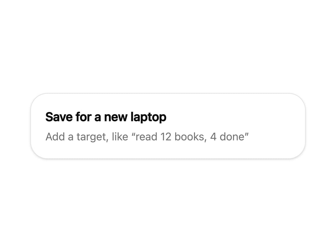
A progress card for a numeric goal (e.g. "7 of 12 books") with a percentage readout, a progress bar, and +/- step buttons to adjust the current value.
Built with React and Tailwind. Copy the prompt and paste it into Claude Code, Cursor or Lovable: your agent adds Goal Progress Card to your project and fits it to your theme.
Code
How Goal Progress Card is used: the demo's code. The component's own source comes with a free account.
Usage.tsx
import GoalCard from "@/components/ui/goal-progress-card";

export default function GoalProgressCardMissingTargetDemo() {
  return (
    <div className="flex min-h-screen w-full items-center justify-center bg-background p-6">
      <div className="w-full max-w-sm rounded-3xl border border-border bg-card p-5 shadow-sm">
        <GoalCard
          data={{
            title: "Save for a new laptop",
            current: 0,
            target: null,
            unit: null,
          }}
          interactive
        />
      </div>
    </div>
  );
}
Dependencies
More by Anish Gupta
View all
Countdown Card
Morph Container
Animated Checklist
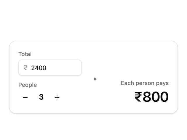
Bill Split Card
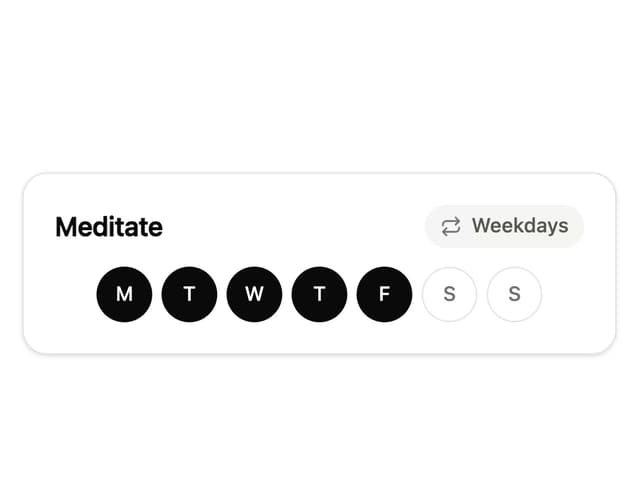
Habit Tracker Card
More in Cards
View all

Course Design Cards
1.3K

Statistics Card 7
327
Statistics Card 2
305

Interactive Tech Stack Bento Grid with Hover Effects
625

Card Studio
5
The Item one
4

Weather Card
65

Card
9