
About
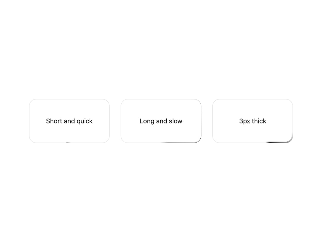
An animated glowing comet that travels around an element's border, used to draw attention to cards, buttons, or loading states.
Built with React and Tailwind. Copy the prompt and paste it into Claude Code, Cursor or Lovable: your agent adds Border Beam to your project and fits it to your theme.
Code
How Border Beam is used: the demo's code. The component's own source comes with a free account.
Usage.tsx
import { BorderBeam } from "@/components/ui/border-beam";

const CARD =
  "bg-background border-border text-foreground flex min-h-24 items-center justify-center rounded-2xl border px-5 text-center text-sm";

export default function BorderBeamSizeAndSpeed() {
  return (
    <div className="flex flex-wrap items-center justify-center gap-6">
      <BorderBeam className="w-44 rounded-2xl" length={3} speed={3}>
        <div className={CARD}>Short and quick</div>
      </BorderBeam>
      <BorderBeam className="w-44 rounded-2xl" length={30} speed={10}>
        <div className={CARD}>Long and slow</div>
      </BorderBeam>
      <BorderBeam className="w-44 rounded-2xl" thickness={3}>
        <div className={CARD}>3px thick</div>
      </BorderBeam>
    </div>
  );
}
More by appica-dev
View all
Text Animate
21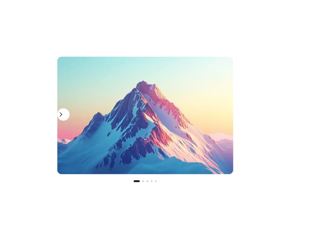
Carousel
19
Avatar
16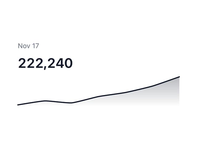
Sparkline
8
Table of Contents
7
Background Pattern
7
Color Area
6
Autocomplete
2