"use client";

import { type MouseEvent } from "react";
import { Toc, TocList, TocItem, TocLink } from "@/components/ui/toc";

const SECTIONS = [
  {
    id: "toc-demo-getting-started",
    title: "Getting started",
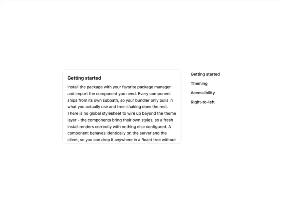
    body: 'Install the package with your favorite package manager and import the component you need. Every component ships from its own subpath, so your bundler only pulls in what you actually use and tree-shaking does the rest. There is no global stylesheet to wire up beyond the theme layer - the components bring their own styles, so a fresh install renders correctly with nothing else configured. A component behaves identically on the server and the client, so you can drop it anywhere in a React tree without reaching for a "use client" boundary unless your own code needs one. Sensible defaults mean most components look right immediately, and every visual choice can be overridden through props or class names. Once you are comfortable with one component the rest follow the same composition-first API, so there is very little new to learn as you reach for more of them across a project.',
  },
  {
    id: "toc-demo-theming",
    title: "Theming",
    body: "Colors, radii, and motion are driven entirely by CSS variables. Override them at any level of the tree to retheme a single section or the whole application, with no build step or configuration. Light and dark modes are just two sets of the same variables, so a theme toggle is a single class on a parent element. Because everything resolves at runtime, you can even let users tweak the palette live.",
  },
  {
    id: "toc-demo-accessibility",
    title: "Accessibility",
    body: "Components follow the WAI-ARIA patterns out of the box - roving focus, correct roles, and labeled landmarks - so keyboard and screen-reader support comes for free. Focus is trapped and restored where it should be, and every interactive element is reachable by keyboard. We test the primitives against axe to catch regressions early. You are still responsible for naming your own instances, but the wiring underneath is handled.",
  },
  {
    id: "toc-demo-rtl",
    title: "Right-to-left",
    body: 'Logical properties and a direction provider mean every component mirrors cleanly under dir="rtl" without any extra work on your part. Padding, borders, and animations all flip to follow the reading direction. Arrow-key navigation and popup placement respect the resolved direction too. Switching a whole app to RTL is a single attribute on the html element plus the provider.',
  },
];

// Demo only: scrolls within this panel instead of the page so the example stays put.
// A page-level TOC needs none of this - let the anchor jump the page natively.
function scrollWithinPanel(event: MouseEvent<HTMLElement>) {
  const link = (event.target as HTMLElement).closest('a[href^="#"]');
  if (!link) return;
  const id = decodeURIComponent(link.getAttribute("href")!.slice(1));
  const heading = document.getElementById(id);
  const panel = heading?.closest("[data-scroll-panel]");
  if (!heading || !panel) return;
  event.preventDefault();
  const gap = parseFloat(getComputedStyle(heading).scrollMarginTop) || 0;
  const top =
    heading.getBoundingClientRect().top -
    panel.getBoundingClientRect().top +
    panel.scrollTop -
    gap;
  panel.scrollTo({ top, behavior: "smooth" });
}

export default function TocDefault() {
  return (
    <div className="flex w-full max-w-xl gap-4">
      <div
        data-scroll-panel
        className="border-border h-64 flex-1 scrollbar-none overflow-auto rounded-lg border p-4"
      >
        {SECTIONS.map((section) => (
          <section key={section.id} className="mb-6 last:mb-0">
            <h3
              id={section.id}
              className="text-foreground-intense mb-2 scroll-mt-6 font-semibold"
            >
              {section.title}
            </h3>
            <p className="text-sm leading-relaxed">{section.body}</p>
          </section>
        ))}
      </div>

      <Toc className="w-38 shrink-0" onClick={scrollWithinPanel}>
        <TocList>
          {SECTIONS.map((section) => (
            <TocItem key={section.id}>
              <TocLink href={`#${section.id}`}>{section.title}</TocLink>
            </TocItem>
          ))}
        </TocList>
      </Toc>
    </div>
  );
}