import {
  Carousel,
  CarouselContent,
  CarouselSlide,
  CarouselPrev,
  CarouselNext,
  CarouselPagination,
} from "@/components/ui/carousel";
import { Button } from "@appica/ui-react/button";
import { ChevronLeft, ChevronRight } from "@appica/icons-react";

const CARDS = [
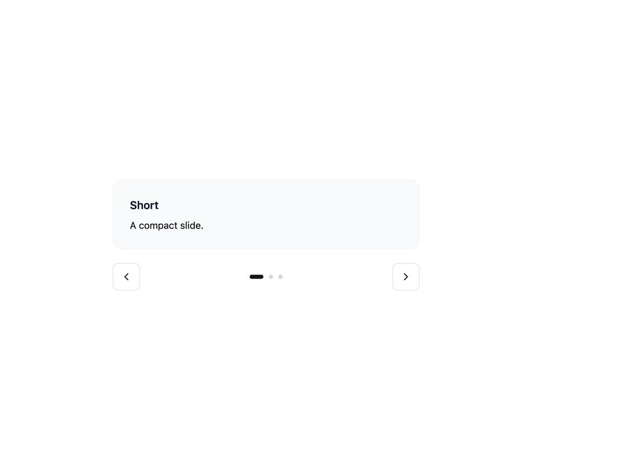
  { title: "Short", body: "A compact slide." },
  {
    title: "Medium",
    body: "This slide carries a couple of sentences, so it stands a little taller than the first. The viewport grows to fit it.",
  },
  {
    title: "Tall",
    body: "And this one runs longer still. Auto Height animates the viewport between each slide's natural height as you navigate, so nothing is clipped and there's no empty space below shorter slides. It keeps mixed-length content - quotes, cards, forms - looking tidy inside a single carousel.",
  },
];

export default function CarouselAutoHeight() {
  return (
    <div className="w-full max-w-md">
      <Carousel loop autoHeight align="start">
        <CarouselContent>
          {CARDS.map((card) => (
            <CarouselSlide key={card.title}>
              <div className="border-border-muted bg-background-subtle rounded-xl border p-6">
                <h4 className="text-foreground-intense mb-2 font-semibold">
                  {card.title}
                </h4>
                <p className="text-sm">{card.body}</p>
              </div>
            </CarouselSlide>
          ))}
        </CarouselContent>
        <div className="mt-5 flex items-center justify-between gap-4">
          <CarouselPrev
            position="none"
            render={
              <Button variant="outline" size="icon-md">
                <ChevronLeft />
              </Button>
            }
          />
          <CarouselPagination />
          <CarouselNext
            position="none"
            render={
              <Button variant="outline" size="icon-md">
                <ChevronRight />
              </Button>
            }
          />
        </div>
      </Carousel>
    </div>
  );
}