
About
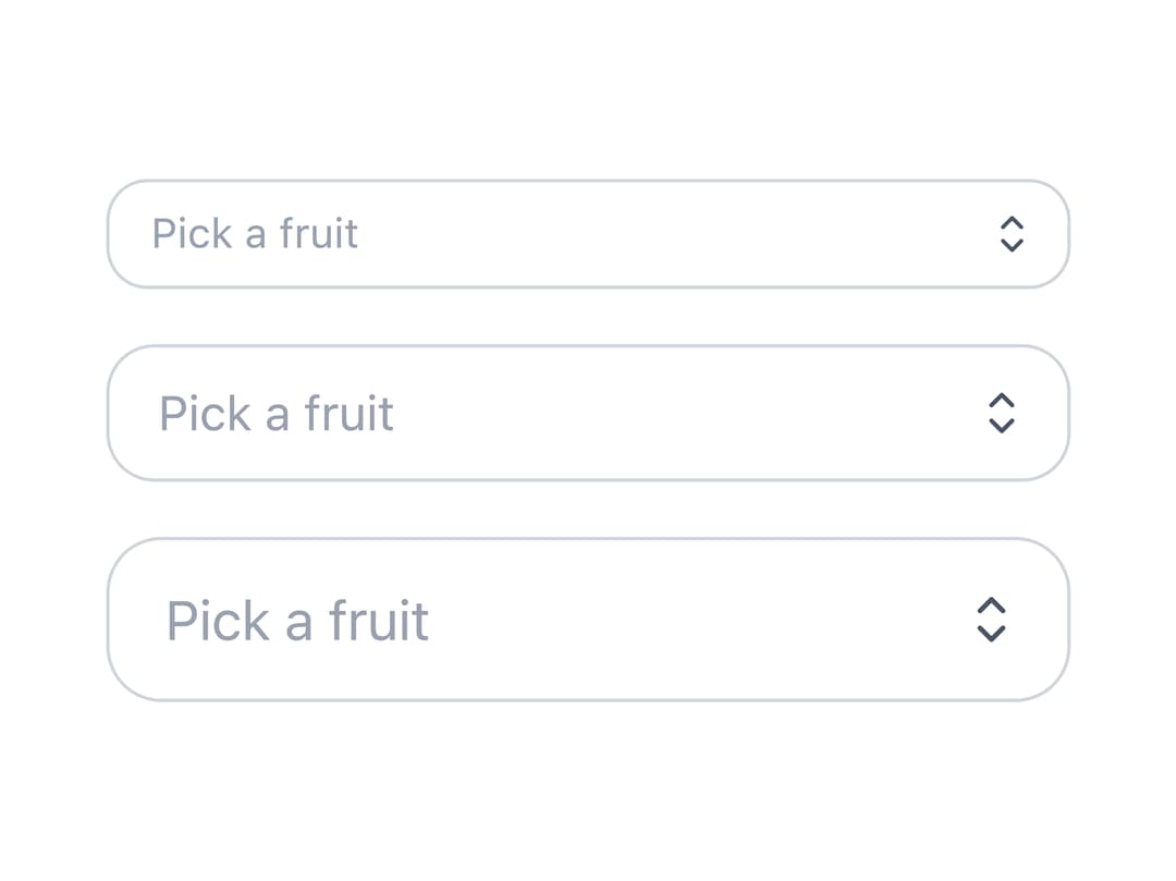
A dropdown select control with a styled trigger and popup listbox for choosing one or multiple options from a list.
Built with React and Tailwind. Copy the prompt and paste it into Claude Code, Cursor or Lovable: your agent adds Select to your project and fits it to your theme.
Code
How Select is used: the demo's code. The component's own source comes with a free account.
Usage.tsx
import {
  Select,
  SelectTrigger,
  SelectValue,
  SelectContent,
  SelectItem,
} from "@/components/ui/select";

const fruits = [
  "Apple",
  "Banana",
  "Blueberry",
  "Grapes",
  "Orange",
  "Strawberry",
];
const sizes = ["sm", "md", "lg"] as const;

export default function SelectSizes() {
  return (
    <div className="flex w-full max-w-70 flex-col gap-4">
      {sizes.map((size) => (
        <Select key={size} size={size}>
          <SelectTrigger aria-label={`Pick a fruit (${size})`}>
            <SelectValue placeholder="Pick a fruit" />
          </SelectTrigger>
          <SelectContent>
            {fruits.map((fruit) => (
              <SelectItem key={fruit} value={fruit}>
                {fruit}
              </SelectItem>
            ))}
          </SelectContent>
        </Select>
      ))}
    </div>
  );
}
Dependencies
More by appica-dev
View all
Border Beam
63
Text Animate
21
Carousel
19
Avatar
15
Sparkline
8
Table of Contents
7
Background Pattern
7
Color Area
6