About
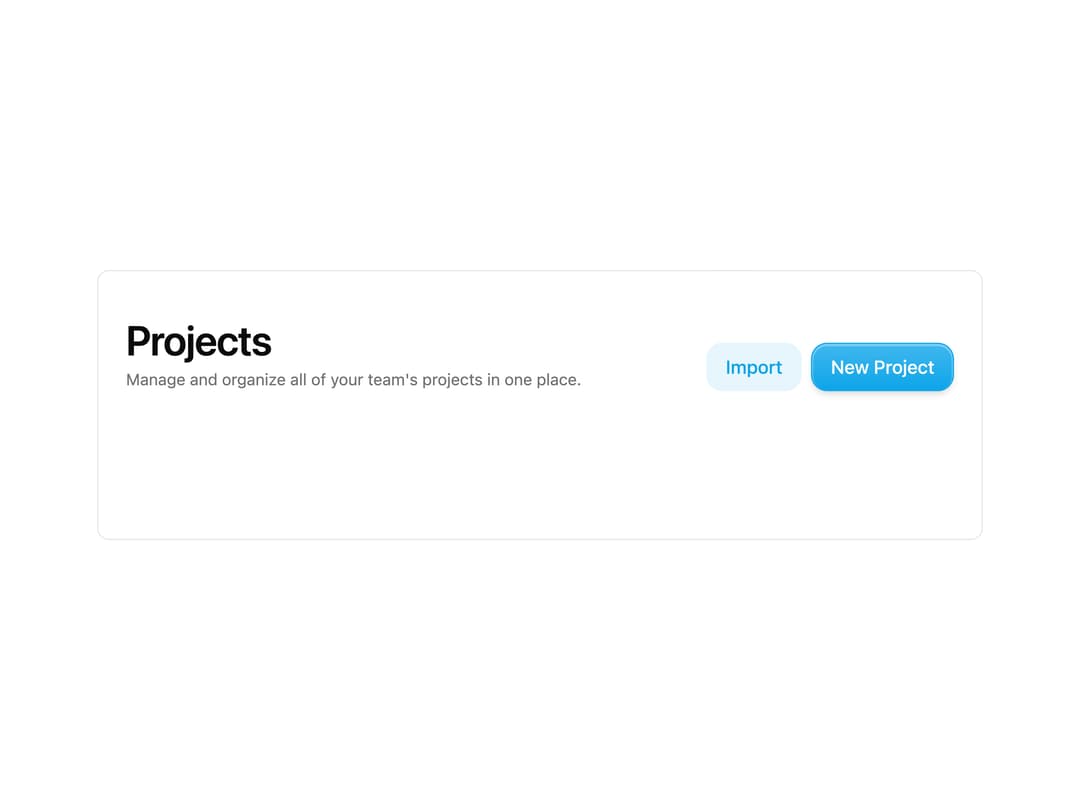
A page header with a large title, optional description, and a slot for actions to keep page layouts consistent.
Built with React and Tailwind. Copy the prompt and paste it into Claude Code, Cursor or Lovable: your agent adds Page Header to your project and fits it to your theme.
Code
How Page Header is used: the demo's code. The component's own source comes with a free account.
Usage.tsx
import { PageHeader } from "@/components/ui/page-header";
import { Button } from "@/components/ui/button";

export default function Default() {
  return (
    <div className="w-full max-w-3xl mx-auto rounded-lg border bg-background text-foreground overflow-hidden">
      <PageHeader
        title="Projects"
        description="Manage and organize all of your team's projects in one place."
      >
        <Button>New Project</Button>
      </PageHeader>
      <div className="h-32" />
    </div>
  );
}
More by asanshay
View all
Chat Reasoning
139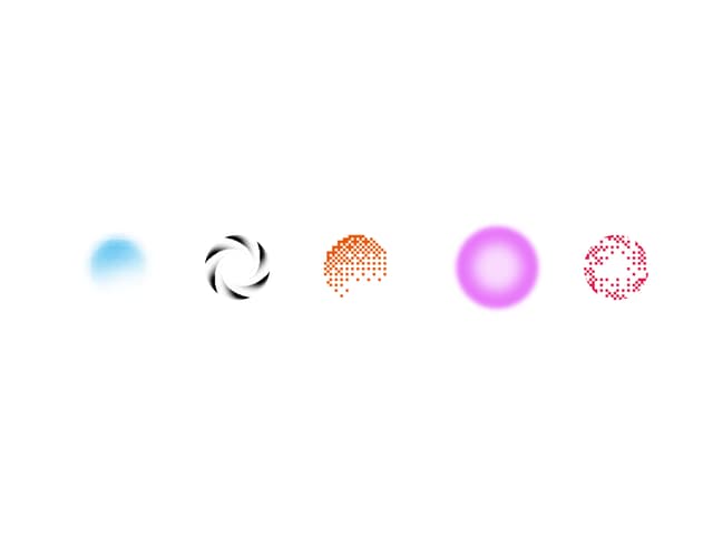
Shader Loader
83
Motion Blur Text
42
Reveal
15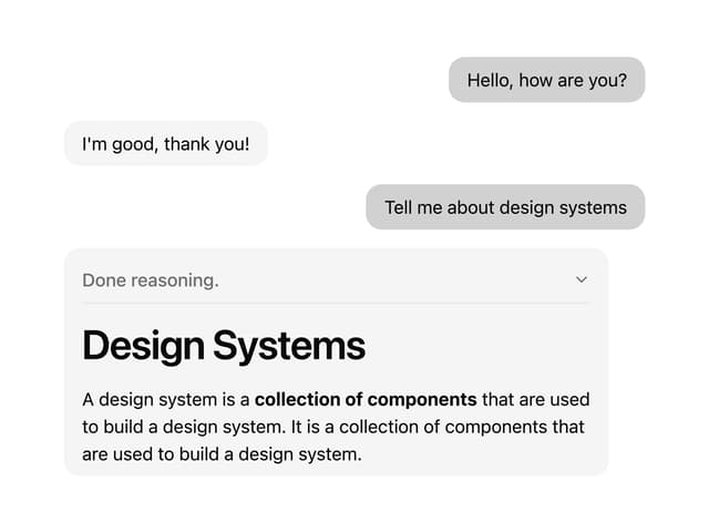
Chat Message
11
Chat Tool
11
More in Buttons
View all
Texture Button
102
Button
10

Button
4
Native Button
12

Button Group
38
Button
76

HeroUI Button Group
11
Split Button
36


