
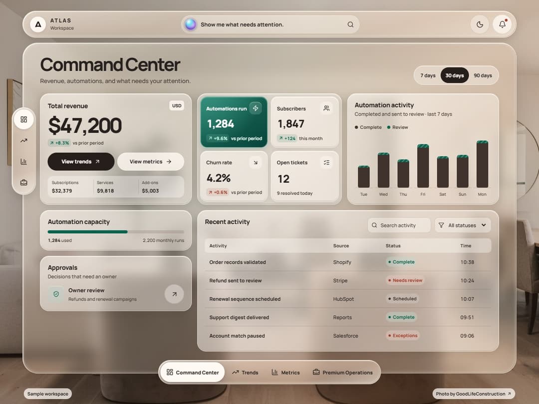
About
A responsive glass dashboard for exploring revenue, traffic, and operations. Switch between four ATLAS workspace views to compare reporting periods, inspect animated charts, review sample workflows, and export CSV reports in light or dark mode.
Built with React and Tailwind. Copy the prompt and paste it into Claude Code, Cursor or Lovable: your agent adds Glassy Dashboard to your project and fits it to your theme.
Code
How Glassy Dashboard is used: the demo's code. The component's own source comes with a free account.
Usage.tsx
"use client";
import { useEffect, useState } from "react";
import GlassyDashboard from "@/components/ui/glassy-dashboard";

const settings = { workspaceName: "ATLAS", panelFrost: 12 };

function useWorkspaceTheme() {
  const [dark, setDark] = useState(false);
  useEffect(() => {
    const html = document.documentElement;
    const preferred = matchMedia("(prefers-color-scheme: dark)");
    const update = () => {
      if (html.classList.contains("dark") || html.dataset.theme === "dark") setDark(true);
      else if (html.classList.contains("light") || html.dataset.theme === "light") setDark(false);
      else setDark(preferred.matches);
    };
    const changes = new MutationObserver(update);
    changes.observe(html, { attributes: true, attributeFilter: ["class", "data-theme"] });
    preferred.addEventListener("change", update);
    update();
    return () => { changes.disconnect(); preferred.removeEventListener("change", update); };
  }, []);
  return dark;
}

export default function GlassyDashboardDemo(props: Partial< typeof settings> = {}) {
  const s = { ...settings, ...props };
  const dark = useWorkspaceTheme();
  return <>
    <style>{"#root .w-screen:has(.gd-app) { width: 100%; min-width: 0; }"}</style>
    <GlassyDashboard workspaceName={s.workspaceName} panelFrost={s.panelFrost}
      initialTheme={dark ? "dark" : "light"} />
  </>;
}
Dependencies
More by Automate Flows w/ Troy
View all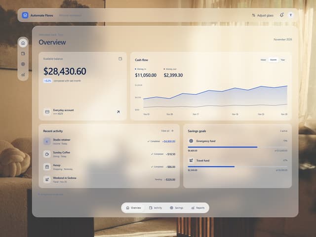

Adjustable Glass Dashboard
1K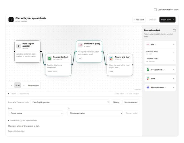
Interactive Workflow Blueprint
417
Glassy Coverflow Carousel
340
Liquid Glass Wordmark Footer
169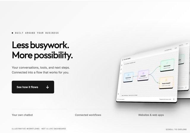
Dimensional Workflow Hero
140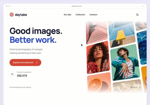
Daytake Landing Page
56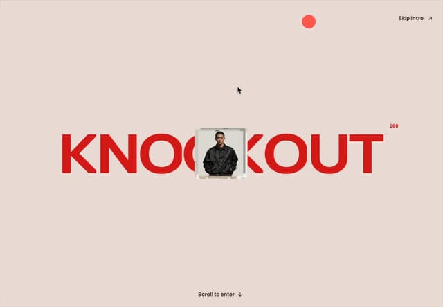
KNOCKOUT Landing Page
18
Liquid Glass Expandable Sidebar
8
More in Dashboards
View all
Dashboard with Collapsible Sidebar
2.6K

Sidebar
387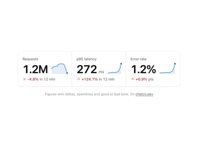
Stat Card
35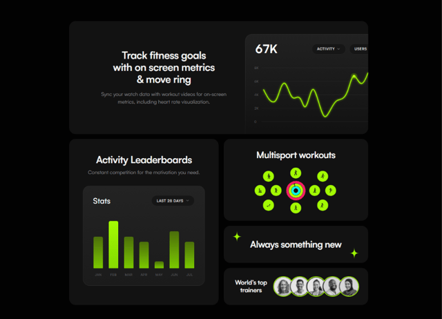

Fitness Bento Grid
34

SaaS Template
2.7K
Stats Bento
1.2K

Course Design Cards
1.3K

Data Grid Table
16


