
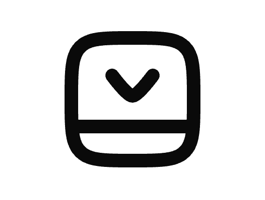
About
An animated panel icon with a bottom bar that bounces on hover, useful for UI actions like closing a bottom panel or drawer.
Built with React and Tailwind. Copy the prompt and paste it into Claude Code, Cursor or Lovable: your agent adds Panel Bottom Close Icon to your project and fits it to your theme.
Code
How Panel Bottom Close Icon is used: the demo's code. The component's own source comes with a free account.
Usage.tsx
import { PanelBottomCloseIcon } from "@/components/ui/hu-panel-bottom-close";

export default function PanelBottomCloseIconDemo() {
  return (
    <div className="flex items-center justify-center w-full h-full min-h-[200px]">
      <PanelBottomCloseIcon size={32} />
    </div>
  );
}
Dependencies
More by Avijit Dey
View all
Checkmark Circle Icon
1
Eye Icon
1
Mouse Pointer Click Icon
1
VK Square Icon
Bell Off Icon
Filter Icon

Shield User Icon
Analytics Down Icon
More in Buttons
View all
Texture Button
108
Button
14

Notification Button
117

HeroUI Button Group
2

Eclipse Button
44
Button Save
50

App Store Button
484

Base Button
1


