
About
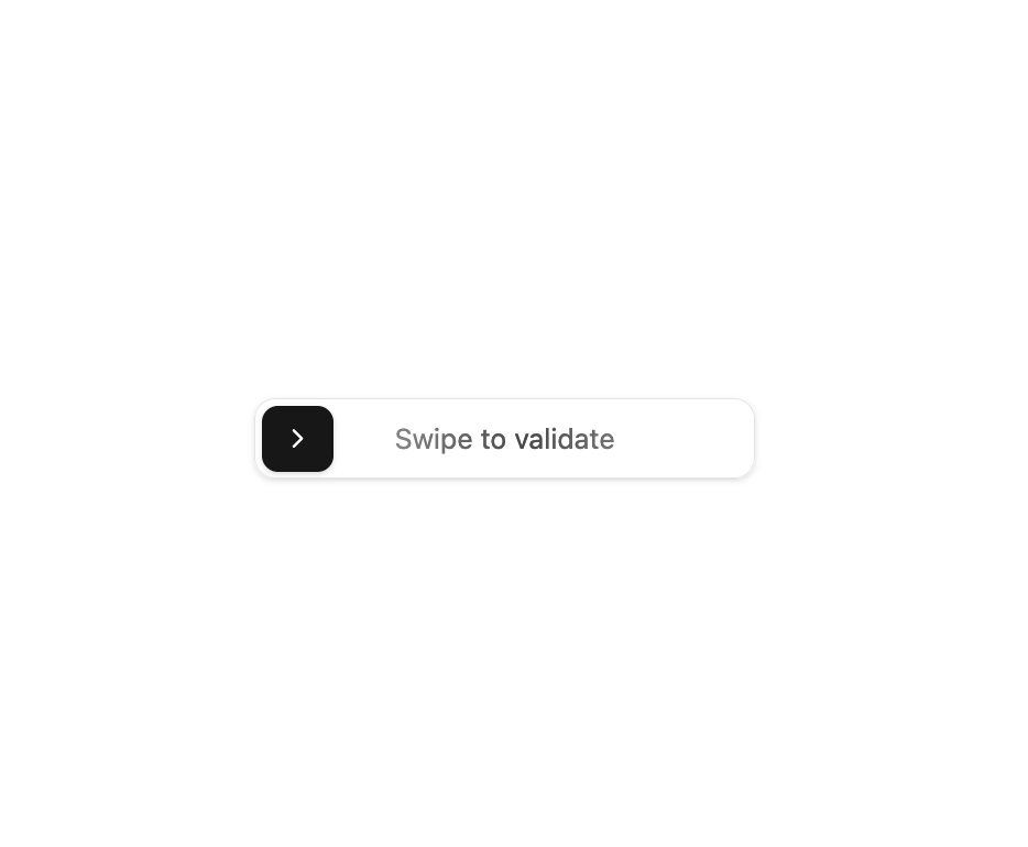
Here is Swipe Button component
Built with React and Tailwind. Copy the prompt and paste it into Claude Code, Cursor or Lovable: your agent adds Swipe Button to your project and fits it to your theme.
Code
How Swipe Button is used: the demo's code. The component's own source comes with a free account.
Usage.tsx
"use client"

import confetti from "canvas-confetti"

import { SwipeButton } from "@/components/ui/swipe-button"

export default function SwipeButtonDemo() {
  const triggerConfetti = () => {
    confetti({
      particleCount: 100,
      spread: 70,
      origin: { y: 0.6 },
    })
  }

  return (
    <div>
      <SwipeButton onSwipeComplete={triggerConfetti} />
    </div>
  )
}
Dependencies
More by badtz
View all
Animated Card Chart
1K
Animated Card Diagram
660
Animated Card
479
dock
357
Glowing Button
221
Cursor Cards
196
Border Beam
193
Star Button
92
More in Buttons
View all
Button
12

Notification Button
115
Texture Button
105

HeroUI Button Group
2

App Store Button
482
Split Button
16
Button
78

Base Button
1


