
About
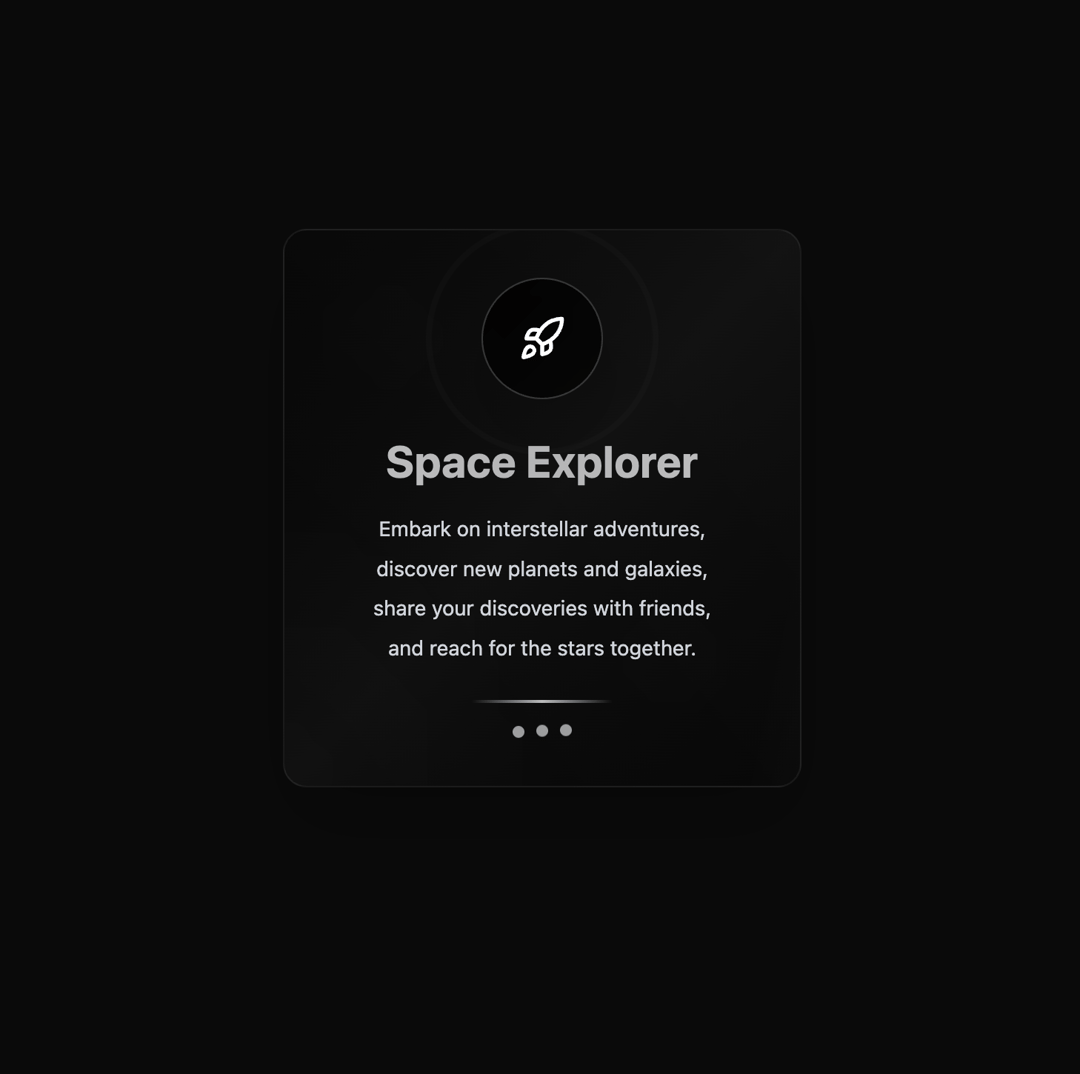
Highlight Card shacn card
Built with React and Tailwind. Copy the prompt and paste it into Claude Code, Cursor or Lovable: your agent adds Highlight Card to your project and fits it to your theme.
Code
How Highlight Card is used: the demo's code. The component's own source comes with a free account.
Usage.tsx
import Component from "@/components/ui/highlight-card";
import { Rocket } from "lucide-react";

export default function DemoOne() {
  return (
    <Component
      title="Space Explorer"
      description={[
        "Embark on interstellar adventures,",
        "discover new planets and galaxies,",
        "share your discoveries with friends,",
        "and reach for the stars together."
      ]}
      icon={<Rocket className="w-8 h-8 text-white" />}
    />
  );
}
More by Berat Berkay Gökdemir
View all

AI Loader
1.4K
Hero
1.3K
Profile Card
823
Roadmap Card
584
Glassmorphism Profile Card
500
Hero
492
Product Card
406
Shader Hero
259
More in Features
View all

Grid Feature Cards
1.9K

Feature Sections
55

Features 8
3.2K
Feature with advantages
297

Features Grid
91
Features Card
263

Feature 1
121

MotionFlow Feature Grid Showcase
27

