

About
A three-card feature grid with masked split-line headline reveal, staggered fade-ups, and live animated UI mockups per card.
Built with React and Tailwind. Copy the prompt and paste it into Claude Code, Cursor or Lovable: your agent adds MotionFlow Feature Grid Showcase to your project and fits it to your theme.
Code
How MotionFlow Feature Grid Showcase is used: the demo's code. The component's own source comes with a free account.
Usage.tsx
"use client"

import Component from "@/components/ui/cue-motionflow-feature-grid-showcase"

export default function Demo() {
  return <Component />
}
More by Alok
View all

Glossy Slider Call Button
26
Dot Graph Card
23
Profile Menu Expander
4
Pixel Perfect Command Palette
2
Phantom Infinite Gallery
1
Collapsing Cards Accordion
1
Interactive Card Sphere
1
Sticky Cascade Services & Timeline
More in Features
View all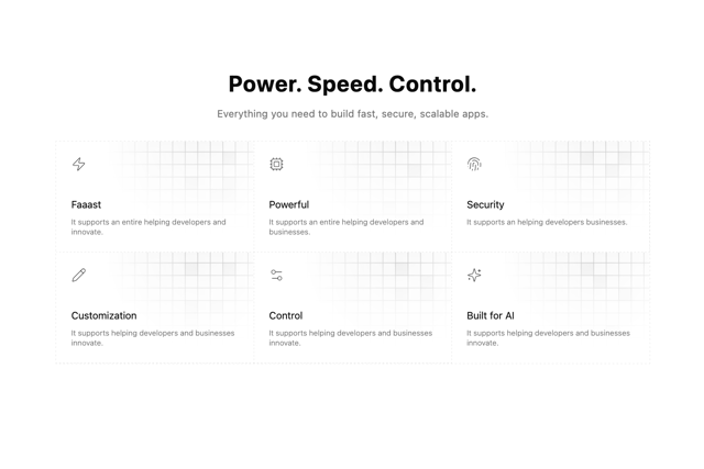

Grid Feature Cards
1.9K

Feature Sections
54

Features 8
3.2K

Feature 1
118
Feature with image
153
Features Card
249
Feature with advantages
290
Features 1
286

