About
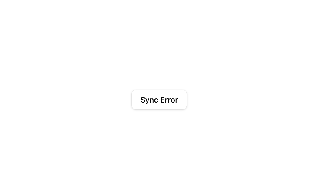
A button that triggers a promise-based Sonner toast, showing loading, success, and error states for async actions like syncing data.
Built with React and Tailwind. Copy the prompt and paste it into Claude Code, Cursor or Lovable: your agent adds Sonner Promise Toast to your project and fits it to your theme.
Code
How Sonner Promise Toast is used: the demo's code. The component's own source comes with a free account.
Usage.tsx
import ToastComponent from "@/components/ui/toast8";
import { Toaster } from "sonner";

export default function DefaultDemo() {
  return (
    <div className="flex min-h-64 w-full items-center justify-center bg-background text-foreground">
      <ToastComponent />
      <Toaster />
    </div>
  );
}
Dependencies
More by Bundui.io
View all

Fluid particles background
833
Floating paths
706
Text Gradient Scroll
648
Stars
564
Image Comparison
429
Magnetic Button
412
Marquee Effect
340
Wavy
219
More in Buttons
View all
Button
16
Texture Button
110

Astryx Button Group
27

Button
135

Button
36

HeroUI Button Group
2

Eclipse Button
9
HeroUI Toggle Button
2

