
About
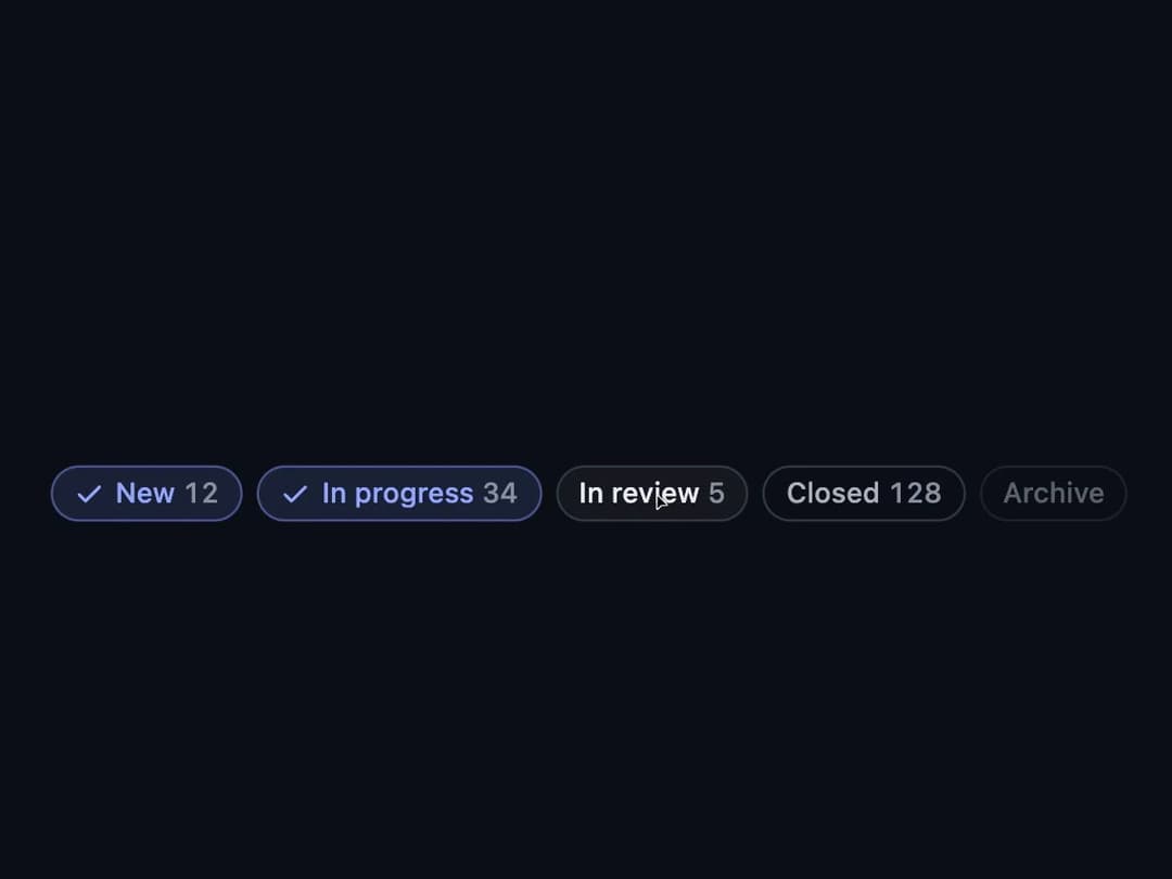
A small pill-shaped label used as a toggleable filter, a removable applied-filter tag, or a static tag, with optional icon and tone colors.
Built with React and Tailwind. Copy the prompt and paste it into Claude Code, Cursor or Lovable: your agent adds Chip to your project and fits it to your theme.
Code
How Chip is used: the demo's code. The component's own source comes with a free account.
Usage.tsx
"use client";

import Chip, { ChipGroup } from "@/components/ui/chip";
import { useState } from "react";

const STATUS_FILTERS = [
  { id: "new", label: "New", count: 12 },
  { id: "work", label: "In progress", count: 34 },
  { id: "check", label: "In review", count: 5 },
  { id: "done", label: "Closed", count: 128 },
];

export default function ChipDemo() {
  const [statuses, setStatuses] = useState<string[]>(["new", "work"]);
  const toggle = (id: string) =>
    setStatuses((cur) =>
      cur.includes(id) ? cur.filter((x) => x !== id) : [...cur, id],
    );
  return (
    <div className="flex min-h-[160px] w-full items-center justify-center p-8">
      <ChipGroup aria-label="Task status">
        {STATUS_FILTERS.map((f) => (
          <Chip
            key={f.id}
            selected={statuses.includes(f.id)}
            onClick={() => toggle(f.id)}
          >
            {f.label} <span className="ev-num ev-muted">{f.count}</span>
          </Chip>
        ))}
        <Chip selected={false} onClick={() => undefined} disabled>
          Archive
        </Chip>
      </ChipGroup>
    </div>
  );
}
Dependencies
More by bypaws
View all
Popover