
About
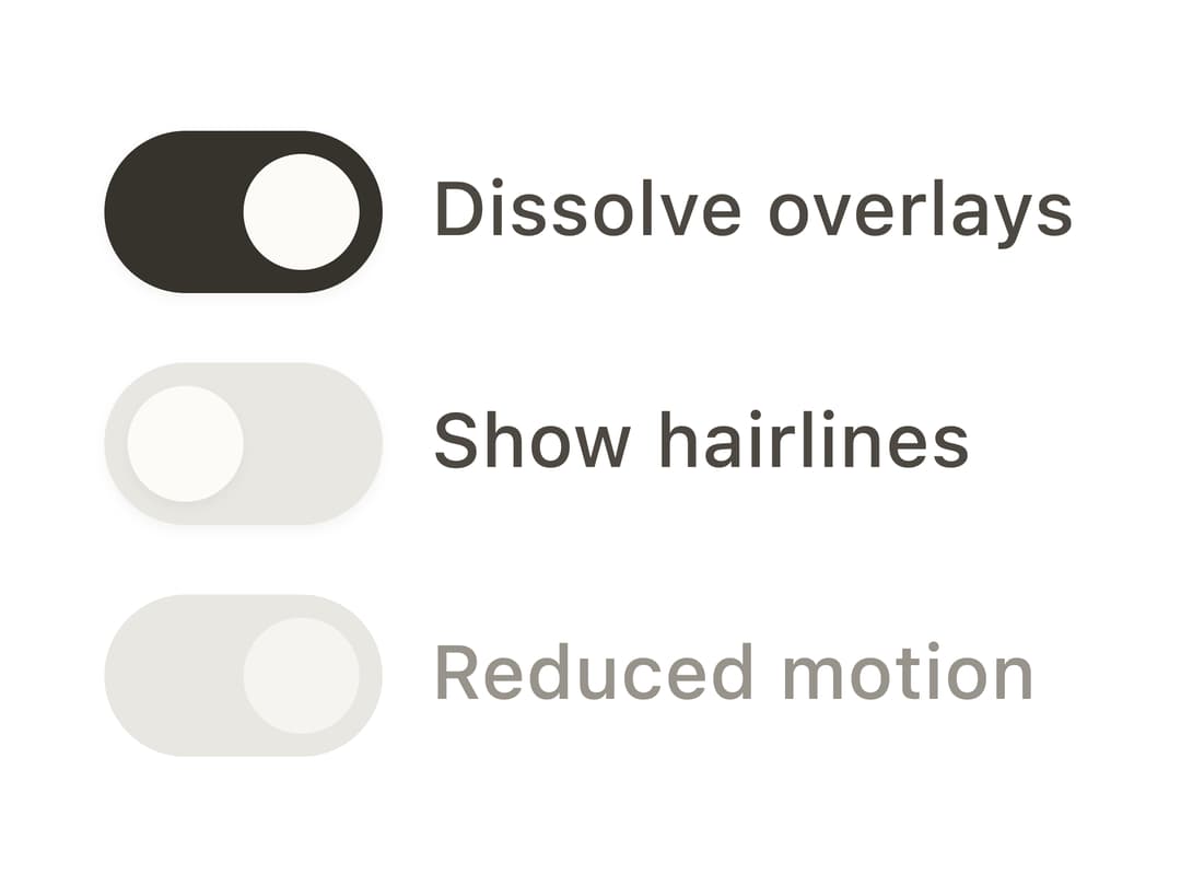
An accessible on/off toggle control built on Ark UI's headless switch machine, styled with CSS custom-property design tokens for light/dark themes.
Built with React and Tailwind. Copy the prompt and paste it into Claude Code, Cursor or Lovable: your agent adds Switch to your project and fits it to your theme.
Code
How Switch is used: the demo's code. The component's own source comes with a free account.
Usage.tsx
"use client";

import { Switch } from "@/components/ui/switch";

export default function SwitchDemo() {
  return (
    <div style={{ display: "grid", gap: "0.75rem", maxWidth: "20rem" }}>
      <Switch.Root defaultChecked>
        <Switch.Control>
          <Switch.Thumb />
        </Switch.Control>
        <Switch.Label>Dissolve overlays</Switch.Label>
        <Switch.HiddenInput />
      </Switch.Root>
      <Switch.Root>
        <Switch.Control>
          <Switch.Thumb />
        </Switch.Control>
        <Switch.Label>Show hairlines</Switch.Label>
        <Switch.HiddenInput />
      </Switch.Root>
      <Switch.Root defaultChecked disabled>
        <Switch.Control>
          <Switch.Thumb />
        </Switch.Control>
        <Switch.Label>Reduced motion</Switch.Label>
        <Switch.HiddenInput />
      </Switch.Root>
    </div>
  );
}
Dependencies
More by bysages
View all
Avatar Group
7
Typography
5
Spinner
4
Grid
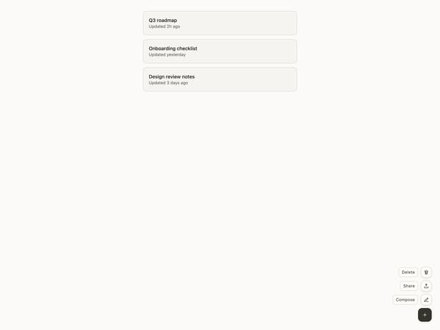
Float Button
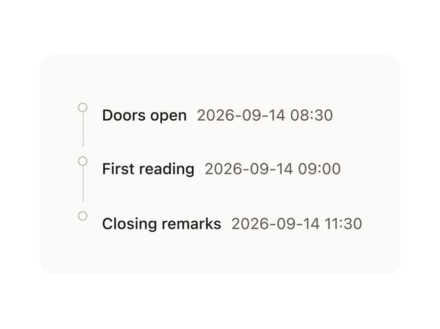
Timeline

Floating Panel

Ellipsis
More in Forms
View all

Premium Auth
519

Contact Card
1K

Form
16
Authentication Card
48

Book A Demo 1
72
Book A Demo 4
55

Login Form
7
Login Card
26

