

About
Here is Buttons Components
Built with React and Tailwind. Copy the prompt and paste it into Claude Code, Cursor or Lovable: your agent adds Buttons to your project and fits it to your theme.
Code
How Buttons is used: the demo's code. The component's own source comes with a free account.
Usage.tsx
import { DownloadIcon } from 'lucide-react'

import { Button } from '@/components/ui/button'

const ButtonDownloadDemo = () => {
  return (
    <Button variant='outline' className='flex items-center gap-2 border-primary border-dashed shadow-none'>
      <DownloadIcon size={15}/>
      Download
    </Button>
  )
}

export default ButtonDownloadDemo
More by Clevision
View all

Calendar
110
Card Studio
106
Collapsible
43
Button Group
39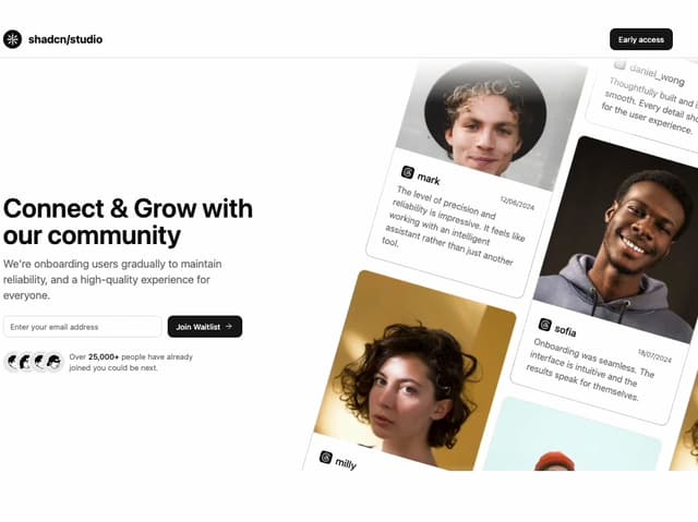
Waitlist 01
33
Combobox
32
Logo Cloud
31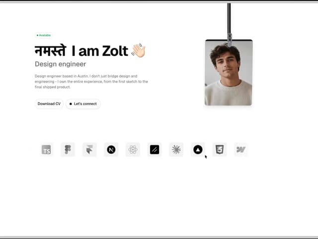
Hero Section 44
30
More in Buttons
View all
Button
10

Button
1

Eclipse Button
42
Native Button
12
Texture Button
103
Split Button
15
Button

Button
77


