

About
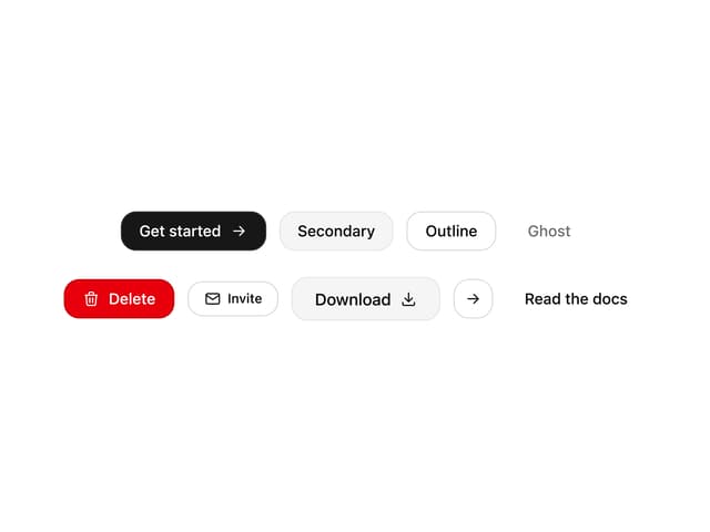
Here is Buttons Components
Built with React and Tailwind. Copy the prompt and paste it into Claude Code, Cursor or Lovable: your agent adds Buttons to your project and fits it to your theme.
Code
How Buttons is used: the demo's code. The component's own source comes with a free account.
Usage.tsx
import { Trash2Icon } from 'lucide-react'

import { Button } from '@/components/ui/button'

const ButtonDiscardDemo = () => {
  return (
    <Button
      variant='outline'
      className='flex items-center gap-2 hover:bg-destructive/10! text-destructive! border-destructive! focus-visible:ring-destructive/20 dark:focus-visible:ring-destructive/40'
    >
      <Trash2Icon size={15} />
      Discard
    </Button>
  )
}

export default ButtonDiscardDemo
More by Clevision
View all

Syntra Hero
270
Calendar
114
Card Studio
108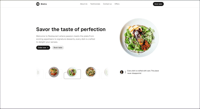
Hero Section 41
99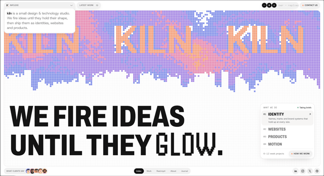
Agency Hero
69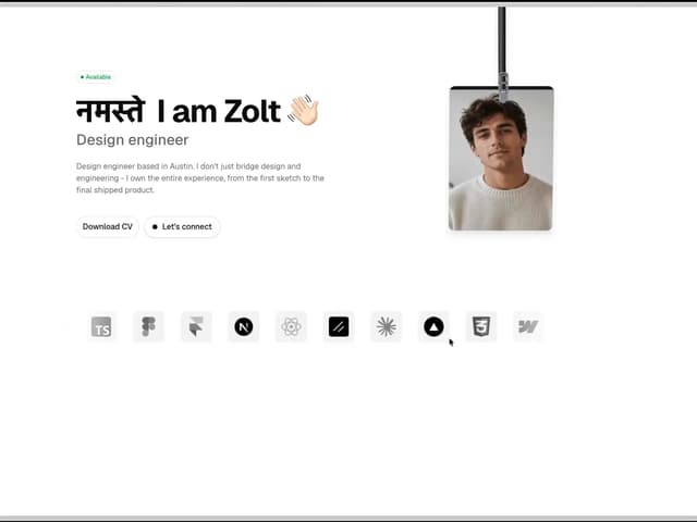
Hero Section
57
Hero Section 01
48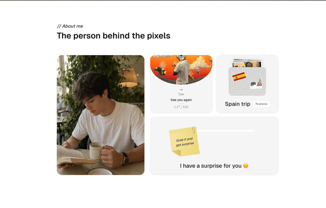
About Us
45
More in Buttons
View all
Button
16
Texture Button
110
Button Group

Button
137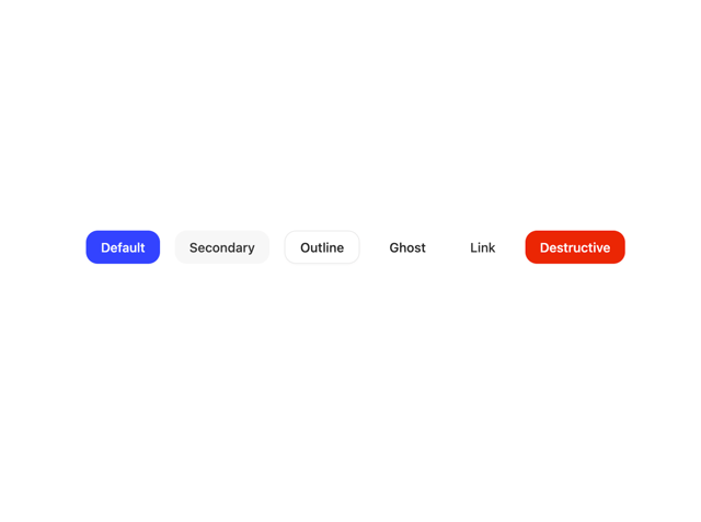

Button
37

Eclipse Button
44

Astryx Chat Send Button
3

Random Letter Swap CTA Buttons
62

