
About
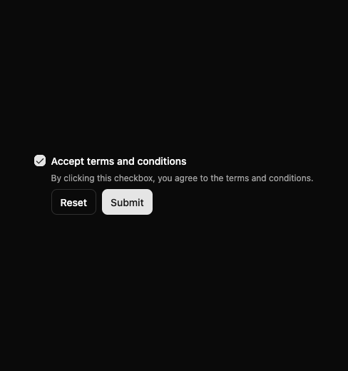
Here is Checkbox component
Built with React and Tailwind. Copy the prompt and paste it into Claude Code, Cursor or Lovable: your agent adds Checkbox to your project and fits it to your theme.
Code
How Checkbox is used: the demo's code. The component's own source comes with a free account.
Usage.tsx
import { useId } from 'react'

import { Button } from '@/components/ui/button'
import { Checkbox } from '@/components/ui/checkbox'
import { Label } from '@/components/ui/label'

const CheckboxFormDemo = () => {
  const id = useId()

  return (
    <div className='flex items-start gap-2'>
      <Checkbox id={id} defaultChecked />
      <div className='grid gap-2'>
        <Label htmlFor={id} className='gap-1 leading-4'>
          Accept terms and conditions
        </Label>
        <p className='text-muted-foreground text-xs'>
          By clicking this checkbox, you agree to the terms and conditions.
        </p>
        <div className='flex flex-wrap gap-2'>
          <Button variant='outline' size='sm'>
            Reset
          </Button>
          <Button size='sm'>Submit</Button>
        </div>
      </div>
    </div>
  )
}

export default CheckboxFormDemo
More by Clevision
View all

Calendar
110
Card Studio
106
Collapsible
43
Button Group
38
Buttons
34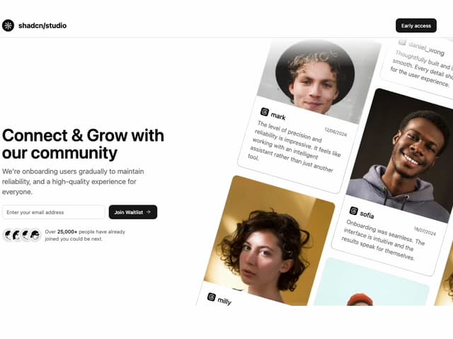
Waitlist 01
33
Combobox
32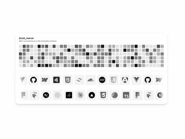
Logo Cloud
31
More in Buttons
View all
Texture Button
102
Button
10

Button
4
Native Button
12
Button
76

HeroUI Button Group
11
Split Button
36

Notification Button
113


