
About
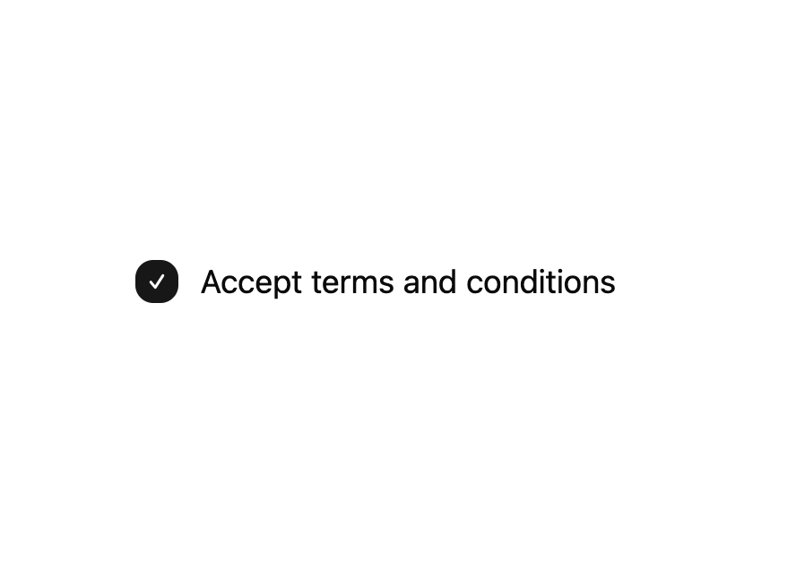
A styled checkbox control for forms, built on Base UI, supporting checked, unchecked, and indeterminate states.
Built with React and Tailwind. Copy the prompt and paste it into Claude Code, Cursor or Lovable: your agent adds Checkbox to your project and fits it to your theme.
Code
How Checkbox is used: the demo's code. The component's own source comes with a free account.
Usage.tsx
import { Checkbox } from "@/components/ui/checkbox";

export default function CheckboxDemo() {
  return (
    <div className="flex min-h-40 items-center justify-center p-6">
      <label className="flex items-center gap-3 text-lg text-foreground select-none">
        <Checkbox defaultChecked className="size-6 sm:size-6" />
        Accept terms and conditions
      </label>
    </div>
  );
}
Dependencies
More by Cnippet
View all

Team
1.3K
Davincho Hero-1
692
Aero Hero-3
590
Features
519
Random Letter Swap Navigation
513
Services with Animated Hover Modal
472
Blogs
398
Aero Hero-1
366
More in Forms
View all

Premium Auth
536

Contact Card
1K

Form
17
Login Card
6

Book A Demo 1
78

Input
14

Split Sign In Form
82
Text Field

