
About
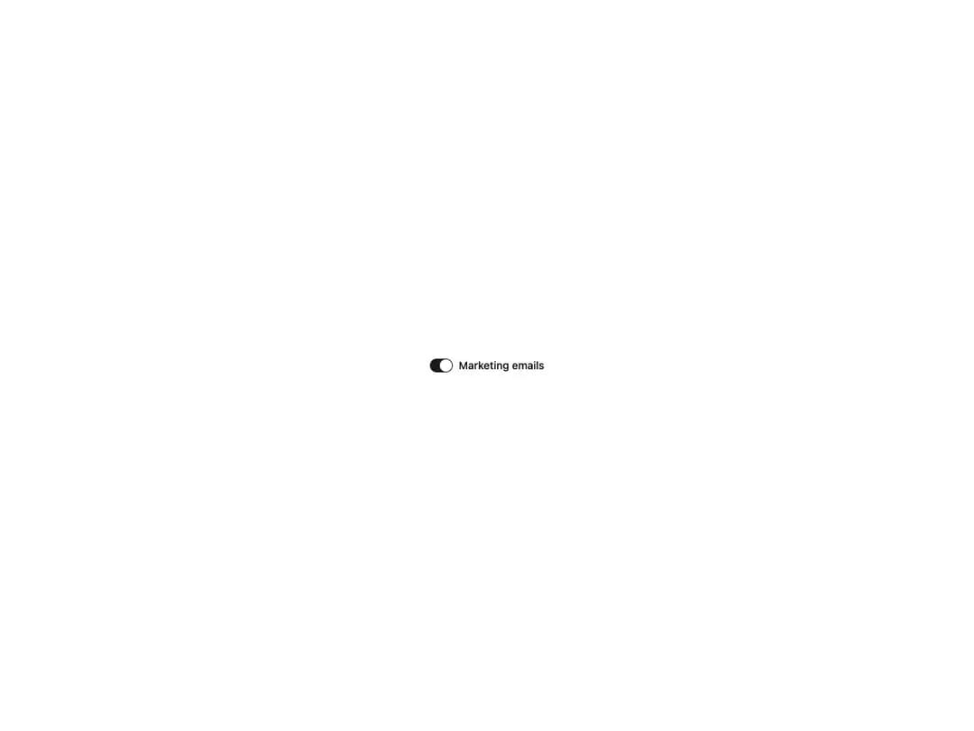
An accessible toggle switch built on Base UI's Switch primitive. Animated thumb with a springy press/scale interaction, two sizes (default and sm), controlled or uncontrolled usage via checked / defaultChecked, disabled state, and easy accent recoloring through the data-checked:* utilities. Re-exports SwitchPrimitive for advanced composition.
Built with React and Tailwind. Copy the prompt and paste it into Claude Code, Cursor or Lovable: your agent adds Switch to your project and fits it to your theme.
Code
How Switch is used: the demo's code. The component's own source comes with a free account.
Usage.tsx
import { Switch } from "@/components/ui/cnippet-switch";

export default function SwitchDemo() {
  return (
    <label
      className="flex items-center gap-2 font-medium text-sm"
      data-slot="label"
    >
      <Switch />
      Marketing emails
    </label>
  );
}
Dependencies
More by Cnippet
View all

Team
1.3K
Davincho Hero-1
692
Aero Hero-3
590
Features
520
Random Letter Swap Navigation
514
Services with Animated Hover Modal
472
Blogs
398
Aero Hero-1
367
More in Forms
View all

Premium Auth
537

Contact Card
1K

Card Studio
45

Login 2
10

Book A Demo 1
78

Form
17
Login Card
30

Form
12
