
About
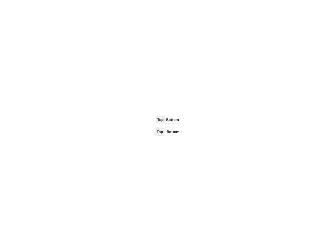
A set of toggle buttons that work together as a single control, built on Base UI's ToggleGroup primitive. Supports single or multiple selection, horizontal and vertical orientation, default and outline variants with three sizes, and an optional ToggleGroupSeparator between items. The Toggle and Separator primitives are inlined so the component ships as a single self-contained file.
Built with React and Tailwind. Copy the prompt and paste it into Claude Code, Cursor or Lovable: your agent adds Toggle Group to your project and fits it to your theme.
Code
How Toggle Group is used: the demo's code. The component's own source comes with a free account.
Usage.tsx
import {
  ToggleGroup,
  ToggleGroupItem,
} from "@/components/ui/cnippet-toggle-group";

export default function ToggleGroupOutline() {
  return (
    <div className="flex flex-col items-center justify-center gap-4">
      <ToggleGroup defaultValue={["top"]} size="sm" variant="outline">
        <ToggleGroupItem value="top">Top</ToggleGroupItem>
        <ToggleGroupItem value="bottom">Bottom</ToggleGroupItem>
      </ToggleGroup>
      <ToggleGroup defaultValue={["top"]} variant="outline">
        <ToggleGroupItem value="top">Top</ToggleGroupItem>
        <ToggleGroupItem value="bottom">Bottom</ToggleGroupItem>
      </ToggleGroup>
    </div>
  );
}
Dependencies
More by Cnippet
View all

Team
1.3K
Davincho Hero-1
698
Aero Hero-3
607
Random Letter Swap Navigation
536
Features
526
Services with Animated Hover Modal
478
Blogs
401
Aero Hero-1
373
More in Buttons
View all
Texture Button
102
Button
10

Button
4
Native Button
12

Button Group
38
Button
76

HeroUI Button Group
11
Split Button
36


