
About
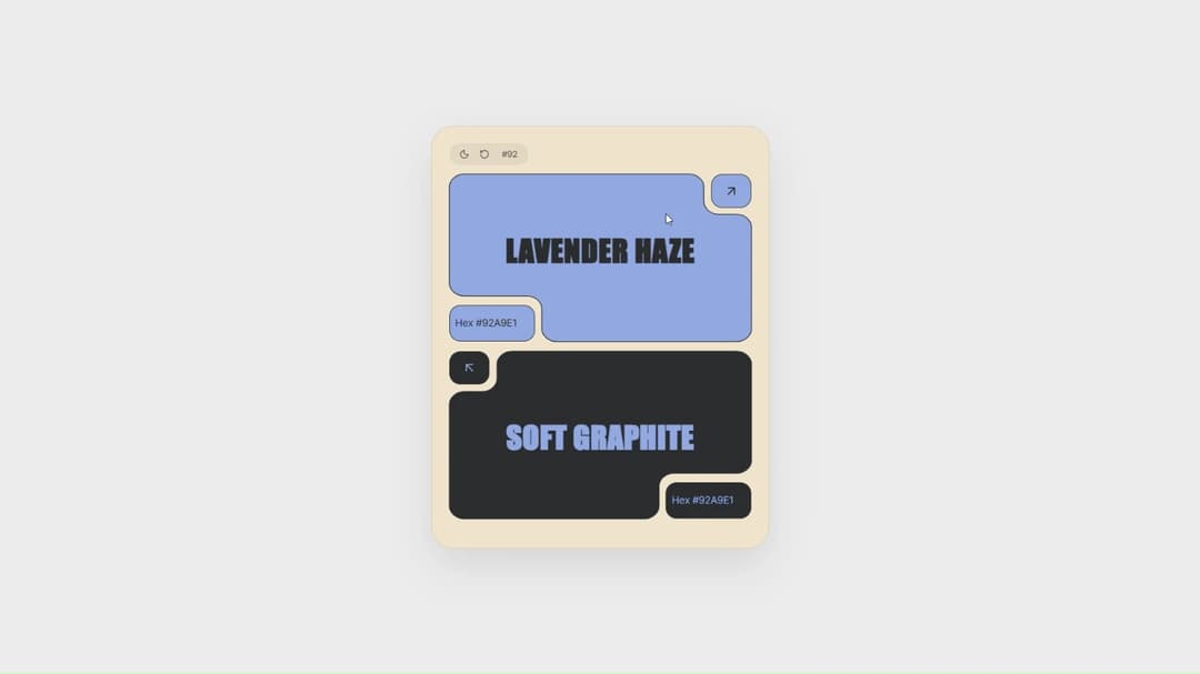
An interactive SVG-notched bento color palette card with inverted corner cutouts, one-click hex copying, live color dominance swapping, and dual light/dark mode support.
Built with React and Tailwind. Copy the prompt and paste it into Claude Code, Cursor or Lovable: your agent adds Color Pairing Card to your project and fits it to your theme.
Code
How Color Pairing Card is used: the demo's code. The component's own source comes with a free account.
Usage.tsx
// This is a file with a demo for your component
// That's what users will see in the preview
// Create new files in this directory to add more demos

import ColorPairingCard from "@/components/ui/color-pairing-card";

// ONLY DEFAULT EXPORT WILL BE TREATED AS A DEMO
export default function DemoOne() {
  return (
    <main className="h-dvh w-full overflow-hidden bg-[#ECECEC] dark:bg-[#05070E] transition-colors duration-500 flex items-center justify-center p-4">
      <ColorPairingCard />
    </main>
  );
}
Dependencies
More by Daiwiik Harihar
View all

Spatial Product Showcase
2.3K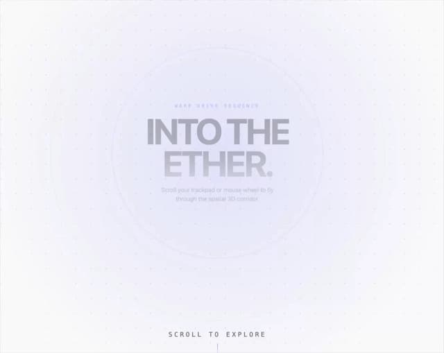
Perspective Tunnel Hero
1.8K
Constellation Grid
1.2K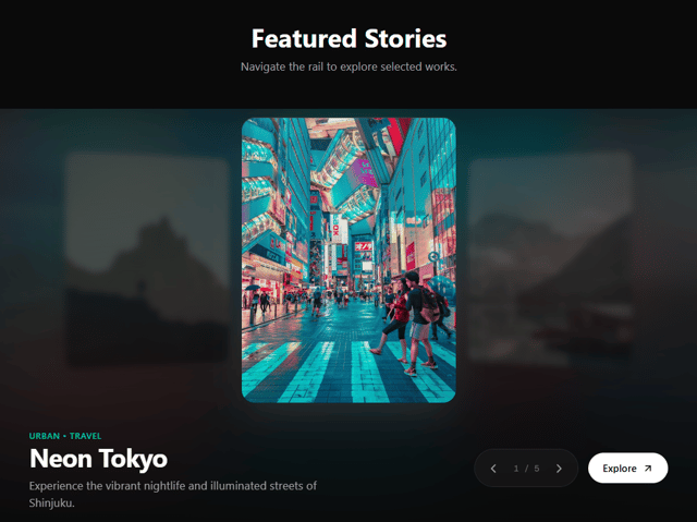
Focus Rail
1.1K
Elastic Gallery
1K
Rolling List
943
Hero Shutter Text
926
Text Block Animation
893
More in Cards
View all
Stats cards with links
40

Course Design Cards
1.2K

Interactive Tech Stack Bento Grid with Hover Effects
414

Card Studio
14

Statistics Card 2
292
Statistics Card 7
311
The Item one
3
Card
70
